Peer perspectives: Channel 4
Taking flexible visual identities to the extreme, Britain’s Channel 4 has reimagined the role of television idents. Martin Grimer gives the Channel 4 brand refresh a big thumbs-up for its brave, surreal storytelling
Project: Channel 4 Brand Refresh by 4Creative alongside DBLG Reviewer: Martin Grimer, executive creative director, Aesop Agency
Summary: I was at art school when the original identity and groundbreaking idents for Channel 4 came out. I thought they were really fresh, with the different coloured blocks of the logo animating together to represent the new channel’s diversity of programming.
Channel 4’s brand refresh by 4Creative alongside DBLG recreates this in a new, perhaps more relevant way, as media becomes ever more fragmented. For me, it truly reflects what the channel’s programming is all about: innovation, diversity, creativity. There’s the surreal, ethereal, ‘bonkers’ film idents by the award‐ winning Jonathan Glazer, which set the scene in a highly emotive way. Then there’s the more on‐the‐nose, consumable executions like the Simpsons ident. They unpack the backstory of that original blocky identity created by Lambie Nairninthelate’80s.
The new work certainly doesn’t follow the conventions of modern TV idents; this is more of an unfolding story, a teaser saying ‘What’s coming next?’
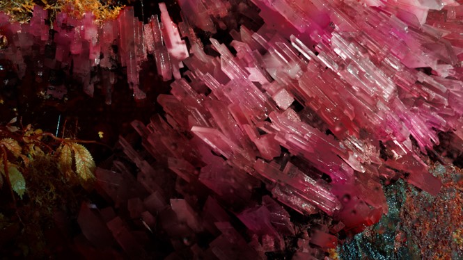
About the teaser: We’re taken on a journey through the story of the ‘precious’ blocks, from their origins in a surreal, magical world where shamans dance in caves and glistening gem‐like blocks appear in the landscape. The blocks are then harvested by white suited, goggled technicians and refined in a laboratory until they develop a life of their own, manifesting themselves in any way they want. This echoes the channel’s philosophy of discovering and nurturing raw talent and producing bold, innovative content as well as its audience’s desire for new, challenging programming.
Beyond the film the blocks suddenly have an amazing versatility – here we see remnants of the original Channel 4 identity reimagined in a fresh,graphic,contemporaryway. Thebespoke typeface that Neville Brody has developed to support the brand refresh also nods to the original blocks with its chamfered off letterforms.
My personal favourite? Yellow blocks and two little eyes on a graphic blue background. Immediately you know it’s the Simpsons ident. The blocks have suddenly got a life to them that’s relevant and fresh...perfect, really.
What works: The fact the refresh is all joined up – not just matching luggage. The parts are all crafted and considered in their own right, to deliver what’s relevant each time and in whichever guise. It’s also a triumph that the emotive film demands a little effort to work out what’s going on. Normally we’re handed TV idents, all glossily decoded, on a plate so we can just sit back and effortlessly consume – but here we’re being challenged. It’s a great refresh by 4Creative – and it endlessly produces stunning work that surprises and satisfies the viewer. I guess the fact that it’s a bespoke shop to the channel allows it to be in control of its own destiny – ensuring creative freedom and integrity as paramount. What doesn’t work: Cynics may say they don’t get the new ident film...shamans, close up of a microscopic bug, all too trippy, too weird? My mum wouldn’t get it, but she doesn’t watch Channel 4.
What’s surprising: It’s all surprisingly like Lambie Nairn’s ident was back in the 80s, and that’s why I like it. It’s fresh, intriguing, compelling – the idea of giving the blocks a backstory (let alone an interesting one) is the unexpected that slaps a big fat smile on your face.
What the future holds: The future is wherever those blocks choose to take us – but I don’t predict boring! Hopefully this prompts a future that raises the bar for the other channels to push on creatively, to surprise us with their identities and take us to new places. As ever it takes brave bold work to move things on. Hats off to 4Creative.
Martin Grimer is the executive creative director at Aesop
