Craft, heritage and revolution for the water of life
The perception of whisky is shifting away from the dusty bottle on the old man’s liquor shelf. Younger consumers, digital communications and packaging technologies have led to a revolution in the ways in which whisky brands communicate. Brittany Golob reports
Over 118 years ago, a group of entrepreneurs in Scotland’s Speyside valley raised the equivalent of £20m to create a modern, efficient, massive distillery producing single malt whisky. One of the first to set up on the banks of the river Spey, Tamdhu became one of the core brands in the region. By 2011, it was a dusty, undervalued single malt that was used mostly in blends. In the years since, the revitalisation of the brand has taken an industrialist attitude, Victorian visual cues and a modern positioning to drastically change Tamdhu’s reputation.
The history of whisky is rife with these vibrant stories. Each distillery has its own individual character, its quirks and its triumphs. Yet whisky still carries a perception of being an ‘old man drink’. Don’t tell that to the distillers and brand managers, though, who are reinvigorating a sector entrenched in the past and making that history come alive in the present.
That relies on brand experience – the physical experience, its complement online and the communicative abilities of packaging. “It’s about pulling out those authentic truths and stories,” says Diageo’s design leader Clare Negus. “It’s more about building brand image and using experience to do that…You’re using every touchpoint to really enhance the brand image and how people interact with the product.” Whisky companies as prominent as Diageo – which owns Johnnie Walker, Bushmills and 26 others – and as local as Tamdhu and its peers in Scotland have sought to make their stories relevant to a younger audience in order to increase product premiumisation and brand awareness worldwide.
Seems simple, for a brand as pervasive as Johnnie Walker; just get people to drink more. Yet, achieving those objectives requires major thought into the positioning and design of the brand and brand experience. The timeless ‘striding man’ icon has done the brand good over the years and it continues to act as a prominent mark. Brand managers have pushed that pioneering spirit farther, however. “It’s about taking [those strengths] and pulling out the key pillars of the brand that have always existed and continually reinventing them to keep them fresh, tell the story in another way,” Negus says. Johnnie Walker has pioneered the luxury liquor market in Asia through its Johnnie Walker Houses – exclusive clubs meant to transmit the experience of making and drinking whisky to a new, young, status-conscious audience. That use of the environmental experience has seeped around the world as well. The brand worked with a luxury golf resort in the UK, the Gleneagles Hotel, to create a new way for the brand to be experienced – complete with molecular cocktail menus and lighting designed to evoke the shape of the bottle. London design agency Sedley Place was responsible for the packaging redesign and the Gleneagles experience. Planning director Giles Calver says brand experiences are, “Engaging with customers in the whole heritage of scotch and the whole experience and how you turn it into a sociable drinking experience.”
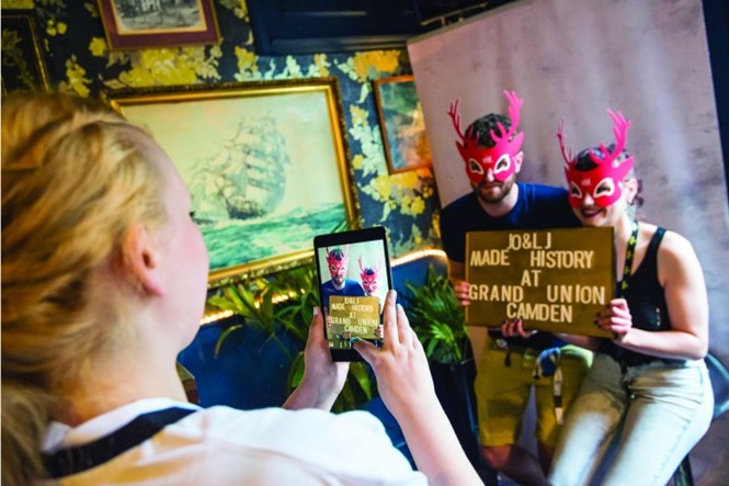
For brands seeking to not only reinvigorate their target audiences or reach new consumers but to reposition the brand as well, the physical experience plays a key role. Berkshire-based experiential agency BEcause worked with Kentucky bourbon brands Maker’s Mark and Jim Beam to redefine the way in which American whiskies are perceived by young audiences. Despite the trend toward premiumisation, these brands positioin a premium accessibility to young people. “They really walk that tightrope,” BEcause’s business director Anna Bradshaw says. “Sometimes it’s about more in-depth immersive experiences that create brand advocates that go out to talk to others.”
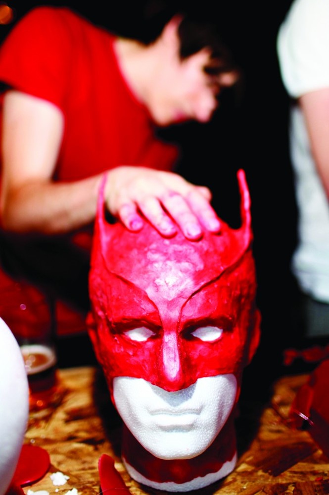
Both brands sought in-bar experiences to communicate directly with a young audience. Yet the results were as unique as each whisky brand. Maker’s Mark, which features an iconic red wax seal used disruptive sampling and encouraged people to order long drinks alongside a hands-on experience allowing bar-goers to play with a giant block of red wax. Jim Beam used its pioneering focus to encourage people to ‘make history’ by using in-pub photo booths and then sharing theresulting images.
“Whiskies have a heritage of brand experience. People have been doing whisky tastings and visiting distilleries for a long time. They have brand ambassadors and it has always historically worked very well on word of mouth and social currency.”
Bradshaw says modern experiential campaigns are just the latest for a sector that has been entrenched in experience for most of its commercial life, “In a weird way, whiskies have a heritage of brand experience. People have been doing whisky tastings and visiting distilleries for a long time. They have brand ambassadors and people who are really enthused naturally about this sector and it has always historically worked very well on word of mouth and social currency.”
The physical experience in bars and in travel retail – which is an increasing focus for many whisky brands, Negus and others note – has long been rooted in the distillery visit. Each distillery has its own distinct identity, character and style, making the visiting experience unique. Yet, not everyone can trek up to the Scottish highlands or Irish and Kentucky riverbanks to take part. Thus, whisky brands have been focusing on the digital experience to allow a global audience to build connections through engagement.
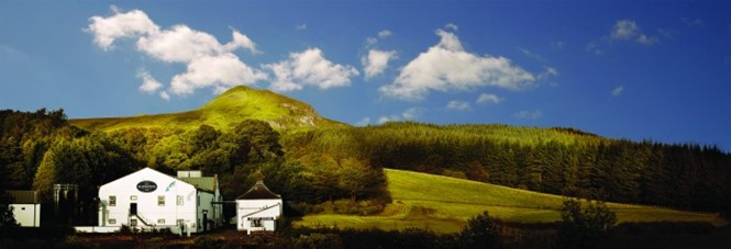
For Tamdhu, sister company of Glengoyne and owned by Ian Macleod Distillers, the distillery itself left much to be desired as it had been rebuilt in a modern style in the 1970s. But the richness of the brand story and the Speyside region allowed for a digital experience to be crafted that imparted the same feeling. “Our message is very much about 1897, the Victorian era and this whole idea of Victorian optimism and what we call the ‘can dhu attitude’,” says Ian Macleod’s director of marketing Iain Weir says.
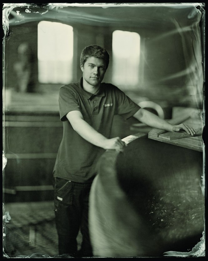
The brand, alongside British brand consultancy Good redesigned the whisky itself, turning it from an unaged, low-price, single malt into a more premium, sherry cask-aged 10 year old. They also used the distillery’s Victorian railway station, as part of the romantic, Victorian spirit embodied by the digital experience. Wet plate photography – an art form that prints a negative directly onto a silver plate and went out of fashion with the invention of film cameras – was deployed to capture the beauty, history and industrial spirit of the distillery and its surrounds.
They then created a parallax website and complemented by custom illustrations evoking a steampunk spirit. Good’s design director Darren Adams says the project combined the technological advancements embraced by the distillery’s founders as well the innovations of the time to draw a connection with the modern consumer. “We didn’t want it to be a history lesson,” he adds, describing the balance between the modern and traditional elements of the brand. “How do you apply that attitude today and capture enough of the past? What does that drink mean today?”
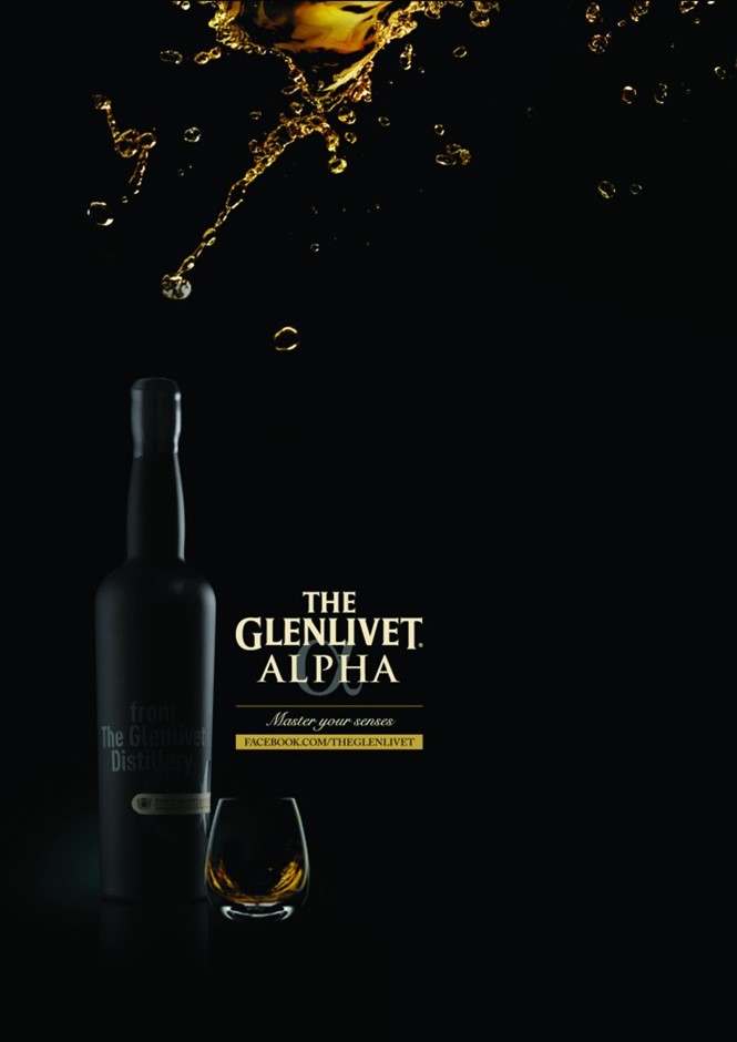
For existing beloved single malt Glenlivet, the digital experience was also a focus of the brand’s repositioning. Many distilleries have looked toward digital to create a bespoke, yet classic experience that draws on similar emotions as does a visit to a physical distillery. Glenlivet, a Speyside single malt, took the whisky tasting experience digital to complement the launch of its utra-luxury Alpha line. The distillery worked with London digital marketing agency Parnters Andrew Aldridge to create a virtual tasting session. Managing partner Paul Vallois, says, “There was a huge global audience who wasn’t going to get to taste [Glenlivet Alpha]. The whole idea about the game and the work we developed was rallying a much broader audience to engage with Alpha and to try and unlock its secrets.” They worked with a visual artist who specialises in depicting the different senses to create an online game through which users could determine the sight, smell, taste and feel of the whisky and then be treated to a discussion from the master distiller about the premium whisky.
Vallois says brands are trying to replicate the physical experience on other platforms, “Brands are now recognising that you do need to let [consumers] in. You need to let them be part of the experience. Having your brand up on a pedestal and out of reach isn’t going to cut it anymore. Letting more people get involved with the brand doesn’t actually damage the brand.”
The decision to popularise the premium whisky turned out to be a good one. Vallois says 50% of users returned to the site week after week to finish the game. The average time spent on the site was a whopping five minutes.
While the digital and physical experiences of whisky are important. In the food and drink sector, packaging remains one of the key brand touchpoints in terms of communications and brand experience. Glenlivet Alpha used a plain black package to build mystery and encourage people to experience the sensation of whisky tasting. For most others, though, the package is the most important tool for building brand awareness, educating consumers and encouraging sales.
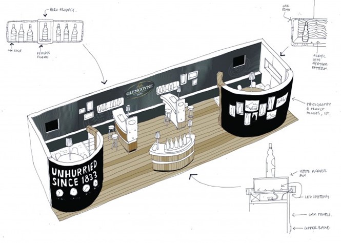
Tamdhu takes its pack design from a Victorian pillar with period-based typography. “There was utter fear because we felt we’d probably lost that link between the packaging, the positioning and the brand itself,” Weir says of the initial impressions of the Tamdhu brand. Now, the packaging is at the heart of the repsoitioning of the brand. “We really reinvented the whisky itself,” he adds. For Ian Macleod’s other brand, Glengoyne, packaging spoke to the distillery’s core brand values. Brand equity inherent in the Glengoyne heritage – largely its commitment to doing things right, even if the right way is the slow way – are reflected in the packaging to build its premium quality. Yet for established brands, repackaging does not usually equate to revolution. “You have to sit within certain clues for people to understand that it’s a whisky. You don’t want to alienate the drinkers that are there by trying to push the brand too far into a direction that people are uncomfortable with,” Adams says.
Those links back to heritage and craft are important in the European market, but even more so in the Asian market where whisky is becoming a mark of status and social drinking typically involves bringing a bottle to the table – thus putting the packaging front and center in the brand experience. “They like premium, they like to be seen drinking what they consider the best spirit in the world,” Weir says of the youth-oriented Asian market. “They like the character and the stories and the provenance and the history and the craft behind single malt.”
The Johnnie Walker Houses across Asia see this trend first hand. At the brand level, the team at Diageo is constantly examining the materials, design and quality of the packaging to ensure consistency across all sub-brands and prime Johnnie Walker to succeed in the changing marketplace. “We particularly look to packaging to play a real role in being the embodiment of the brand and the product and through how your prepare that packaging in terms of not only the graphic design, but the materials, the finishing, the layering so that people are getting an experience through the packs as well,” says Negus.
She says the distinctions made in pack design between the sub-brands imply the audience of the particular brand. Red Label, for example, is an entry-level spirit in the US and western Europe. But in South America, which is less developed in terms of whisky, it is a premium product.
The recent launch of the Johnnie Walker Collection, designed by brand consultancy Lewis Moberly, showcases the different approaches to each bottle and the core values across the portfolio. “Premium packs, especially those given as gifts, create more theatre and value through ritual and sense of discovery,” the agency’s strategic planning director Hilary Boys says.
The premium side of packaging is well-understood. What brands are now experimenting with is merging experience, pack design and brand awareness. Ballantine’s, a Lowlands Scotch, has taken that challenge head on by introducing, alongside brand experience design agency Hornall Anderson, a technologically- advanced bottle that responds to music. It was designed to stand out in the dark back bar area and features world-first technology. “For years now, whisky brands have been trying to lower their consumer demographic but without much real success,” design director Andy Atkins says. Diageo brand Haig Club, too, is seeking a hipper, younger audience with David Beckham as brand ambassador and a redesign of its packaging to look like a cologne bottle. Negus says Haig Club is has pushed the bounds of visual style within the sector while staying true to its brand.
Adams adds about the challenge whisky brands face, “Whisky has a job trying to attract younger drinkers. All the positives that go with it, which is the heritage and the craft, work against it in a way because a certain amount of people expect that and that’s all the boxes ticked. Whereas the younger consumers think ‘I don’t want all that fustiness that goes with it’.”
The market is shifting. Brands rooted in centuries of tradition are finding they need to revive their brand experiences – through packaging or digital or physical experience – in order to change the perception of whisky as a whole and cater to younger, more diverse audiences.

