What the EFF?
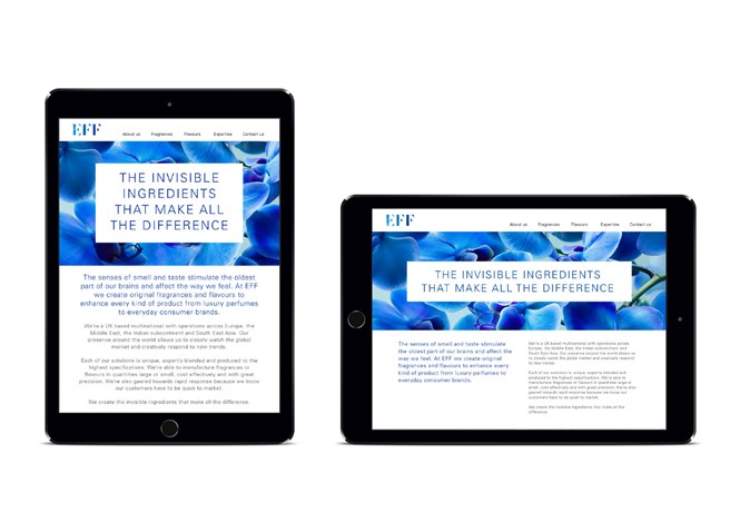
When new beauty brand commissioned London-based brand agency Frank Bright & Abel to create its visual identity, the team had to ask itself, “How do we illustrate the invisible?” EFF’s brand positioning focuses on its invisible ingredients and the value they add to the products.
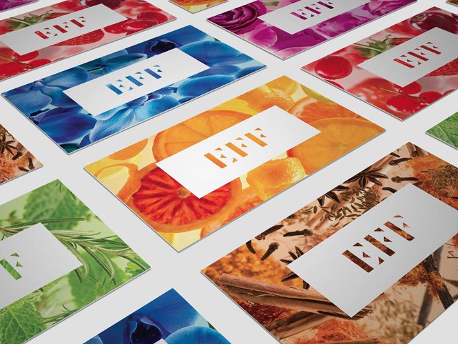
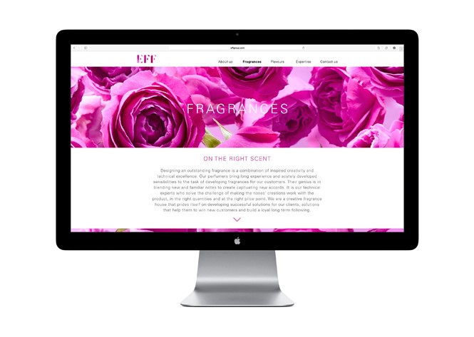
Using that positioning as the core of the brand, FB&A designed an brand system centred around the invisible. A diverse colour palette allows flexibility in the wordmark, which features the ‘EFF’ mark as a white negative. The cut-outs bring the photographic backgrounds to the fore.
Unusually for a beauty brand, photography forms the core of the brand’s look, as it eschews the traditional script-typeface, monochrome visuals that pervade across the sector. The photographic library, shot by floral photographer Carol Sharp includes imagery taken in the EFF laboratories and features six core images that form the basis of the visual identity.
“Transforming our organisation’s brand with flavours and fragrances is a complex concept to communicate. Frank Bright & Abel has created and implemented a brand that makes the intangible tangible, and does so with individuality, spirit and a great deal of credibility. This will help us take our successful business to the next level.”
The UK-based company operates internationally and thus had to ensure its brand would work across multiple markets. Frank Bright & Abel also produced trade show exhibition material that espouses the same principles of the invisible made real.

