#TransformTuesday: 28 July


Every week, Transform examines recent rebrands and updated visual identities. This week's picks are below. For more from #TransformTuesday, follow @Transformsays

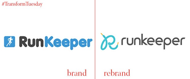
Runkeeper
A quick iPhone search brings up well over 6,000 running apps on Apple’s App store, and it seems 5,000 of them have little running men identities. Boston-based Runkeeper, developer of the eponymous fitness app (one of the first 200 apps available at the original iPhone launch) has sent its little man running. Taking up the visual identity baton is an upper case R, made of a white shoelace. The wordmark itself jettisons its upper case letters with a san serif identity stripped down for small devices, but possibly with a little less attention paid to the kerning. The shoelace ‘R’ identity is aimed to appeal to a changing demographic – younger and less male.
Interestingly, despite a lengthy narrative on the new logo, the old visual identity is still used on both iPhone and Apple Watch - so points definitely lost on implementation.
There’s enough with this visual identity to get it into the final heat. The question is, could it win a top three place.
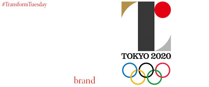
Tokyo 2020 Olympics
The original bid emblem for the Tokyo 2020 Olympics has been replaced by a new, official identity. In contrast to the soft-edged, multi-coloured florals, the new identity is geometric and modern.
Tokyo was awarded the right to host the event almost two years ago. Last week, the organising committee presented the official emblem that will represent the games. The emblem was designed by Kenjiro Sano, who runs a bureau called Mr Design.
The “T”-like symbol stands for “Tokyo, team and tomorrow”, and the centre of the logo is inverted for use in the Paralympic Games. The brand’s reveal video makes it clear that diversity and inclusion are key to the new identity, even beyond and above the sport itself.
The shapes that make up the design each have their own meaning, and can be recombined into a grid pattern, which will likely become the overarching design for the games.
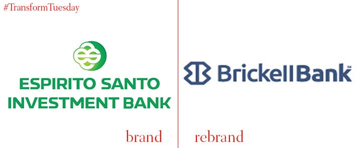
Brickell Bank
If your newly acquired bank brand is tarnished with criminal allegations, an insolvency, a stack of toxic assets and a foreign name then a rebrand probably makes sense. Espirito Santo Bank, the US arm of former Portuguese banking group Banco Espirito Santo, was acquired in May by Venezuela’s Benacerraf banking family, following a desperate nine month search for a new owner. The Benacerraf’s haven’t wasted any time in jettisoning the old name and brand – and only just in time. The day after the new ‘Brickell Bank’ brand was launched, Ricardo Salgado, the former CEO of the banking group, was arrested and questioned for accounting fraud.
There may have been a reason for the speedy new rebrand, but, sadly, in name, identity and execution the haste shows.
Oh, and in case you’re not from Miami, Brickell Bank wasn’t taken from a Dr Seuss book, but is named after the suburb of Miami where the new bank brand is based…
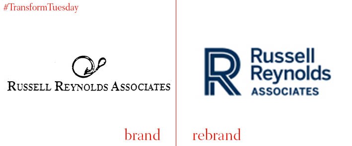
Russell Reynolds Associates
Professional service firms can have a problem with their brands. With most firms desperate to highlight a restrained gravitas, there’s a difficulty in creating a competitive differential. If anything these issues are even more keenly felt at the top end of the recruitment and executive search and selection industry.
Russell Reynolds Associates, the global c-suite recruitment firm, appointed design firm Prophet to help them with these thorny issues. They threw away the serif, reverted to upper and lower-case, though kept 'ASSOCIATES' in caps, highlighting the consultancy nature of the firm. The old identity was a wordmark, but they've now added an upper-case 'R' logo, with lines reminiscent of road markings, possibly signifying the journeys we make in our careers.