#Transform Tuesday: 02 June
Every week, Transform examines recent rebrands and updated visual identities. This week’s picks are below. For more from #TransformTuesday, follow @Transformsays
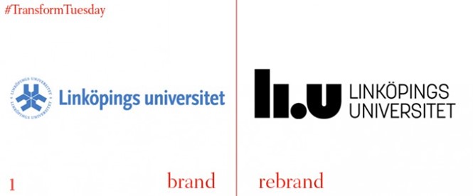
1. Whatever happened to radical youth? Students from Swedish Linkoping university are following in the footsteps of their London (Kings College London) counterparts by rising up in protest against their uni’s rebrand and demanding a return to the status quo. “What do we want?” “Helvetica Neue” “When do we want it?” “After lunch!”.
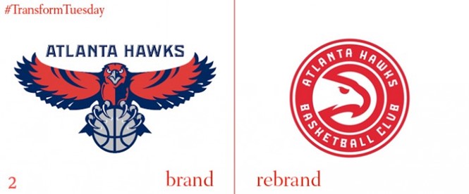
2. The hawk has been put back in its circle by the Atlanta Hawks Basketball Club, as it returns to its roots with a new visual identity harking back to a similar marque used from 1972 for 23 years. Making less of the bird and more of the words, it’s expanded its wordmark too.
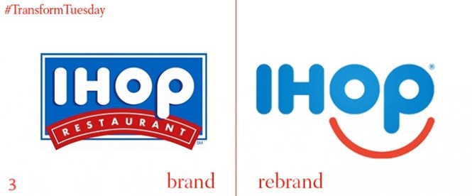
3. Global fast food chain IHOP, (International House of Pancakes) has ditched it’s small town drugstore identity for a new and funky emoji-style smiley face. See what they’ve done with that ‘p’? Yes, it’s a nose. According to their marketing VP the new VI “captures the essence of the IHOP experience”.
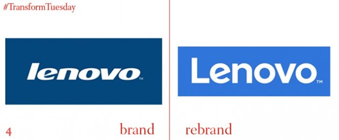
4. Chinese tech giant Lenovo has put its logo in a box. Or, in their words “a window into culture and the world that surrounds us”. By capitalising their name they’ve also removed that whole ‘i’ or ‘L’ confusion.
Have a tip for next week’s #TransformTuesday? Send your suggestions here.
