Spotlight on CIPD
The CIPD’s communications future made its old brand obsolete, prompting a change programme spanning from digital media to tone of voice. Brittany Golob reports
A 2000 rebrand left the Chartered Institute of Personnel and Development (CIPD) with a static, inflexible logo. The blue and yellow wordmark was to be used only
in those colours and only upon a white background. The starburst symbol, while a nice touch, was unable to fully represent the organisation. “I call it the Star of Bethlehem,” says head of brand Jenny Lynch. On determining if it was to be replaced, Lynch adds, “Coming up with a symbol that resonated with everybody internally and externally was really tricky. I think it’s probably because it’s such a complex organisation.”
The brand needed to change as the organisation itself had changed. “We started to consider how our logo is used and how it will be used in the next 10 years and the fact that actually, how it’s represented in digital communications, making sure it’s really clear and stands out as distinct and legible was quite critical,” says Lynch. The CIPD’s communications have begun to focus more and more on social media, its printed materials span national borders and sector and its marketing team needed more flexibility in terms of the visual brand.
At a time when the organisation was refocusing on its reputation among members, but also on its ability to draw new recruits into the HR profession, a new brand had to be modern, versatile and fresh. New leadership and a new corporate strategy – aligned around the strapline “Championing better work and working lives” – prompted an examination of the brand. The prospect of a full rebrand began to emerge during the early days of the CIPD’s work with London-based agency Frank, Bright & Abel.
After extensive research and consultation with the CIPD, the agency suggested a rebrand. “Our view was that visual brand-wise, there needed to be considerable change, for many reasons. First of all, although the old visual brand had served them well, they had outgrown it. Most importantly, if we say we’re about championing better work and working lives, that’s got quite a statement, that’s got quite a lot of teeth and punch. How do you look like or do that?” asks Rebecca Price, partner at Frank, Bright & Abel.
The CIPD is a membership body comprised of 135,000 members worldwide, with a headquarters in Wimbledon, south London and hubs in Ireland, southeast Asia and the Middle East. It also looks after an extensive network of local branches that are all volunteer-led. The association offers training courses, resources, support and information to those in and considering the human resources profession. That wide a network, encompassing such a breadth of services prompted a few challenges when approaching
the rebrand. The brand had to be representative of the range of stakeholders within the CIPD, help in recruitment to the profession and function effectively on digital and social media.
Brand
Rebrand
Lynch says the CIPD considered changing the full name of the organisation to perhaps eliminate the use of the word ‘personnel.’ “Personnel is a bit of an old-fashioned term and in certain international markets, personnel is considered to be quite a low-level administrative role. We looked at the professionals who work in HR now who were saying they don’t think it’s a representative word for us anymore.” However, it proved complex from a legal perspective to change the organisation’s name and a lot of brand equity was apparent in the CIPD acronym. Ultimately, the name was preserved, though the communications will shift toward the acronym CIPD – akin to British Petroleum’s shift to simply BP, says Lynch.
Once that was decided, the CIPD and Frank, Bright & Abel reconsidered the logo and visual identity. They then audited the brand and reviewed other professional bodies and membership organisations. In a light-bulb moment, the internal brand team and the agency realised that, to best encompass the “championing better work and working lives” concept in visual form, they should focus on dialogue. “If we’re about championing, then it’s about dialogue. It’s about voice. It’s about having a point of view,” Price says.
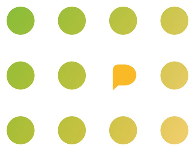
The visual manifestation of this ethos was the useful, simple and graphically-flexible speech bubble. The new brand incorporates the icon subtly into the logo as the blank space within the P letterform. “It was a long road to get there,” Lynch says. “I’ve got presentations upon presentations of iterations of logos.” The speech bubble can also be used on its own, as it will be more and more – chiefly on digital media. It can be deployed in a range of colours – using a palette which Price calls “thoughtful, restrained but upbeat” – and formats.
But the icon was also the basis for a flexible, extensive visual system that encapsulates the conversation aspect of the CIPD brand. The CIPD produces a wide variety of communications across multiple platforms – everything from tweets and newsletters to reports, training courses and guidelines. The visual system thus had to be flexible enough to work for each and yet unify the entire communications output of the CIPD.
Price recounts visual patterns which can be used to portray anything along the scale of ripples in a pond to seismic shifts. The patterns depict polka dots, dashed lines, graphs and blocky shapes. The speech bubble is almost always incorporated into the patterns in some way and the pointing end of the bubble is often used as a pointer device within the pattern, to add emphasis.
Lynch says the versatility of the graphics and colour palette have allowed the CIPD to choose the most effective communications tools to best reach the target audience. The flexibility has been, in the weeks since the brand launch, a bit of a challenge for internal staff, she adds, but only because of the array of options available to communicators. That flexibility though, will become a benefit in the long run as the CIPD’s communications become more tailored and visually enhanced. Price says flexibility and consistency were key, “Have a harmonious group of elements that come from the same place that you use across different media in different ways rather than ‘Here’s the system, it’s really rigid and it works like this everywhere.”
One of the first steps Frank, Bright & Abel took was a redefinition of the brand values – purposeful, agile, collaborative, expert – which, according to Lynch, have been well embedded in the CIPD culture for some time. Price says the values were reinterpreted to align behind the new strapline and corporate strategy, thus ensuring their continuing relevance to the CIPD community. That step acted as a foundation upon which the new tone of voice and brand language could be derived.
A shift in tone of voice was no mean feat for the CIPD as it has communicators both internally and acting on its behalf, representing the organisation – like its training course administrators and branch volunteers. “I’ve had a series of workshops and we’re doing a series of webinars to reach people that aren’t in the office to train them on these communications principles and give them the permission to actually change their tone a little bit,” Lynch says. “To be more conversational, to want to engage with the audience, to think about customers’ needs first in their communications.”
“Have a harmonious group of elements that come from the same place that you use across different media in different ways rather than ‘Here’s the system, it’s really rigid and it works like this everywhere’”
Price says copy style and tone of voice have were key aspects of the rebrand. Frank, Bright & Abel developed tone of voice guidelines using the four brand values and what they mean in context. “What they and we believed in is you can allow people to do their jobs, to have the freedom to bring their personalities to what they write, but also to underpin the principles and the purpose of the organisation and do it in a way that’s consistent. How we write was a really massive part of it,” says Price.
Price and Lynch’s teams focused on the needs of stakeholders throughout the project in order to ensure that all stakeholders understood why changes were being made and how to incorporate the elements of the rebrand into their jobs. Membership organisations can develop strong emotional ties, thus any change is apt to be difficult. “People have been members for their lifetime a lot of the time, so they are very wedded to the old brand. Not everyone will agree what the new brand should look like going forward but I’ve been absolutely delighted reading some of the feedback on our social media channels,” Lynch says.
Price says Frank, Bright & Abel worked hard to understand who the relevant stakeholders were and engage them throughout the rebrand through workshops, research and at events. “It’s about listening at the beginning. It’s about developing something that is incredibly flexible and then that will absolutely hold together. It is about understanding what it means to devise an international brand and understanding some of the whys and wherefores about that,” Price says.
Lynch says the rebrand was done to better align the brand with the organisation’s future and to better represent its members. Ensuring members were informed of those changes and the drivers behind them was important. “Especially with our branch networks,” she says. “They’re all volunteers and they’re very emotionally tied to the organisation. They’re giving up their time for nothing to represent it.”
The brand was also brought to life by members, volunteers and employees themselves as the photographic library accompanying the rebrand is comprised of shots of CIPD community members in their working lives and at CIPD events. The global nature of the organisation was reflected in a style that focuses on the role of the human resources professional in his or her job function. The shoots were carried out at a series of CIPD events held across the UK but attended by international members.
The organisation is constantly changing though. “If you’re going through a rebrand, you’re working with an organisation that’s going through change,” Price says. “That means you’re working with a moving target and that was certainly the case with CIPD.” The rebrand had to acknowledge that change and better prepare the CIPD to adapt and change in the future. One of the most prevalent aspects of that change has been a focus on digital.
The CIPD has active social media feeds – over 61,000 people follow the organisation on Twitter and over 52,000 on LinkedIn.
Lynch says the comms focus of the CIPD is shifting more toward digital. The brand, she says, had to work well in traditional forms of communications, but also on digital and social media. Because of its experience in community forums and on social channels, the CIPD’s overall tone of voice on social media was fairly well defined. It was, as Lynch says, a matter of aligning the look and feel of the visual identity to that persona. The website and content production aspects of digital communications are going to be areas of focus in coming years.
Price says the brand was tested and retested on digital platforms to ensure its usability and functionality online. Even things as seemingly small as ensuring that a Twitter avatar is legible and recognisable was considered. “CIPD are going through a huge amount of effort at the moment to become a digital- first organisation,” Price says. That focus will only grow in future.
For now, though, the brand has been launched and lauded, received well on the whole by stakeholders and is beginning to be rolled out across digital media. Lynch however looks to the future, “The only measure is ‘What did it do to recognition and recall and how engaged people are with the brand?’ We’ll see that in a year’s time when everything is consistent in the marketplace.”

Peer review
Jon Towell, creative partner, Luminous
Rebranding a professional body such as the CIPD has many challenges, and one of the keys is to avoid the potential compromises that can often seem natural reactions to the conflicting demands of internal stakeholders.
A brand such as this requires a freshness and immediacy to stand out, but also needs to be conscious of the needs of the audience. On the whole, I think Frank Bright & Abel have met this challenge well.
Like all effective brands, the idea seems to have been built around the core proposition – and this link between positioning and visual devices provides a nicely coherent experience.
The use of the speech bubble is obviously not original, but here it is relevant to the concept of having a voice and promoting debate.
I think the key to long-term success is whether the flexibility of the brand device is leveraged by those implementing it. I imagine the rebrand will have to work across a number of touch points and divergent geographies, so keeping it fresh on an ongoing basis will be the main challenge.
At first view, the large number of ways for the basic elements to come together should provide ample opportunity to make this work well over time. There is a nice subtlety of execution in the logo and the graphic patterns, and clearly the potential range of executions has been well thought through at this stage.

