Spotlight on Avianca

Latin American flag-bearers Avianca and Taca merged, prompting a need to redefine brand strategy. Emily Andrews takes to the skies with the airlines
Take one large, Colombian airline, and offerings of the two companies beforehand, and the
one popular, Central American airline, merge them together, and you get a whole lot of branding challenges and opportunities. This was the state
of the newly merged Avianca and Taca airline in 2010, at the beginning of its branding journey, when its management team approached the Lippincott brand strategy firm. There had been little overlap between the
two separate brand identities needed to be united under one cohesive new strategy.
Lippincott had worked on the rebrand of Taca some years previously, and came to the project through close ties with the newly merged brand’s senior management. Steve Lawrence, a senior partner at Lippincott, says, “We had a relationship with Taca that was very strong, so it was a natural thing for the merge management team to ask us for our thoughts on how to approach the corporate identity and brand identity opportunities that they faced as they brought the two companies together.”
There are several challenges to consider with this kind of rebrand, and Lippincott began the three-year process by carrying out extensive research. The first step of the research process was identifying who the airline’s target audience would be. This was soon identified as the ‘Latino moderno,’ the modern Latin American customer, a group that symbolised a set of values and ideals and became a key theme for the entire branding process. Lawrence defined this group as, “The young, vibrant, incredibly alive, Latin personality that this airline needed to connect with.” In this way, national pride became integral to the new airline brand from the beginning.
Once the group was identified, it was crucial to find out exactly who they were, and what they wanted. Lippincott carried out a series of one-on-one interviews throughout Central America and South America, from Chile to El Salvador and Colombia, specifically with this target modern Latin customer in mind. They tried to find out what would make a truly world-class brand in the eyes of this group so they could ensure the new brand embodied all of those qualities.
It was this seed of truth that the new airline brand grew out of. It had to epitomise that Latin American vibrancy, while remaining worldly and thus relevant to an international audience. The brand needed to take on the personal qualities of its modern Latin audience. Abbott continued, “We had to do that initial research to really start to understand who it was that we were really talking to, and who we were building the business for. That then led to the customer definition and further research.”
One decision that had to be made fairly early on in the research stage was choosing the name of the newly formed company. While the possibility of using both names was considered, Lawrence explained, “We thought about the two-brand scenario, maintaining each brand in their respective markets, but when you think through the economics of that all the way, it becomes a burden to manage two brands, and prevents you from getting to the place where the vision of the combined airline could go.” When it came down to choosing just one of the merged airline’s names to keep, Avianca seemed like a natural choice because it was both a larger and a better known company than Taca airlines. As a Colombian flag carrier, Avianca also had that strong Latin American heritage
that Taca was missing as more of a pan-American entity. Avianca’s heritage was better suited to Lippincott’s vision of a modern Latin airline. Finally, the positive perceptions of the Avianca brand that became clear during research, tipped the scales firmly in Avianca’s favour. Thus the new combined airline was named Avianca, but the new Avianca had to evolve, retaining some of the previous airline’s positive associations, but growing to meet the needs of its new expanding market.
While the Colombian heritage of the original Avianca airline remained important, the new Avianca needed to be less nationally specific, and more regionally representative. It had to represent modern Latin; still essentially Latin American, but with the worldliness and energy of the modern Latin consumer. As an example Abbott explained that, throughout the design, Lippincott were careful not to reinforce the specifically Columbian aspects of the original Avianca brand, such as the Colombian flag colours in the aircraft livery. However, there were elements of the Avianca heritage that transferred over to the new Avianca. Lawrence says, “Avianca has flown to other parts of the region for many years, so it’s not a Colombia-only image, but it’s a from-Colombia image, that also brings with it a sense of growth and change because the region is growing and changing. Heritage of strength, growth, and leadership were aspects that we wanted to retain.” For this reason it was important that the new Avianca brand not change beyond recognition.
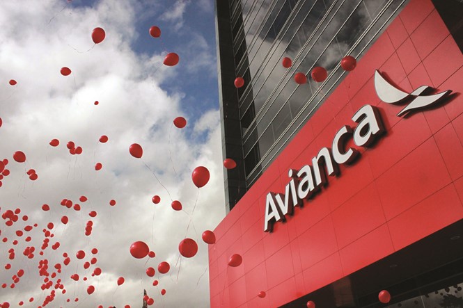
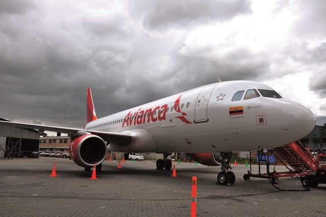
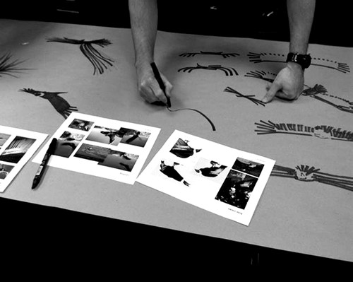
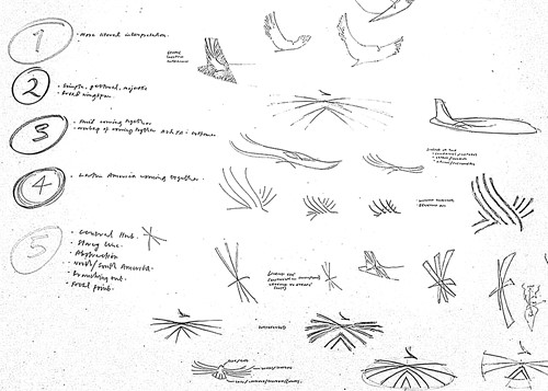
The new Avianca design is simple, clean and modern. It takes ownership of the colour red, minimising the other flag-derived colours in the original brand thus making the airline more universal, yet still essentially Latin American. Whereas before the condor symbol in the Avianca wordmark had become abstract and minimal, the new symbol is more identifiably a condor, a symbol that is popular and well-recognised across Latin America. Also within the logo is an abstraction of linking the Americas, a shape that follows a loose form linked from Northern America, to Central and South America. The entire design reflects the regional roots of the new brand, while combining modern design elements.
“Avianca has flown to other parts of the region for many years, so it’s not a Colombia-only image, but it’s a from-Colombia image, that also brings with it a sense of growth and change because the region is growing and changing. Heritage of strength, growth, and leadership were aspects that we wanted to retain”
Once the new brand had been formulated its implementation bought about a whole new set of challenges. Predominantly, the challenge faced by all new brands that are products of mergers: winning over the internal stakeholders. As Lawrence says, the formation of one company out of two is always a delicate matter, “Corporate identity becomes hugely important in helping the company bring itself together. It becomes the vehicle for the leadership team to express itself about what they see as the challenges and opportunities and vision and direction to be – information that everybody needs to know.”
A well thought out and consistent brand strategy is critical, but equally as important is the way that it is implemented among its stakeholders. The research that Avianca carried out extended to its non-consumer stakeholders, including employees of both Taca and the original Avianca brand. It was important to gauge what their expectations for the new brand were, and to understand the company cultures that they came from. In the same way that consistency across all brand touch points is essential for implementation among consumers, it was essential to ensure that employees of the new Avianca brand came to fully understand, trust, and feel a part of, the new brand through a complete implementation process.
Lawrence describes the way in which the new Avianca brand was implemented among staff members as, “A very thorough downward communication programme punctuated by events and management sessions
where the people who, in an airline are scattered far and wide, could have the opportunity to interact with the management team frequently.” He stresses that no strategy can gain people’s support overnight, but that an ongoing process will eventually solidify feelings of commitment; something he feels Avianca performed well.
The large scale brand implementation brought a whole new set of challenges to GLIMMA, the brand implementation specialists responsible for Avianca’s physical assets on the ground. One issue was the multinational reach of the new brand, and the communication issues that came with that. The new Avianca was implemented in Spanish, Portuguese and English-speaking countries, meaning that signposting had to be multilingual. There were also the airport regulations to deal with, a factor that slows down the implementation of any airline branding project as airports have security rules and regulations that differ from one country to another.
Tom Hill, VP of US sales and business development at GLIMMA says, “In the U.S., with the Transportation Security Administration, it’s a 24 hour clearance period. When we get down into Latin America and Central America, the clearance period could be three to five days for individual crew. They’re submitting their documentation, they’re submitting their information and frankly they were independent of Avianca, so Avianca and GLIMMA had to conform to the independent security company rules.”
The multinational and inherently Latin nature of the brand may have caused technical issues at the implementation stage but it is integral to what the new
Avianca brand represents; the modernity and Latin spirit of its consumer.
Since the official brand launch in spring 2013 Avianca reported a record 9.7% jump in passenger demand over the first two months of the year. Today Avianca serves nearly 18m passengers and reaches more than 100 destinations in Latin America, North America and Europe. The modern Latin target audience and the attractive brand qualities that stem from this association should stand the new pan-Latin American airline in good stead for the global expansion to which it aspires.
Peer review
Marcelo Bicudo, co-founder, Epigram part of Brand Union
It seems natural and fundamental that today Avianca is the fruit of a combination of different brands and cultures. It needs and wants to become international, to unify its graphic signal and identity system, as well as the brand’s essence and culture.
However, wisely translating essence into appearance and positioning in design is not an easy task, especially when building the image of a company for different countries, languages and cultures. In this sense, the major challenge for designers and strategists is to guarantee translation of a brand using design that is as faithful to intentions as possible, guaranteeing that the analytical complexity is transformed into a graphic synthesis capable of dissolving borders. While at the same time it needs to create a feeling of belonging for all of the stakeholders of a brand, irrespective of differences.
Therefore, the solution comes about when we turn to the understanding of the fundamental codes that constitute a language, capturing and reverberating patterns, transforming them into a visual identity system that carries the original.
In the redesign of the Avianca brand, the objectives and intention are spot on, due to the real need for integration. Nevertheless, in searching for the utmost synthesis, the brand has been sterilised. In the search for a global language, the original, the origin, is forgotten. Fundamental codes are lost in the intention of what is universal. The regional colors, referencing Colombia, its country of origin, are left behind. The movement and festiveness that marked the original graphic signal has also been left behind. The codes are so universal that they end up mixing with so many others, making it so that the new Avianca brand seems excessively like the new American Airlines brand.

