Crafting an icon
Digital iconography has become the modern form of wayfinding and signage. Icons lead a user through a site, app or digital experience, but only recently have brands begun to customise their iconography and turn them into an intrinsic, ownable part of the brand itself. Emily Andrews reports
The word ‘maps’ used to conjure up images of compasses, keys and grids, but for most people, thinking of a map now, one of the first images to pop into their heads will likely be the Google Maps location pin on a smartphone. The button is a digital icon and one of many modern symbols that are shaping how the public understands visual language.
Digital icons are a symptom of the way contemporary audiences consume content. People want personalised information delivered at speed. The proliferation of mobile devices as a preferred way to access the internet is a crucial aspect of this since they can deliver information instantly and on a one-to-one basis. For brands this creates a unique opportunity for tailored messaging that strengthens brand loyalty. Digital icons are an important consideration for brands who function in this new space, they are most commonly viewed as app buttons or as digital signposting on social media and corporate websites.
While most organisations have made their corporate websites smartphone and tablet-friendly, many still use their original, full-size logos across these sites and across social media channels. Helena Corvin-Swahn, a UK-based freelance communications consultant, says, “Brand strategists have realised that long form, letterform identities are actually not relevant in a digital space.”
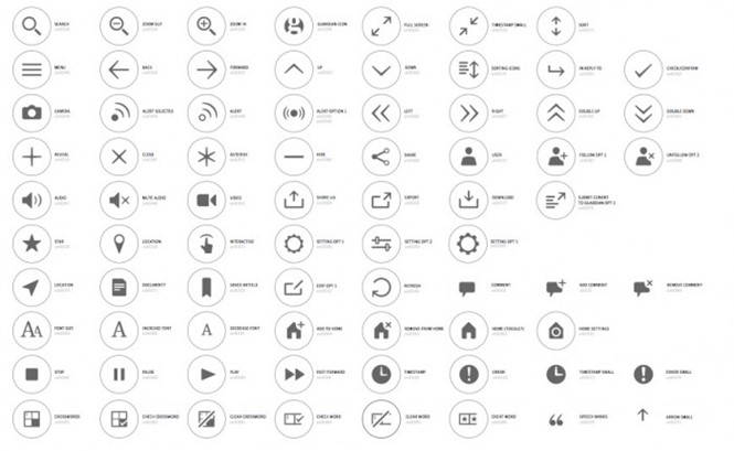
Those that do use icons often have a mismatched set of generic, commissioned icons, which, though functional, do not deliver on brand integrity. In some ways icons are similar to typography in that they are one part of what gives a brand consistency. Their role is to contract a brand’s essence into a small space without losing clarity or meaning.
The icons themselves often borrow from design aspects of the brand, such as typography. Lee Fasciani, creative director of brand at Territory, a creative design studio that worked on the development of digital iconography for British newspaper the Guardian, says, “We work from the brand itself and the assets it already has. Typographic style is often a source of look and feel in terms of shape, colour and style. If there is any other graphic style that the brand owns that will also be included in the research material and incorporated into the overall style of the icon design. This helps cement an ownership of the icons.”
For the Guardian, custom font, Egyptian, was the biggest influencer on the new icon design. The symbols themselves are straightforward in their intention, but it was Territory’s job to style those symbols so that they became ownable for the Guardian. An icon might be a variation of the original logo, or it might be a recognised symbol such as an arrow or magnifying glass whose function is to guide users through a digital space. The familiar symbols should be as recognisably on-brand as the logo itself.
Fasciani says, “For an icon to work very quickly it needs to be simple and understandable. That’s the minimum requirement for quality. You’re also trying to layer some brand style on top of that to make sure that it’s in the same brand family.
as all the other assets. For the ownability factor that’s very important and for the communication factor the simplicity and understandability of it are very important.”
David Carroll, founder of David Carroll & Co, an international branding and design consultancy based in London, has the same priorities. He says, “It is about the simplicity and the clarity. Icons are quite tricky things because you have to boil them down to the essence of what you’re trying to communicate, but they still have to be instantly recognisable.”
Although many companies use generic icons, a shift toward personalised icons is likely. Large corporates and organisations recognise the value of their brands and digital iconography is a growing element of value. Corvin-Swahn says, “Brand consistency today goes into such incredible detail. This is something that brands are having to face up to now. It’s becoming far more important to make sure that your whole identity maintains integrity across every channel and touch point. It’s a huge project.”
Despite the necessary investment involved, more and more established brands are creating bespoke digital icons while modern tech brands, such as Twitter and Snapchat, have used widely-recognised icons from the outset due to their roots in social media and mobile applications. In this context it can be difficult to stand out, Carroll says, “When you’re flicking through all your apps, a lot of them are blue or the same colour, so you need to really get the icon to stand out, which is quite a tricky thing to do in such a small space.” Creating a set of icons is a substantial design challenge, but when done effectively it can deliver a number of benefits.
“For an icon to work very quickly it needs to be simple and understandable. You’re also trying to layer some brand style on top of that to make sure that it’s in the same brand family as all the other assets”
Icons are a unique brand touchpoint in that have the potential to be a universal form of communication; an advantage in the digital space. When brands publish content online they have little control over who sees that content since it is available to everyone. To make the most of that wider audience, icons are often as universally recognisable and culturally inclusive as possible. Corvin-Swahn says, “You now go to a website and the symbols that are used within the iconography; for going forward, backward, for getting more information or for sending an email, are now more or less implicit and understood universally. In that form it’s almost a universal language. It doesn’t matter where you are coming from.”
Icons are therefore a simple way to communicate to an international audience and as more and more icons are created, that collective understanding grows and develops accordingly. iPhone icons, for example, are understood all over the world. They are also intrinsically indicative of the Apple brand. Samsung Galaxy icons share many of the same features, but the minor differences in their design make them instantly recognisable as a product of the Samsung brand.
Icons are also inherently digital and so are removed from traditional, corporate tone of voice. The simple and instant nature of icon communication makes them a modern phenomenon that is less formal than a typical logo. This style of communication is preferred by modern consumers who have become accustomed to the more individualised and personal brand relationships that are largely a consequence of the digital age. Iconography, as a tool that is predominantly used on personal devices, is part of the new emotionally connected brand.
More practically is the icon’s role as a modern form of wayfinding. In much the same way as a road sign, an icon instantly communicates an instruction as instantly and clearly as possible. Icons have to operate on a much smaller scale and must maintain that key brand integrity at the same time. Fasciani says, “Wayfinding has the added function of typography usually because you have different levels of information. Icons are a bit more straightforward than wayfinding. When you’re dealing with very little space you need to be able to communicate those things instantly.”
Crucially, a set of icons is just one aspect of a strong overall brand. For the iconography to be truly in-line with the brand, the foundations must already be in place. Iconography will also feed back into that original brand through user experience and clearer communications creating an improved overall brand interaction.
Corvin-Swahn says, “The thought process for how to convey information is probably more important now than it has been because you’re condensing information into such small formats. There’s a risk that brand owners will just take shortcuts and end up with something that is a poor user experience, rather than go through the intellectual rigour of understanding the importance of clear communication and what that actually means in the balance of text and icons.”
Fasciani adds, “I think a brand of a certain size that has content output on digital devices will have to understand how important iconography is.” Iconography is an important tool for brands communicating with their digital audiences. They deliver a brand in its most condensed form and enable easier access to content that in turn builds brand loyalty and engagement. A symbol’s capacity to communicate multiple levels of meaning can make it a powerful method of communication.

