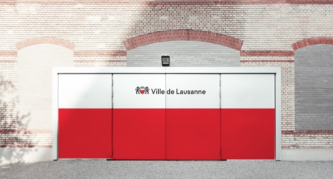
Brand in action: City of Lausanne
Who: City of Lausanne and Base Design
What: The Swiss city of Lausanne sits about 40 minutes from Geneva, on the shores of Lac Léman. Its contribution to science, design and culture date back to its founding as the Roman city of Lousonnensium. But, the city had lost its identity. “The key was to always focus on the overall objective: engaging all of the City’s disparate audiences. We made a point of putting the people first, starting with the city employees who would serve as ambassadors to introduce the project to the citizens,” says Anthony Franklin, design director & partner at Base Design Geneva says.
How: Distilling the essence of a place into a single brand is never an easy task, and it’s one Base didn’t attempt to take on. “The marque doesn’t attempt to communicate the city’s essence, but instead offer a feeling towards it,” Franklin says. The way in which that was done involved the representation of Lausanne through a combination if its mediaeval heraldry and modern graphic design. The reintegration of a lion as Lausanne’s icon, and the development of a typeface called ‘Lausanne’ speak to the city’s heritage and help lend the place brand an air of authority.
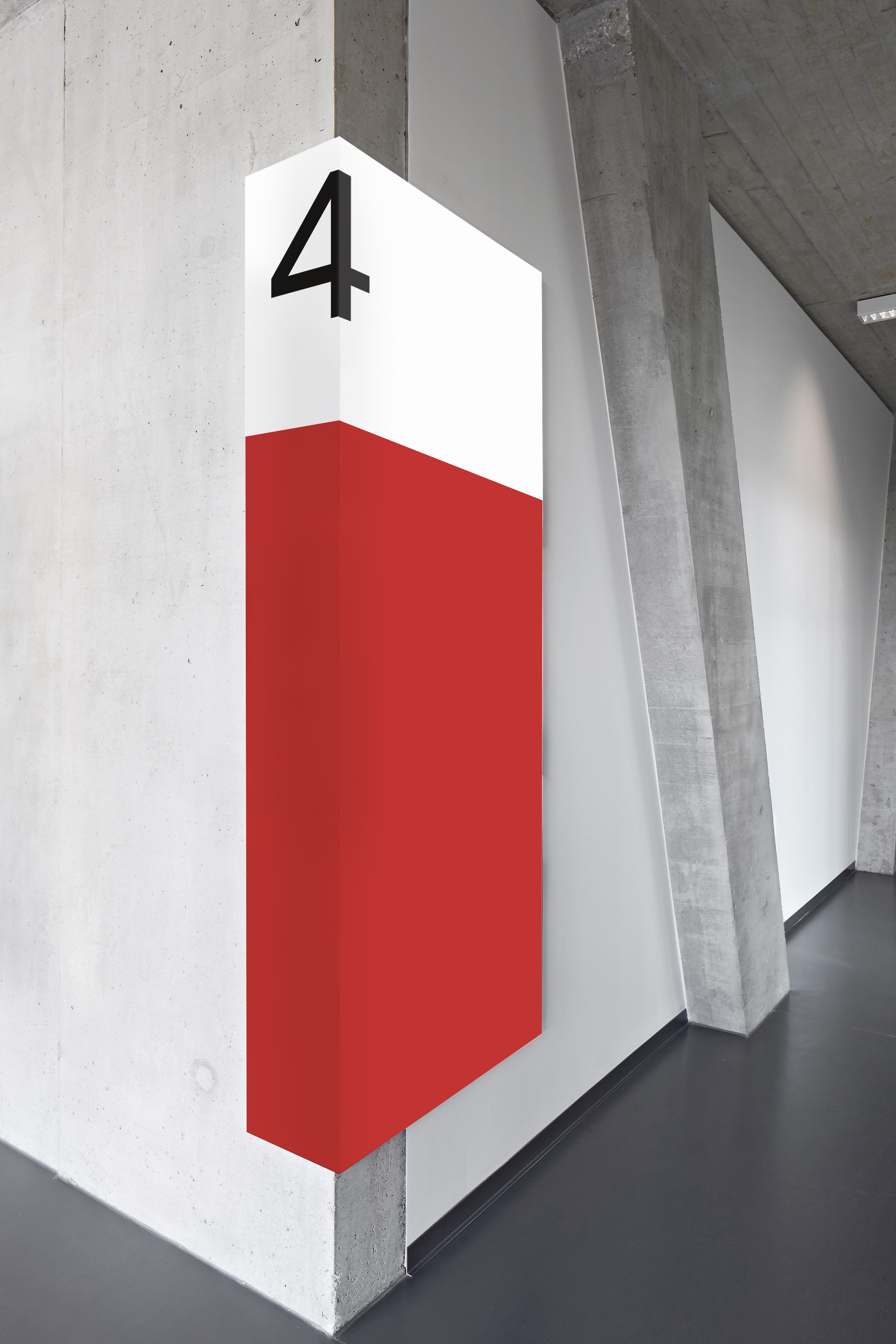
The brand was them put into action across the city, from wayfinding and signage to event promotion to city services and public transportation.
Why: “In recent years, various logos had been developed by the many services of the city to the detriment of a common identity. A 2016 study even revealed that citizens did not identify the city of Lausanne behind the many services it offered them. The new identity conveys a message of seriousness and righteousness. Our branding gives the message of a strong city that values its image, with a timeless symbol that is highly recognisable and adapted to its mission,” Franklin says.