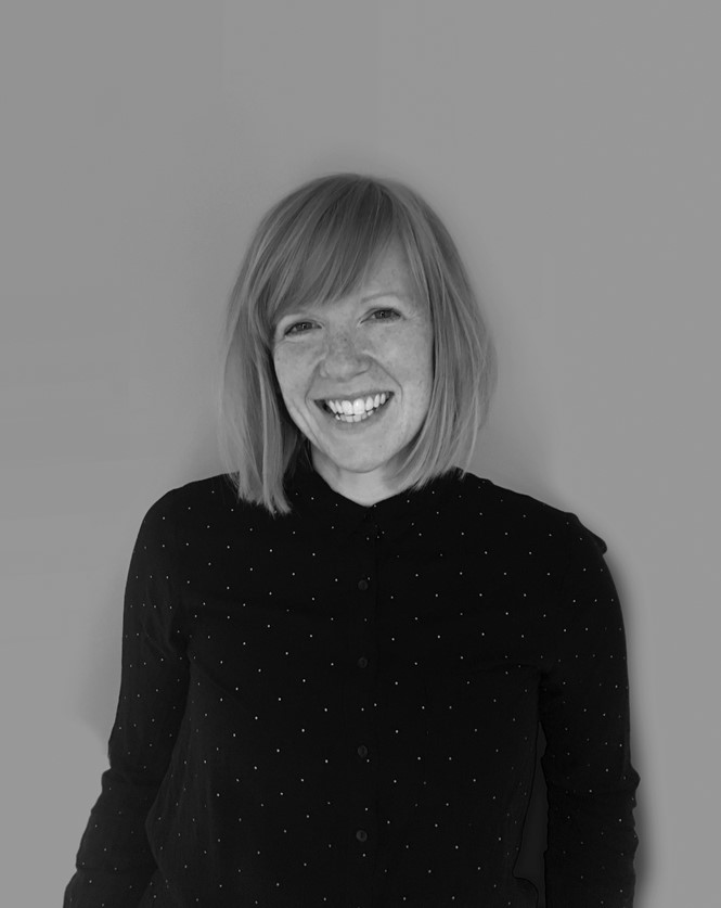
Five minutes with Gale Foster

The Southbank Centre is an acclaimed, multi-venue arts centre in London, with a festivals programme that spreads across the year, a diverse audience and an inclusive brand philosophy. Gale Foster, head of design and brand at the Southbank Centre, talks about the challenges of branding a diverse organisation and the importance of simplicity and visual cut-through
Why did you rebrand a year ago?
We were in desperate need of a rebrand. The brand identity Wolff Olins designed 12 years ago had become tired; it had become confused. We were struggling to be both the parent and the owner of a hugely diverse range of programming, events and genre of work we were putting on for the general public. It wasn’t so much about a change in strategy or a change in direction, it was just a moment to take back ownership of the whole organisation. For us, it really was about the logo. We had an existing identity from so long ago that had been changed so many times, it had become too minimalised and everyone was bored of it. It was time for a fresh start.
What were the objectives of the rebrand?
Ownership, cohesion across everything and a much more invigorated level of brand expression. Becoming the owner of lot of different buildings, types of communication, types of artforms and bringing it all together under one roof again, allowing us to be visible among all those things. We work with a lot of partners, we often programme events and festivals that are quite complicated ideas, often difficult to communicate and our branding was getting lost under all that.
Now, more than a year later, do you think the rebrand was successful?
Yes, definitely. We are very pleased with it. Now, having seen it in action and fruition for a year, we can see how something so strong but also so simple has allowed us to be flexible, while keeping a certain amount of control over everything. The brand is a simple combination of a strong serif font and a strong colour. That’s as far as we’ve talking it, we don’t have any brand guidelines. Just having these two core elements across everything, it’s amazing how far that can take you and how that allows the designers to do what they need to do for varying messages, while keeping everything nice and consistent. It is also invigorating to see how the organisation feels about our brand and our design. It has given us the opportunity to look back, think about what we’re doing and think about how we’re presenting ourselves, which I think people forget along the way when they try to work with complicated programmes and complicated messages. The brand consultant we worked with, North, was amazing and taught me a lot about cutting through all the layers of complexity and focusing on what the audience is seeing, what they’re understanding and what is the simplest layer of communication to go with.
How have you approached the shift towards digital?
We’ve had a strategy of being digital first for about three years now. We went through a swift process of cutting back on our printed materials and making sure that we are talking to our audiences across every digital platform we can. In all our marketing campaigns, we will always use digital first. We’ve got a great digital team, who are working hard across our organic social media to push out content and to think about what our audiences want to engage with and how we can grow our organic following. We try and channel the right communications to the right people, in a way the want to see us or where they want to see us. We will always print certain things, but whenever we can,
we encourage our audience to visit our website and join our mailing lists. We work hard to understand what people are looking at, what they are clicking through to, and work with that.
What are the biggest challenges you face in your job?
My biggest challenge is definitely time. We’re Europe’s largest art centre, we do over 5.000 events each year and we reach out to over 6.9 million people. Therefore, the biggest challenge is to make sure that I see all the visual communications and make sure that we are happy that they’re saying what we need them to say, that they are said in a way that visually means that they look like they’re owned by us and that the message is coming from Southbank Centre.


