On the line: the new London overground identity
London’s public transit system has just created six new lines on its already extensive public transit system. Andrew Thomas explains how history, diversity and storytelling were utilised in the naming process.
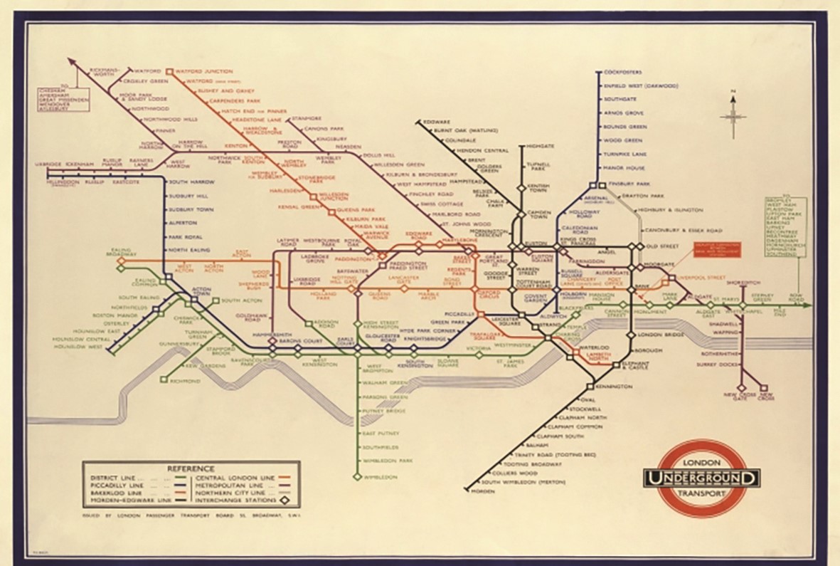
Britain’s London Underground is the oldest rapid transit system and the second largest in the world. It is the beating heart that serves the body of London, its lines are the transport arteries delivering up to five million passenger journeys a day. Everyone who lives in London or visits London will use the Underground, if not for travel then as a landmark, a directional aid or just a way of making sense of the capital’s sprawling metropolis. The London Underground defines London and Londoners in a unique way.
In 2007, when the former Silverlink Metro line was taken over by Transport for London (TfL), London Underground’s owner, they launched the Overground brand, and added it to the Underground map. Over the next five years those 27 stations were joined by the addition of the East London line, the North London line and the creation of other lines serving large areas of London hitherto under-represented by the transport system, creating a network of 113 stations all served by the Overground and all identified with an orange roundel.
Londoners didn’t take to the name. The Overground had often been used unofficially as a way of describing trains that were outside of London, or that would take people away from London. The new name seemed to distance itself from the capital, rather than be part of it. From the start, Londoners created their own nickname for the new services - the Ginger Line.
This wasn’t the first time Londoners had adopted their own name for an Underground line. Before the Baker Street and Waterloo Railway Line had even opened in 1906, the London Evening Standard newspaper had coined its own name for it, the portmanteau, Baker-Loo Line. There was disapproval amongst railways aficionados, with the Railway Magazine calling it a ‘gutter title’, suggesting that the owners should “have more dignity” than to adopt the nickname. But it was popular with the public and within a few months of opening the name was officially changed to the Bakerloo Line.
Public sentiment wasn’t the only problem for TfL. Although the Overground had a single name, its size and the number of stations meant that it didn’t feel like a single line. In fact, many parts of the line weren’t connected at all. This meant confusion for passengers – did a closure on the Overground affect their part of the Overground or elsewhere in a completely different part of London? It was clear that changes had to be made.
Dividing lines
TfL decided to split the Overground into six separate lines, each with its own separate identity and put out to tender the contract for the naming process. DNCO, a London-based creative agency, won the pitch.
One of DNCO’s areas of expertise is place branding. They had previously worked closely with the London Borough of Newham on brand exercises for a major regeneration project in the Royal Docks. Then when the Mayor of London’s office moved to the Royal Docks in 2022, DNCO was asked to name the street where the new City Hall would sit.
DNCO already knew the area, the communities and the stakeholders. Simon Yewdall, DNCO’s strategy director, felt it was important for the name to reflect the history. “We wanted to create a name for London but also a name that was rooted in that particular area,” he says. “We ran lots of workshops with the local people and we uncovered the fantastic, forgotten story of Kamal Chunchie"
In 1926, Kamal Chunchie founded ‘The Coloured Men’s Institute’, to help the ethnic-minority sailors and their families whose lives were blighted by discrimination and poverty.
The Institute he founded once stood right next to the new City Hall, but neither the institute nor the man were recognised. As Yewdall adds, “By uncovering that story we now had the name – Kamal Chunchie Way.”
Heritage matters to Londoners
DNCO carried this local storytelling approach with them when they started to work on the new London Underground lines. The heritage of the London Underground at least provided a template. Most city transit systems are based on four very basic, simplistic systems. Some, like Doha’s metro, use the colours from their map: the Green Line, the Red Line and the Gold Line. Others use numbers (Seoul) or letters (New York). A fourth system is geographical; Tokyo metro names its lines after districts: the Ginza Line, the Hibiya Line, the Chiyoda line. London is almost unique in that its names celebrate a variety of people, places, directions, even anniversaries.
Names, not colours, numbers or letters had to be the way forward. As Yewdall says, “The London Underground has named lines, and Londoners attribute personality to those different lines. We have a relationship with a name in a way we never can with a number or a letter.”
The existing naming convention wasn’t the only guiding factor for DNCO. Part of their brief was influenced by the Commission for Diversity in the Public Realm, a body set up by the Mayor’s office in 2020 to ensure a greater diversity in London's street names, monuments, public sculptures and artworks.
“This was a huge opportunity to fulfil this mandate, to redress the fact that the diversity of London wasn’t being recognised or celebrated. Public infrastructure is in the public realm and a massive part of our relationship with our city,” says Yewdell.
DNCO’s approach was similar to their work with the Mayor’s office; speaking with passengers, communities and historians. From this research they produced a longlist. “The themes we identified were really exciting,” says Yewdell.
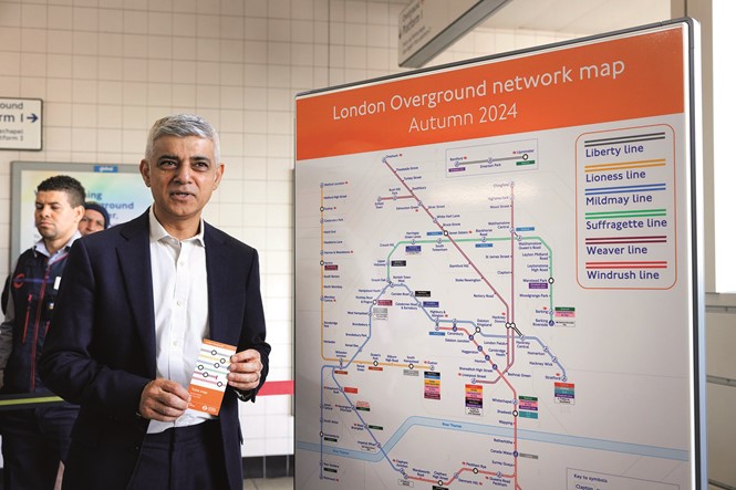
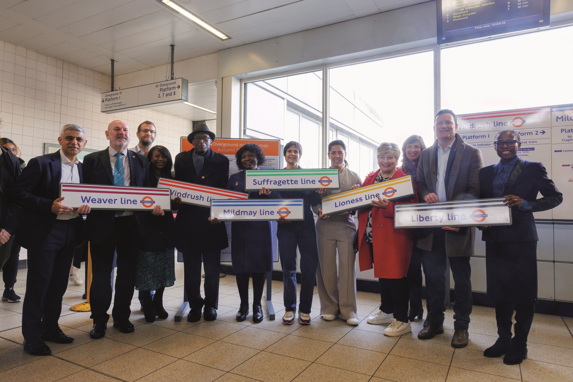
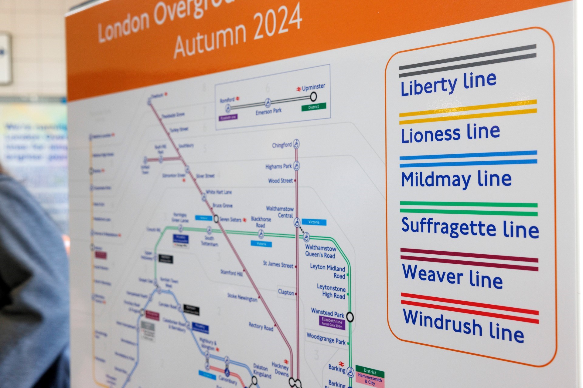
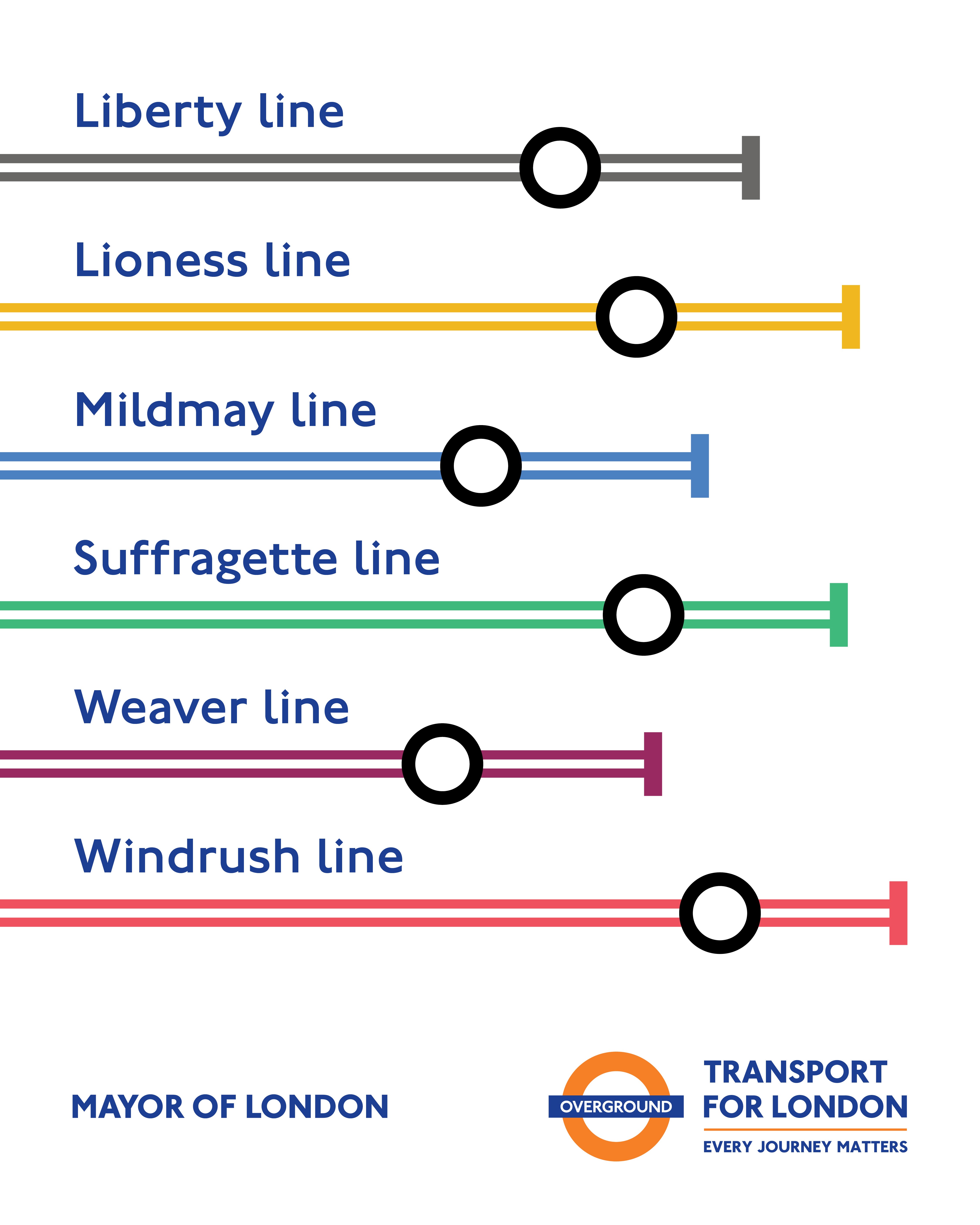
This longlist was sent to the Mayor’s office and the final six names were chosen: the Lioness line, the Mildmay line, the Windrush line, the Weaver line, the Suffragette line and the Liberty line. The new lines all had their unique, London-based stories.
Designing for a metropolis
With the names now in place, TfL needed to incorporate it into their design systems. As Jon Hunter, head of design for TfL points out, “This was a massive project and its impact on London in terms of its mapping, in terms of its navigation is absolutely huge.”
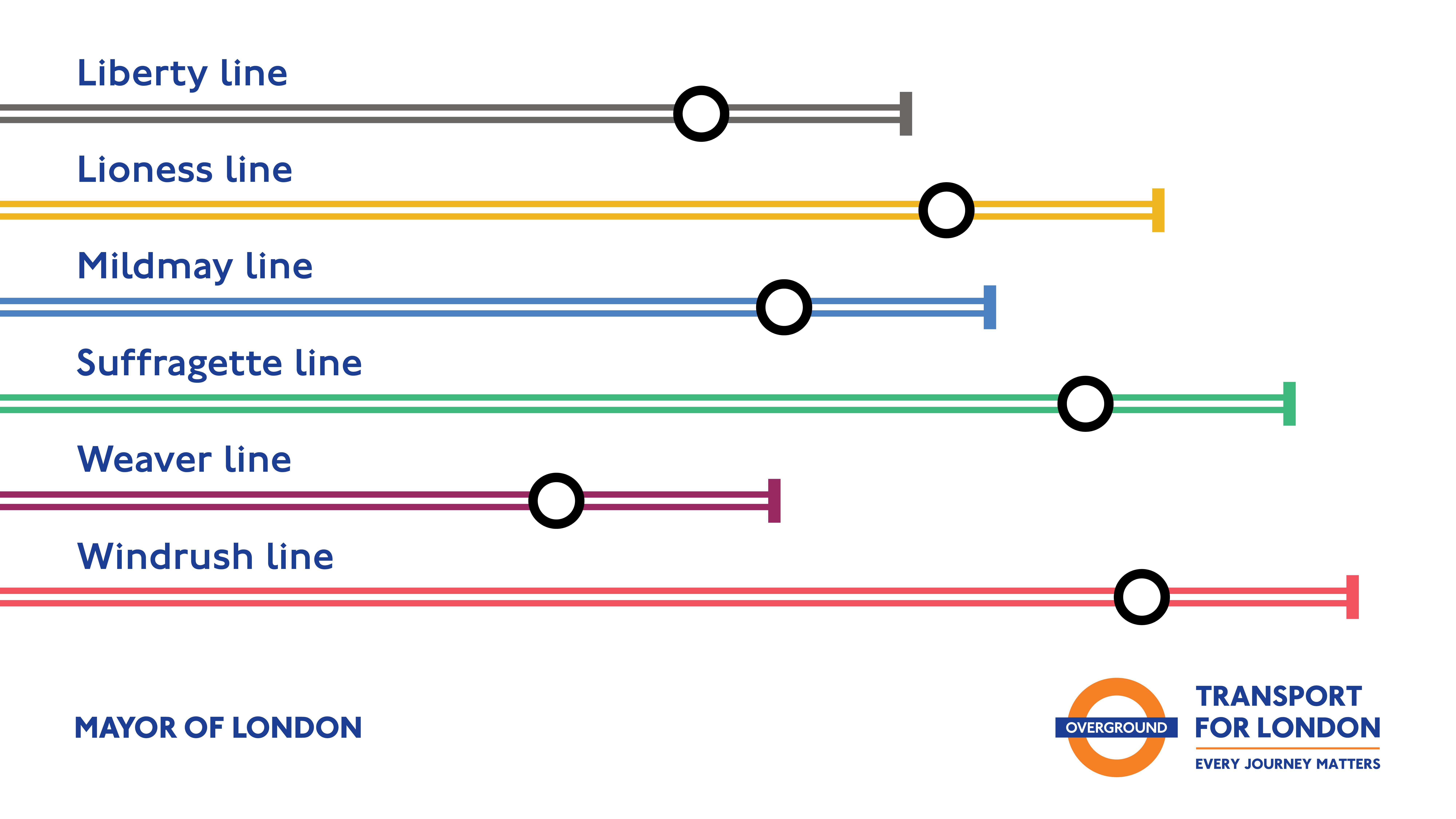
There were 11 existing lines but with other services such as Tramline and the London Cable Car, the London Underground map used 18 different colours. “We have definitely circled the entire colour wheel. It was quite complex to get six lines with enough colour difference, enough tonal difference and to get them as equally spaced around the colour wheel as possible.”
Although the colour subtlety brought challenges to achieving differentiation of the lines, TfL’s solution was to use a parallel line solution to the new additions. Maps and wayfinding systems need to do their job very quickly, according to Peter Krikhaar, managing director for the MENA region for Endpoint, a wayfinding and built environment agency. “Metro systems are all about crowd management. Time is always of the essence in these environments. That's why wayfinding functionality is so important. Passengers need to get the information quickly.”
TfL tested a number of differentiations. Hunter says, “We tried dotted lines, thick lines, thin lines, all sorts of graphical ways. We ran focus groups with accessibility groups. And it all resonated to using the parallel lines that we were currently using on the Overground.”
The next challenge for TfL will be the implementation. TfL has said that full roll out is expected to be completed in one go by the end of the year. This almost overnight approach to implementation is important. Endpoint’s Krikhaar has worked with a number of rapid city transit systems, such as Dubai Tram, the Doha Metro and the forthcoming Etihad rail project and knows how important it is to get it done quickly. “If you think about the way a transport system works, you can’t implement change over a period of time,” he says. “If you change a station name you have to change it everywhere it appears instantly. Or you have passengers getting lost”
Hunter is aware of these issues. He adds, “The potential cognitive disconnect by only doing a couple of stations a week is a big problem. We really do need this Big Bang moment for the reveal.”
The ‘reveal’ and the implementation will all happen in 2024. The new names haven’t been universally popular, but history has shown us that few new naming systems are, as we saw with the Bakerloo line. As DNCO’s Yewdall comments, “This project highlights the sense of history and legacy we give to the London Underground, but it also recognises that London is a different kind of city, an exciting city, a creative city, a city that embraces a unique sense of identity.”

The iconic London Underground map
The first maps of the London Underground appeared in 1908. For the previous 45 years, posters and wayfinding systems showed only the separate lines, but with the launch of the networked Underground brand, passengers were given the opportunity to see a joined-up transport system, overlaid on a street map of London. It wasn’t a pretty sight. Messy and confusing, it was no surprise that as the system grew over the next 20 years many iterations were produced. The underlying streets got fainter but as more stations were added, the map itself, still constrained by the geography of the capital, got denser.
In 1931 an unemployed draughtsman called Harry Beck designed a new map for the London Underground. He did away with the concept of geography and produced a schematic design based on the stations rather than on the city. He sent it in to the Underground’s press office – but it was rejected. Not only was it was felt to be too radical but there was ambivalence towards Beck. He was a draughtsman, a technician – not from the Design and Industries Association, the members of which Frank Pick, the London Transport Passenger Board’s CEO, had always turned to for design ideas. Undeterred Beck made some minor modifications. “It seemed like that was the end of it,” said Beck, “But I did not lose hope and the following year I decided to have one more try.”
It was accepted, trialled and almost instantly became one of the most iconic pieces of British design, its concept adopted by other rapid transit systems around the world. More a diagram than a map, the design has been celebrated on t-shirts, mugs and even British stamps.
Maps of meaning
The Lioness line
Celebrating the England women’s football squad, winners of the 2022 UEFA women’s Championship and runners-up in the 2023 FIFA Women’s World Cup
The Mildmay line
Honouring the Mildmay hospital for its groundbreaking work in the field of HIV and AIDS
The Windrush line
Her Majesty’s Transport ship Windrush became a symbol of the generation of Commonwealth citizens who came to live in Britain in the ‘50s and ‘60s
The Weaver line
Commemorating 700 years of immigrants – Flemish, Jewish, Asian and others – that made a name for Britain’s textiles and garment industry
The Suffragette line
Recognising the women’s suffragette movement, with the line finishing in Barking, home of Annie Huggett, the UK’s longest surviving suffragist.
The Liberty line
This line finishes in the London Borough of Havering, one of the original chartered Liberty manors, which gave residents its own judicial governance and a freedom from taxation
This article was taken from Transform magazine Q1, 2024. You can subscribe to the print edition here.