#TransformTuesday: 24 January
Every week, Transform examines recent rebrands and updated visual identities. This week's selections are below. For more from #TransformTuesday, follow @Transformsays.
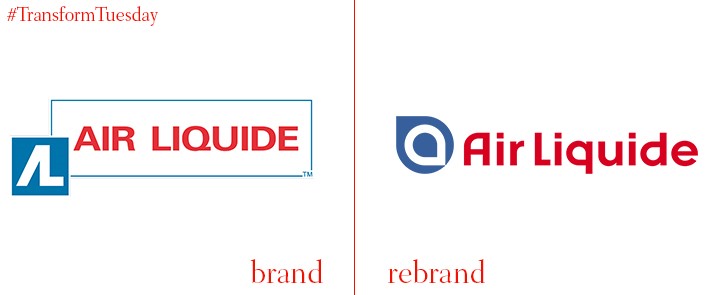
Air Liquide
French multinational company, Air Liquide, employes 68,000 workers and has an international base of around 3m customers. A recent update to its visual identity marks a new era in the company’s 115-year history. In a change prompted by the organisation’s acquisition of US-owned company, Airgas, and the launch of Air Liquide’s customer-centric NEOS Company Program, Air Liquide has modernised the logo held since 1991 – this itself was an update from the original 1972 iteration. Its new icon is described by Air Liquide as an ‘alpha’, which represents the company’s innovative future and forward-thinking business direction.
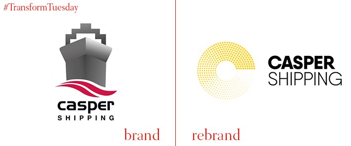
Casper Shipping
With almost 150 years of experience in the shipping sector, Casper Shipping is the UK’s leading independent port agency company. To create a more cohesive environment for its employees and develop a modern aesthetic worthy of its historic identity, Casper Shipping enlisted Middlesbrough, UK-based branding agency, Better. By developing a logotype with modern imagery and a less generic image, Better ensured Casper Shipping’s identity reflects the esteem with which the company is held. In a statement, Casper Shipping says, “Our new identity not only recognises our heritage but more importantly reflects the Casper Shipping group of companies with four new brands being launched: Casper Port Agency, Casper Logistics, Casper Chartering and Casper Customs. The new logo will be common to all of brands reflected by different colours.”
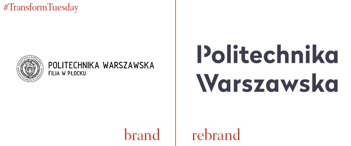
Warsaw University of Technology
Warsaw University of Technology (or Politechnika Warszawska in Polish), one of Poland’s leading technological institutions, has updated its seal, visual identity and suite of marketing materials. Warsaw-based design studio Podpunkt took charge of the rebrand, which is futuristic and creative yet retains the elegance of the university’s initial identity. Based on a typeface aesthetic, the new university logo is flexible and applicable across all university departments – one of the most difficult reconciliations with higher education rebranding. The Warsaw University of Technology seal, an elaborate design, is simplified by Podpunkt although retains the university name in both Polish and English around its exterior.
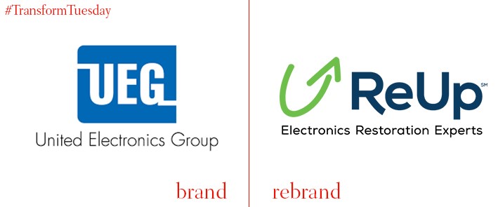
ReUp
The Chicago-based B2B electronic repair operation, previously known as United Electronics Group, has changed in visual and brand identity, as well as undergone name change to better reflect what the group provides. Henceforth known as ReUp, the brand change was implemented by Chicago-based marketing communications agency, Dixon James. The update to ReUp includes a new company position, with Dixon James branding the group as the ‘Electronics restoration experts.’ Its tagline, ‘Where devices go to live,’ is a continuation of the original company offering as a place offering high-quality device repair at reasonable cost for business.
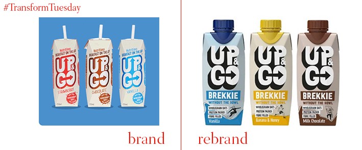
Up&Go
In a retail climate where traditional breakfast food struggles to compete with healthy food choices, companies require inventiveness with their product offering. Up&Go is an example of speed meeting innovation. Its product is breakfast on the go, available in cartons in a variety of drinkable flavours. Its visual identity and packaging has recently been updated by UK-based creative design agency, Otherway, as well as the agency implementing a wider marketing and advertising campaign for Up&Go. The refreshed Up&Go bottles feature characters ‘on the move’, all different according to flavour and reinforcing the energy which informs the product offering. Carton illustrations completed by Biff Creative.
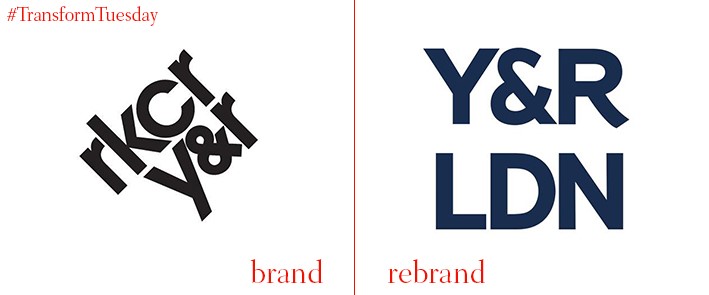
Y&R
Integrated service delivery agency, Y&R, was previously known as RKCR/Y&R. The agency has changed its name and refreshed its visual identity in a brand refresh which takes immediate effect. The Y&R network has experienced a mixed couple of years, but recent big client wins and a new management team signals the beginning of a more positive era. The wins, which include the Premier League and Chanel, indicate the agency moving towards a more international outreach – something reflected in its rebrand. Jon Sharpe, CEO of Y&R London, says, “In the UK, we are increasingly a hub for pan-European and global relationships. Becoming Y&R London is the natural response to this demand and will allow our clients, people and partners to take full advantage of the Y&R network.”


