#TransformTuesday: 11 April
Every week, Transform examines recent rebrands and updated visual identities. This week's picks are below. For more from #TransformTuesday, follow @Transformsays
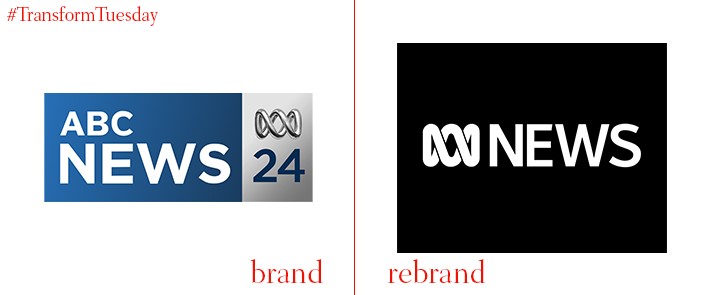
ABC
ABC is a leading Australian brand for multichannel news, events, current affairs, and entertainment television and radio. To streamline its brand architecture and unify its brand portfolio, ABC has redesigned its logo and brought all affiliated channels under the same identity. The ABC News 24 branding, currently blue, is replaced with a distinctive black and white design. The channel has also streamlined its social media channel offering, forgoing multiple Twitter channels to encourage followers to interact with a main ABC new outlet. It has also created a new colour code system to indicate to its audience the nature of the current broadcast, for example red denotes breaking news.
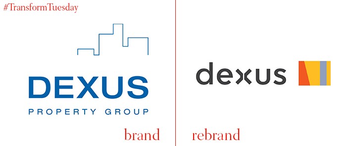
Dexus
Australia-based Dexus is a real estate investment trust which invests in office buildings and residential property. Although the Dexus brand is well-regarded across Australia, its visual commercial brand required a new visual identity to bring it into the modern era of property investment. Australia-based brand designer and agency, Hulsbosch, has designed a flexible new identity for Dexus to reflect its dynamic approach to property investment. Jaid Hulsbosch, director at Hulsbosch, says, “Our creative idea had to crossover location borders, ensure adaptability across office, industrial and retail properties, as well as visually bring something different to the business. The rebrand is ambitious, innovative and reflective of a time of transformation for Dexus.”
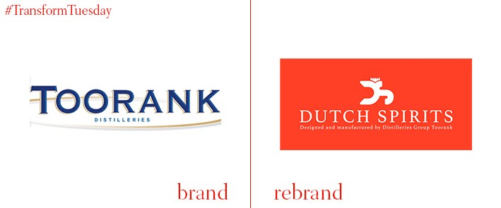
Dutch Spirits
With its new identity based on the expert manufacturing process behind each product, Dutch distilling company previously known as Toorank has rebranded its corporate identity to Dutch Spirits. Dutch Spirits hope the name change and visual update will cement its place as a global leader of drink innovation. While already trading in 50 markets outside of the Netherlands, the rebrand coincides with Dutch Spirits’ plans to expand the business even further. Andy Mallows, managing director at Dutch Spirits, says, “We want to become the biggest Dutch distilling group and felt we needed a strong identity to achieve this. We wanted an identity that reflected our Dutch heritage, as well as the passion and identity of our workforce, hence Dutch Spirits.”
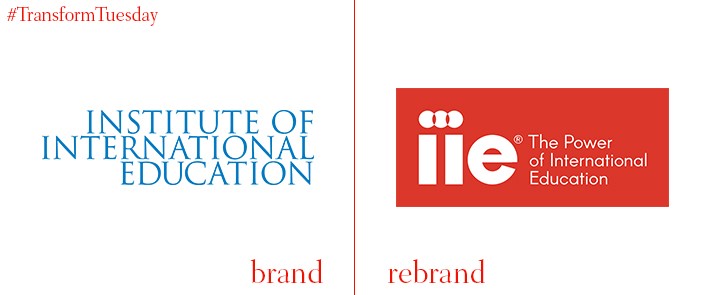
Institute of International Education
Based in New York, the Institute of International Education (IIE) is a private, non-profit organisation offering study courses to academics at every level. It also operates as a research and support body. Given the variety of stakeholders involved with the IIE, the organisation needed to clarify its visual identity to effectively communicate its multi-layered offering. It achieves this through applying three circles, representing the advancing of scholarship, building economies and promoting access to opportunity. IIE’s website announcement says, “Our new tagline, ‘the Power of International Education,’ communicates our belief in the profound impact of what IIE does to advance these goals, together with our partners, clients and donors around the world.”
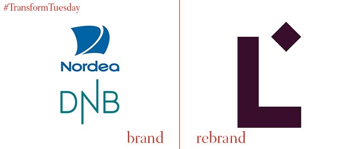
Luminor
In March 2017, Nordic-based (but separate) financial services groups, Nordea and DNB ASA, announced their intention to create their first combined bank. Global brand consultancy, FutureBrand, has revealed its visual identity for the new brand, which will operate under the name Luminor. This is derived from combining the Latin root term for light (lumin) with the prefix ‘nor,' representing the company’s Nordic roots. Freddie Baveystock, senior strategy director at FutureBrand, says, “The brand name Luminor brings together the new bank’s two most distinctive strengths… These two qualities have been combined into one name that can act as a guiding star for customers and colleagues alike, reminding them what the brand stands for and why.”
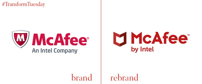
McAfee
At the beginning of April, global internet security provider McAfee announced its intention to begin trading as a standalone company. In a statement, McAfee notes its new visual identity and overall brand strategy is based around three key points: innovation, trust and collaboration. McAfee hopes to secure future investment and use the rebrand to unite its stakeholders in a more integrated cybersecurity model. Christopher Young, CEO of McAfee, says, “Cybersecurity is the greatest challenge of the connected age, weighing heavily on the minds of parents, executives and world leaders alike. As a standalone company with a clear purpose, McAfee gains the agility to unite people, technology and organisations against our common adversaries and ensure our technology-driven future is safe.”