#TransformTuesday: 3 May
Every week, Transform examines recent rebrands and updated visual identities. This week's picks are below. For more from #TransformTuesday, follow @Transformsays
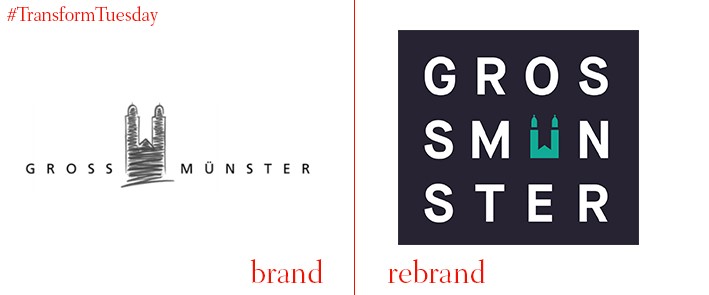
Romanesque is a medieval European architectural style, characterised by semi-circular arches which forms the basis of its structures. The logo and brand identity for one of Zurich’s four major churches, Grossmünster, has been updated by independent international brand agency, Moving Brands – its Romanesque credentials guide the image in its new logo. Yet gone is the sketch of Grossmünster itself, replaced with a more modern, and arguably more corporate logo. On the other hand, use of GT Sectra typeface, designed by Swiss foundry, Grilli Type, ensures the church has a broader appeal to the city’s visitors. A flexible colour palette ensures the Grossmünster logo is easily implemented across its brand architecture while retaining the church’s historical importance.
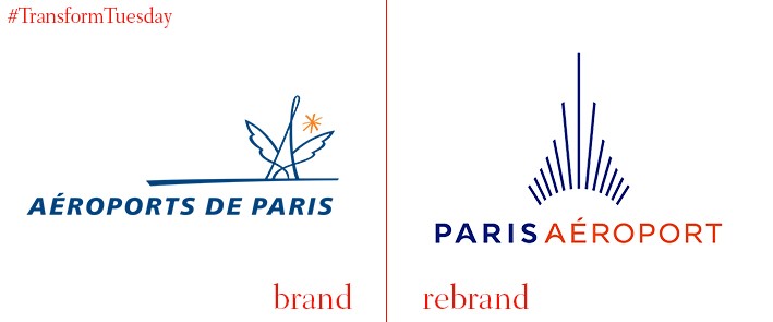
There are 14 civil airports and airfields in the Île-de-France (Paris) area of France. All are owned and managed by the newly-named Paris Aéroport or ADP (Paris Airports) authority, whose corporate identity has been redesigned in-house with a slight art deco twist. Despite the approachability of the previous brand icon, it did not perhaps convey Paris Aéroport as a serious corporation. The new identity invokes notions of holidays and travelling yet cements the company as the central authority of Parisian aviation. Its red-orange, blue and navy colour palette is transferable to the brand implementation without being clichéd – the lines combine to create the impression of an aeroplane during take-off.
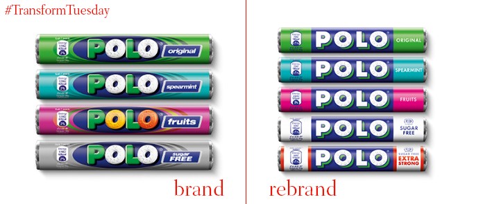
A British staple since 1948, POLO mints were first manufactured in York and are recognisable through their distinctive ring shape. Bristol-based creative agency, Taxi Studio, has redesigned its iconic packaging, focusing on using visual to differentiation between flavours while ensuring the POLO branding is much clearer. On a new dark blue background, the white lettering is now highlighted. This forms a pleasant contrast to the bright colours used to define each POLO flavour while ensuring the product remains central to its brand identity. While the flavour colour palette remains the same, such as the ‘original’ forest green shade, POLO’s new visual identity is contemporary and affirms it as a leading market competitor.
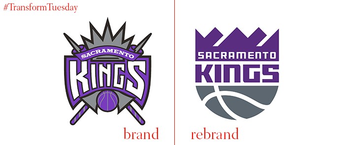
Mississippi-based creative branding agency, RARE, was tasked with the redesign of Californian basketball team, the Sacramento Kings. Part of the NBA, the Sacramento Kings is the oldest franchise in the league, having been established in 1948 – its visual identity had also not been updated since 1995/1996. Despite the new design, RARE has retained the purple and grey colour schemes so synonymous with the Sacramento Kings branding, while one of the team’s new secondary logos depicts a lion wearing a crown – a nod to its royal name. While its outline and major elements have adopted many of the 1985/1986 iteration traits, overall, the new logo and its block typeface lend the brand an identity more fitting to the modern NBA league.

Using the combined efforts of its in-house creative team, and specialist digital brand agencies such as Polynoid, Rattling Stick, The Mill, gotgotneed, MPC, Envy, Box of Toys and Certain, digital network Sky has announced a major rebrand across its entertainment channels. Sky 1, Sky Atlantic and Sky Arts have all undergone individual brand changes with, for example, the brand focus of Sky 1 visualised through the personification of a heroic character. However, the Sky brand will remain easily identifiable and unified through visual indicators across all channels.
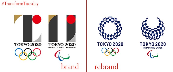
Amid accusations of plagiarism, and controversy surrounding previous styles, a design has finally been chosen to represent the Tokyo 2020 Olympic and Paralympic Games. With the title ‘Harmonised Enchequered Emblem’, its visual identity takes simplicity as its cue, while working a traditional Japanese indigo blue as the main colour of its design. Asao Tokolo is the architect behind the chosen emblem and is said, by the Tokyo 2020 Emblems Selection Committee, to have used notions of ‘elegance and sophistication’ in his final design idea. A stylistic design, it well reflects the integrity and individuality of both the competitors and national teams competing in the Tokyo 2020 Olympic and Paralympic events.


