Tokyo embraces transparency in selection of new Olympic emblems
Emerging from the controversy surrounding its initial logo, the Tokyo Olympic Organising Committee rebounded in fine form. The new logo for the 2020 Olympic Games was selected yesterday by popular vote in Japan.
In September last year, the original logo was criticised of being plagirised by the Theatre de Liege, which featured a similar T device. In response, the organisers put the opportunity for a rebrand to the people of Japan. A nationwide competition was opened and 14,599 entries were submitted. On 8 April, a shortlist of four finalists was released.
In a bid for transparency the committee sought to both ensure the originality of the new designs and reassure the public of their authenticity. The committee said of the shortlist in a statement, “We have implemented a series of format and design checks on all entries, and have received the cooperation of design experts during the design checks. We have received written pledges from each of the designers of the shortlisted designs specifying that they are the original creators. They have also submitted documents demonstrating the design production process used for their creations.”
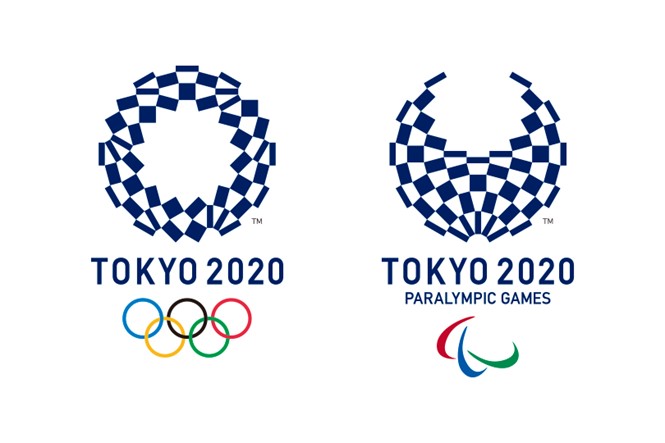
Of the shortlist of four sets of logos for the Olympic and Paralympic Games, three were somewhat similar. They featured rounded figures of flowers or people in bright colours to represent the games. The fourth, and eventual winner is also a round shape, but uses a geometric pattern rather than colour and flowing lines.
In the brand guidelines the committee put to designers, the new emblems were to represent the Olympic spirit, represent Japan and its people, have a sense of innovation and forward thinking and embody resilience, among other themes. By putting the brief out to the people of Japan, the new emblem and the games themselves may feel more relatable to Japanese citizens and will potentially be more reflective of the world’s olympic spirit as the designs were sourced from the people themselves.
The overall winner, or ‘harmonised chequered emblem’ by Asao Tokolo, reflects a traditional design stemming from the Edo period of Japanese history and is “Composed of three varieties of rectangular shapes, the design represents different countries, cultures and ways of thinking. It incorporates the message of ‘unity in diversity.’ It also expresses that the Olympic and Paralympic Games seek to promote diversity as a platform to connect the world.”


