Angus’ A-Z of logos: Dunkin’ Donuts
Pentagram partner and creative director Angus Hyland takes a look at the irresistible history behind Dunkin’ Donuts in his latest monthly Transform column on the A-Z of logo design.
It’s said that you can tell the average American’s political affiliation according to whether their coffee is from Starbucks or Dunkin’, and unfortunately, coffee purchased from the latter establishment is deemed to be the hot drink of choice for those who think it’s a good idea to own guns and want to ‘Make America Great Again’.
Don’t let that put you off though, Dunkin‘ Donuts (as it was) is a great logo that’s ingrained in the cultural landscape of the USA and beyond. Rumour has it that on the doomed flight of the space shuttle Discovery, astronaut Ellison Onizuka took a chocolate-frosted Dunkin' Donut along, which earned it the accolade of being the first donut in space.
Dunkin’ started life as Dunkin’ Donuts in 1950. Its first logo was the epitome of the American Dream, set in an elegant script typeface that would look at home on the back of a pastel-coloured Cadillac. Its second logo (introduced in 1960) is charming and colloquial and features blobby type set in a circular donut shape doing exactly what it promises – dunking itself into a cup of coffee.
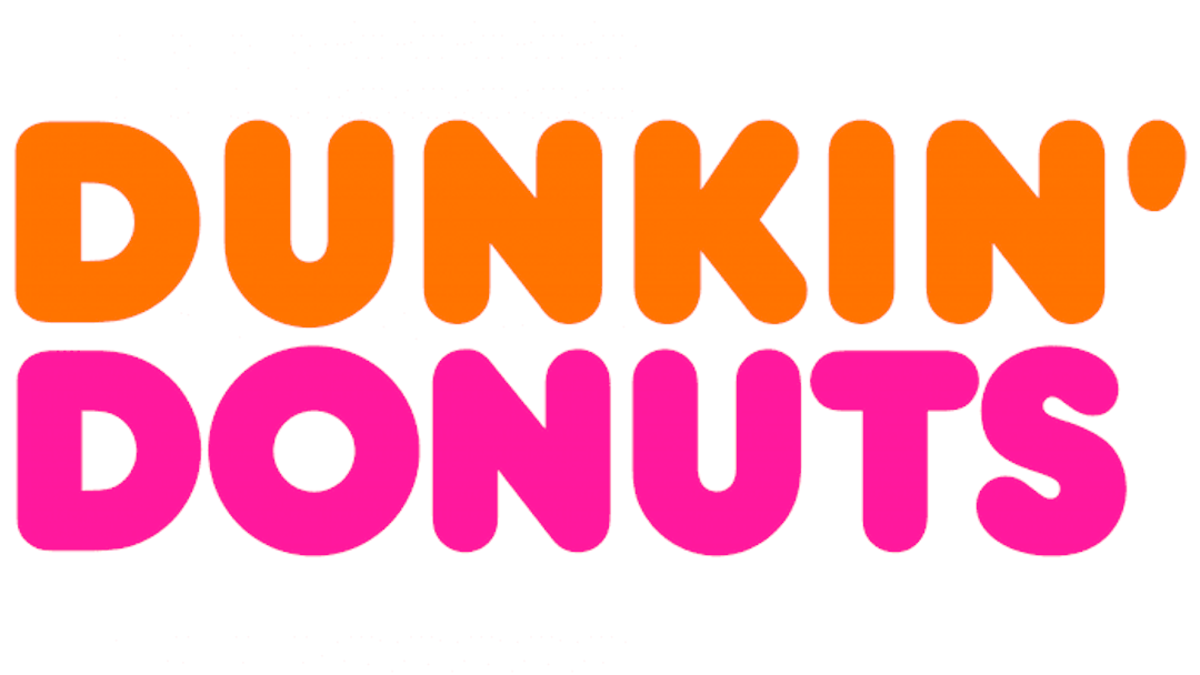
1976 saw the introduction of the classic and most memorable incarnation of the Dunkin’ Donuts logo. Designed by industrial designer Lucia DeRespinis and set in Bob Newman’s unmistakable Frankfurter typeface, it’s perfectly balanced, with an equal number of letters top and bottom and the cheeky apostrophe sticking out to one side. The irresistible colour combination of hot pink and bright orange (the favourite colours of DeRespinis’ five-year-old daughter) was an unusual choice for a food and drink brand at that time.
Since then, the logo has had several tweaks beginning with the reintroduction of a coffee cup in 2008, which signalled Dunkin’s shift towards being a beverage-driven company. The most radical change took place in 2019 when Jones Knowles Ritchie dropped the word ‘Donuts’. Echoing the way that KFC changed from ‘Kentucky Fried Chicken’ and Greggs dropped ‘the bakers’, it reflects the current trend in branding to de-emphasise any unhealthy connotations.
While this was obviously a commercially-driven decision, it’s a bit of a shame as the essence of the Dunkin’ brand is loud, fun and just a little bit naughty. There are plenty of places to go for your Tofu fix and Dunkin isn’t one of them, so why drop your main selling point?
In the meantime, a raft of independent disruptor donut brands has sprung up, creating some unashamedly indulgent treats which are eagerly hoovered up by Gen Xers with selective amnesia about their keto/paleo/clean eating regimes.
Next time: another donut-shape, but one that’s employed in the service of high culture.
Angus' favourite 'C' logo can be found here.