The Verdict: Eurostar
Taken from the Q3 edition of Transform magazine, experts in the brand design industry give their opinion on DesignStudio's much-talked-about rebrand of Eurostar.
About the work
Following the integration of Eurostar and French-Belgian high-speed train operator Thalys in May 2022, global brand agency DesignStudio was tasked with creating a brand and design system for holding company Eurostar Group. Ahead of the two rail operators becoming a single brand by the end of the year, DesignStudio was tasked with creating a new logo, symbol, colour palette, photography, illustration and sonic branding.
DesignStudio’s mission was to create a modern brand which could reflect Eurostar Group’s vision of carrying 30 million passengers a year by 2030. However, the agency was also required to be respectful of the heritage brands. This was partially achieved by retaining the Eurostar name. Perceived to hold powerful equity and global recognition, it remains embedded within the new brand.
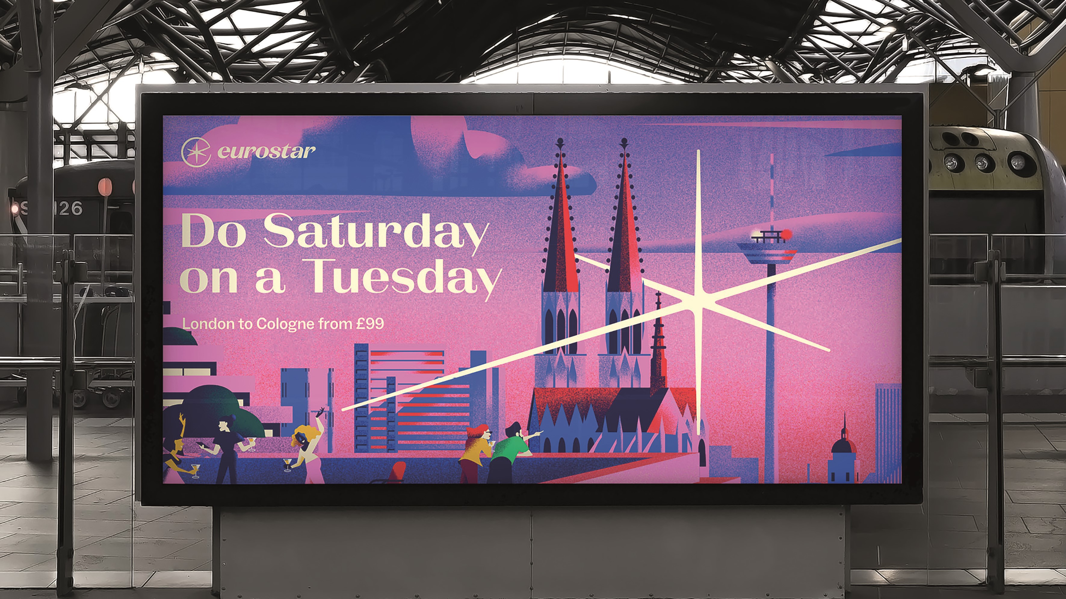
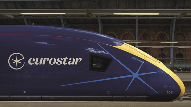
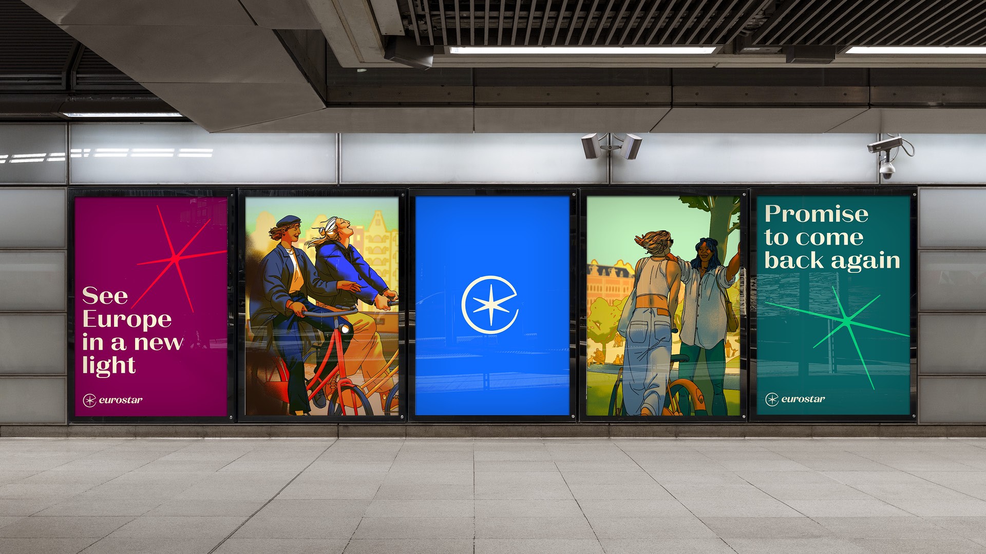
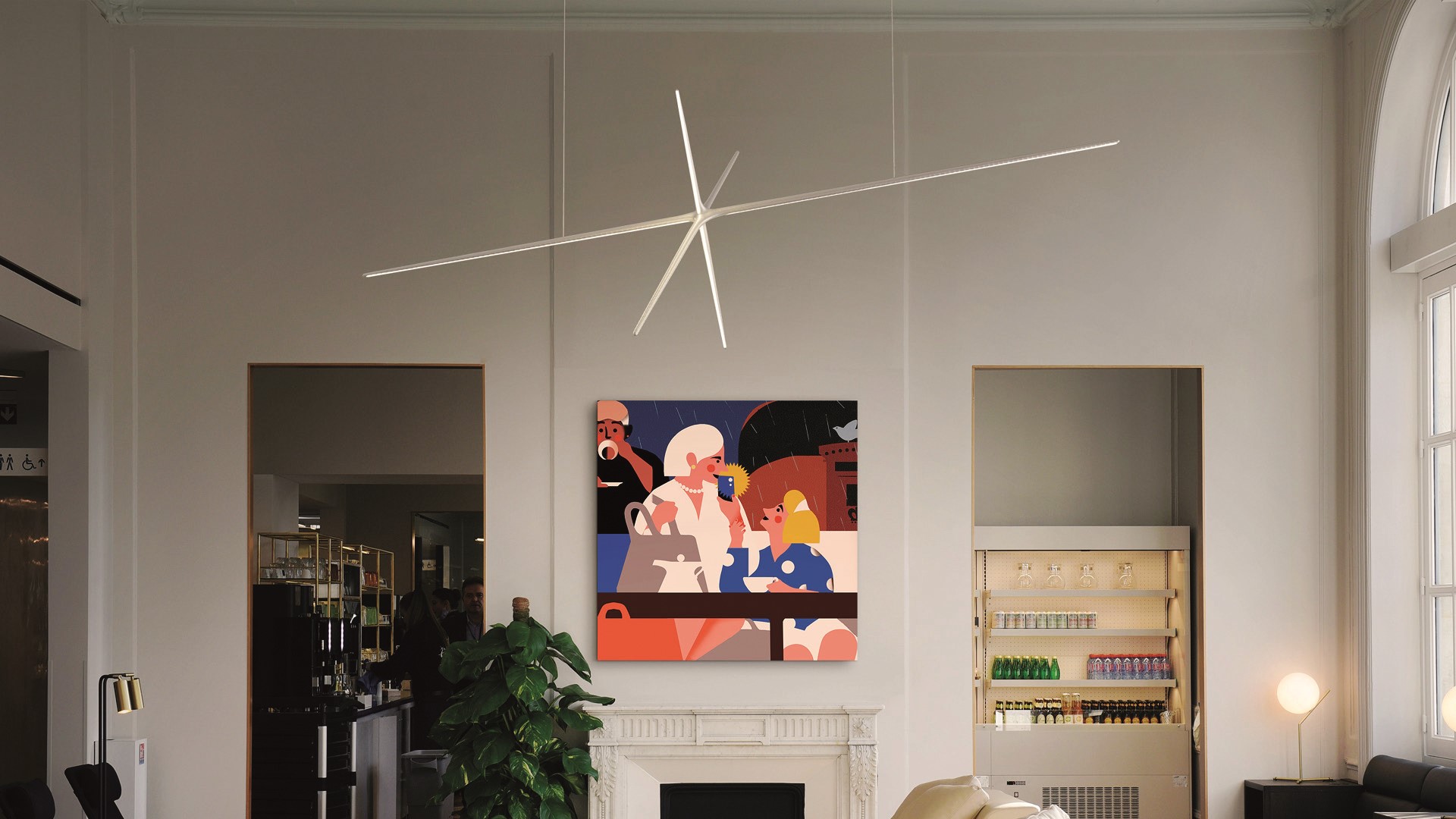
The new brand symbol – a combination of the Eurostar ‘E’ and a star – forms a key part of Eurostar Group’s makeover. Known as ‘The Spark’, its iconic, flexible and dynamic nature allows it to break free from the symbol itself to be utilised across multiple touchpoints, from train livery to digital platforms.
Julien Queyrane, DesignStudio creative director, says, “A key part of the success of our partnership was to work closely with Eurostar and Thalys stakeholders to capture the essence of each brand’s near 30-year heritage, whilst evolving them into the future.
“This led to our brand idea and creative platform, ‘Spark New’, which symbolises how the new Eurostar Group brand is supercharged to spark new experiences, new ideas and new opportunities through high-speed train travel.”
The Spark’s capabilities include acting like a navigational compass to guide travellers around their city destination due to its wide range of motion behaviours such as rotating, extruding and dropping into locations.
Drawing on the diversity and vibrancy of Europe, the agency settled on a modernised version of the Eurostar and Thalys colours. The punchy blue and deep navy primary colours are supported by six secondary colours. Elsewhere, the typography includes hardworking and smooth sans serif font ABC social to support La Pontise. The headline typography aims to give a distinct and elegant feel to the brand while bringing warmth and impact with high contrast characters.
The new Eurostar Group brand is set to launch by the end of 2023.
Peer review
Deva Corriveau, associate creative director, Brandpie
I share the widespread enthusiasm for the new Eurostar brand, which I believe is fantastic. The brand's fresh, playful and beautifully crafted design lives up to the high standards we've come to expect from DesignStudio. I'm particularly intrigued by whether the new identity deliberately accentuates the 'Euro' aspect of Eurostar, as opposed to the prior identity which seemed to have much more of a Parisian feel. However, this shift aligns with the merger with Thalys and the service's positioning as a low-carbon competitor to budget airlines, potentially revolutionising travel in Europe.
The buzz surrounding the brand identity's launch has been palpable within the design and branding community, and it was all over my LinkedIn feed. I acknowledge that my network may be an echo chamber, but I was surprised not to see the new identity in use during a recent trip on Eurostar. While I have since learned that the official launch won't take place until the end of the year, I can't help but feel that others may have shared my initial disappointment and confusion at the lack of new branding.
Sophie Roux and Claude Gottlieb, co-founders, BrandSilver
Mergers are all about compromise, and brand identities are often the symptoms. A big congratulations to DesignStudio who had all the talent to carry out this delicate mission! The choice of the brand name, ‘Eurostar’, seems to be a sensible one. Thalys was, however, a more emotionally rich brand name that would have deserved its chance!
The new visual identity is quite modern while remaining within the codes of the transport sector and the graphic identities of Thalys and Eurostar. In the postmodernist style of the 1960s (when the future was a promise of progress), it is traditional and reassuring. It is also a tribute to the Étoile du Nord, the train that linked Paris, Brussels and Amsterdam from 1924 to 1996. The heritage is respected.
We regret that there was not a more daring approach, with more projection into the future, knowing the energy, social and climatic challenges that rail mobility will have to face in the years to come.
Pierre Nabhan, cofounder, JoosNabhan
Merging brands is not an easy task. Especially when they both have strong roots and a legacy that need to be understood and refreshed to remain relevant with the times - in this case, the opening of rail transport to competition.
More than a visual and verbal identity challenge, it’s a question of managing people – its stakeholders – towards a common goal. And that’s what comes out of the Eurostar Thalys merger: alignment. It feels that way throughout the brand identity and its look and feel, converging towards more clarity and power.
The name, Eurostar, alongside the spark/star, conveys the simple yet powerful idea of guidance and reassurance in mobility. As competition grows, it’s important to position train/mobility brands as being reassuring and forthgoing. Even more so at a time when environmental concerns arise, and trains regain power over more polluting means of transport. It’s also a reminder that Europe is not a single country, but the union of diversity. Brands that unite help to achieve this, including Eurostar.
Mike Smith, creative director, Clout Branding
As always, the inherent commercial strategy is really important to judge the work against. With the previous rebrand (in 2011), Eurostar shot into the future with its sculptural logo and promise of a super-efficient service. In contrast, this most recent rebrand looks like a more restrained yet contemporary rewind to its original heritage.
With the merger opening up a wider network of travel opportunities, it seems fitting that they have reintroduced a star – a metaphor for freedom, discovery and possibilities. Visually, there’s an elegance to the overall positioning, perhaps a deliberate nod to the enduring romance of train travel. And the mark is certainly distinct enough to serve as a recognisable visual shorthand for the brand. Overall, I think this rebrand is really well considered given the strategic aims.
Our design experts have had their say, now it’s time for yours!
Let us know what you make of Eurostar’s rebrand on Twitter with #TransformSays