#TransformTuesday: 5 March

Every week, Transform examines recent rebrands and updated visual identities. This week's picks are below. For more from #TransformTuesday, follow @Transformsays
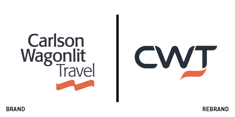
Carlson Wagonlit Travel
As one of the world’s leading travel management companies, Carlson Wagonlit Travel uses cutting-edge technology to assist organisations around the world in delivering a simple, effective travel programme to their employees. However, in honour of its 150th anniversary, the company has chosen not only to celebrate the past, but also to look towards the future in a company-wide rebrand. Now known only as CWT, the company has elected to use an abbreviation of the original name to reflect its increased focus on the digital aspects of the travel management industry. “This identity change is the latest phase in our digital development plan to combine the power of technology and innovation with the expert know-how of our people,” says CWT president and CEO Kurt Ekert. The new logo includes the newly abbreviated title and a simplified, shorter version of the wavelike symbol underneath the text. The original colour palette of navy blue and vermillion remains, but the typography has changed from a simple sans serif font to a bold, more stylised wordmark. The overall result is a more futuristic spin on this classic travel management brand.
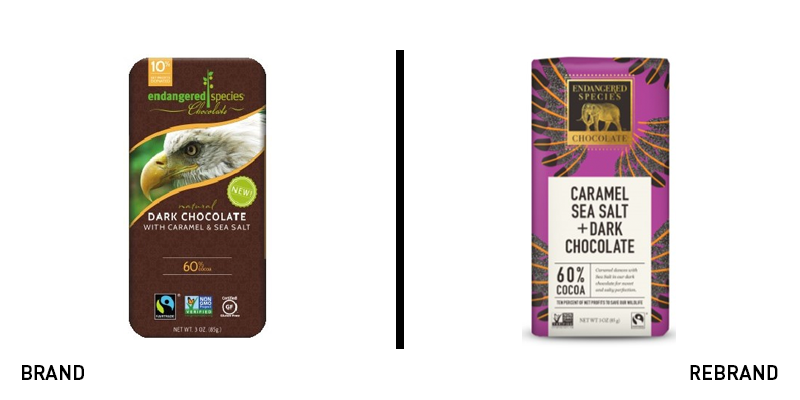
Endangered Species Chocolate
Founded in 1993, Endangered Species Chocolate has always been a brand focused on two things: serving premium, ethical chocolate and supporting global conservation. Its old packaging was distinctive in its use of animal photography, but the overall impression did not fully align with what today’s customers are looking for in a high quality chocolate bar. The refreshed packaging, designed in-house by director of brand and marketing Tod Dalberg with the support of Dallas-based BrandSmith, continues to reflect the brand’s commitment to sustainability and environmental protection through a less literal, more elegant look. Instead of employing photographs of the animals the brand works to protect, the packaging now features designs inspired by each of these animals, giving the bars a more artistic, elevated feel. The company’s logo has also been completely redesigned and now features a gold elephant icon and traditional serif typography on a black background, a shift that will help the brand become more easily recognisable to consumers. The new packaging is environmentally friendly with 10% post-consumer waste.
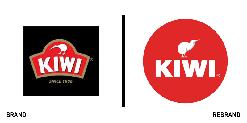
Kiwi
Kiwi is a renowned international shoe care brand famous for its quality. Created in Australia in 1906, the heritage brand is now sold in over 200 countries, and thus needed a new logo that reflected the products’ strength and global popularity. Glitschka Studios, a boutique design firm from the Pacific Northwest of the US, helped the company develop a new brand identity, which included a thicker, more powerful block text typography and a stronger, more impactful Kiwi bird illustration. “We overhauled the personality of the brand character giving the Kiwi bird more confidence and some swagger,” says Glitschka Studios. The rebrand maintains the classic red and white Kiwi colours, while the shape of the icon has been updated to a circular, seal-like logo, emphasising the iconic nature of the brand.
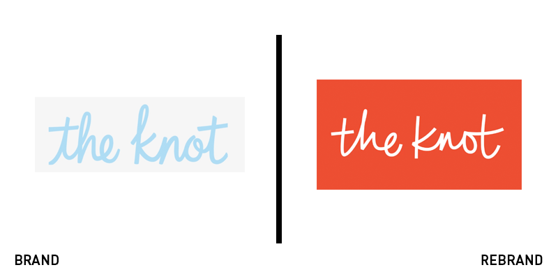
The Knot
Weddings have historically been events steeped in formal convention. However, as more couples opt for increasingly personal, unconventional celebrations, it is time for the wedding industry and its branding to catch up. The Knot, one of the world’s top wedding planning websites, has bucked tradition in its rebrand. Designed by New York-based branding agency Pentagram, the updated logo includes a script-like typography that is reminiscent of the original logo, and thus maintains a sense of brand continuity, but appears more spontaneous and relaxed. The rebrand also showcases a bright, passionate red colour palette that feels more contemporary and inclusive than the baby blue original. The fresh update is more casual and modern, better exemplifying the Knot’s tagline of ‘Wedding Planning for Everyone.’
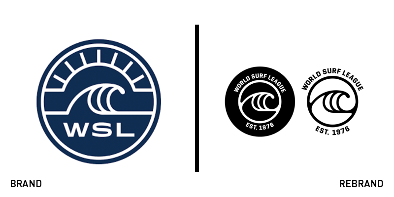
World Surf League
The World Surf League, the organising body behind the annual tour and broadcasting of professional surf competitions, is responsible for putting surfing on the map as an official sport. Its existing logo, however, only included the brand’s acronym, thus failing to effectively advertise the league to new audiences. Thus, the organisation employed California-based design studio Libre to help it capture the same essence of California cool exemplified in the original logo, but with a greater emphasis on the history and identity of the brand. The revamped icon is similar to the original in its circular shape, sans serif wordmark and wave imagery, but the updated version writes out the organisation’s full name and swaps the navy blue colour for a simple black and white palette. The refreshed version also includes the date the brand was established, 1976, a move which reminds audiences of the league’s trailblazing role in the history of surfing.


