McKinsey builds new confident identity based on contrasts
Management consultancy McKinsey & Company has announced a confident visual identity with a new logo, a proprietary typeface and a number of different applications. The rebrand was conceived by brand agency Wolff Olins to build on the contrast between ‘old and new,’ and ‘heritage and modernity,’ giving the company an overall refresh.
The logo, a simple wordmark showing the name of the company, has been realigned and redesigned to host a custom serif font crafted for the occasion. The new font has been named ‘Bower’ after Martin Bower, who helped define the structure and principles of McKinsey in the 1930s and 1940s.
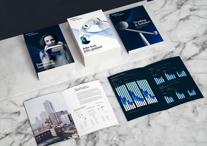
The logo comes with a new dynamic element called ‘Partnership Mark,’ created to symbolise the dynamic and agile relationship between the consultancy and its clients. The blue icon has been employed across several applications, including posters, books and brochures featuring company assets.
The new design looks elegant and sophisticated, confident and well-designed, and it succeeds in suggesting the strong identity the company is trying to achieve. It has been designed to adapt from print to mobile, showcasing ambition and personality across all mediums.
McKinley & Company is a global powerhouse, but it has suffered from being involved in a few controversies over the years, such as the Enron accounting scandal and the Valeant scandal. The rebrand is undoubtedly a way to refresh the business and start from scratch, by building a new identity founded on confidence, pride and commitment.


