One Medical rebrands with set of watercolours and photographs
One Medical announces a rebrand spearheaded by a new logo and a set of watercolour illustrations.
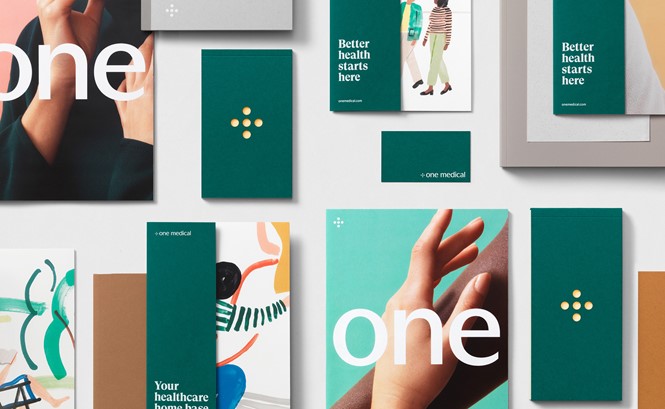
Primary care provider One Medical has announced a rebrand in which watercolour illustrations and brand identity go hand-in-hand. The redesign has been conceived by San Francisco-based brand agency Moniker, in collaboration with the company’s own in-house team.
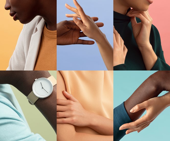
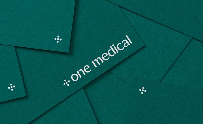
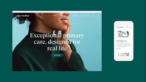
The new identity looks elegant and well-designed, showcasing simplified colour palettes as a background for the numerous photos introduced in the new design. The colours in the logo have been simplified as well, moving from the old ones to a unified deep green – which is also One Medical’s new dominating colour in posters, business cards and other applications.
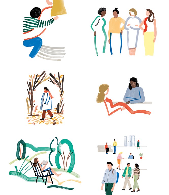
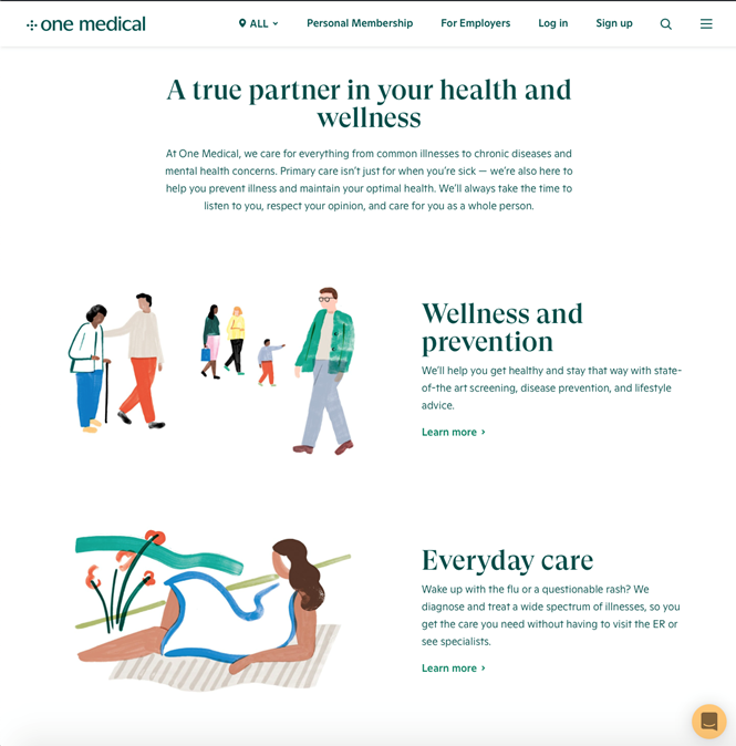
However, what truly stands out are the watercolour illustrations created by Charlotte Trounce. The company’s idea is to use different illustrators over the years instead of a single library for the rest of its history, and Trounce’s works feel like a solid start: the artist used a colour palette in tune with the photography and the rest of the new brand, adopting a style that feels warm and energetic.
The illustrations have been integrated with One Medical’s website and placed in the ‘services’ section, in the attempt to suggest approachability and a different approach to primary health care.
Overall, One Medical’s renewed identity shows an inspiring example of integration between real-life photographs and colourful illustrations, giving strength and identity to the company’s new brand.
Making a difference in the health care landscape
It is also a different and original approach to primary care branding: although sets of photographs are quite common in other US health care and insurance brands (such as Blue Shield of California or the Mount Sinai Health Network in New York), companies in the industry have grown increasingly similar over the past years, using similar colours, pictures and even website structures.
Blue and red are the dominant colours in most of the major US health care websites, including CVS Health and the McKesson and UnitedHealth groups. One Medical’s deep green is uncommon, unexpected and powerfully able to stand out, becoming one of the most interesting brands in the US health care industry.
More similar to ZocDoc’s colourful and lively approach than to the one of its closest competitors, One Medical looks like an outsider and still appears able to inspire some trust in its customers, with a focus on – as the official website states – “people rather than paperwork.” A philosophy strengthened by a fitting set of photographs and an inspired collection of beautiful watercolours.


