#TransformTuesday: 19 February
Every week, Transform examines recent rebrands and updated visual identities. This week's picks are below. For more from #TransformTuesday, follow @Transformsays
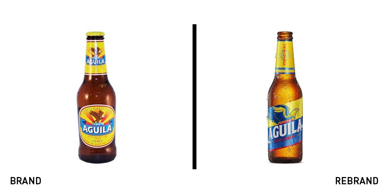
Cerveza Aguila
Cerveza Aguila has been a popular Colombian beer for almost a century. To bring the brand into this century, parent company Bavaria Brewery enlisted the help of MullenLowe43, a Colombian branch of international advertising agency MullenLowe, to update the heritage brand. The refreshed look maintains elements of the brand’s past, such as the soaring eagle symbol and patriotic red, yellow and blue colour scheme, a nod to the Colombian flag, while also debuting a more stylised typeface and diagonally oriented label. The modernised Cerveza Aguila now reflects the Colombia of today, without changing the signature taste and style that made it a national favourite.
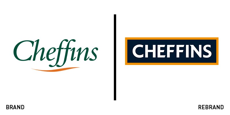
Cheffins
Launched in 1825 as an auctioneering company, Cheffins has had a long history of mergers and acquisitions, which have transformed it into a trusted name in a variety of sectors, including estate agency, rural consultancy, commercial property sectors and the auctioneering of fine art and agricultural machinery. Now, in anticipation of its 200th anniversary in 2025, Cheffins has launched a major rebrand which includes a new logo, updated corporate colours and a new website. Created in collaboration with design and marketing agency Fellowship and website and mobile app designer Isle Interactive, the new branding is modern yet classic. It employs a bold sans serif font surrounded by a gold rectangle, which gives it the feel of a traditional seal. The new logo creates a visual identify that is both versatile and classic enough to represent this heritage company’s diverse offerings.
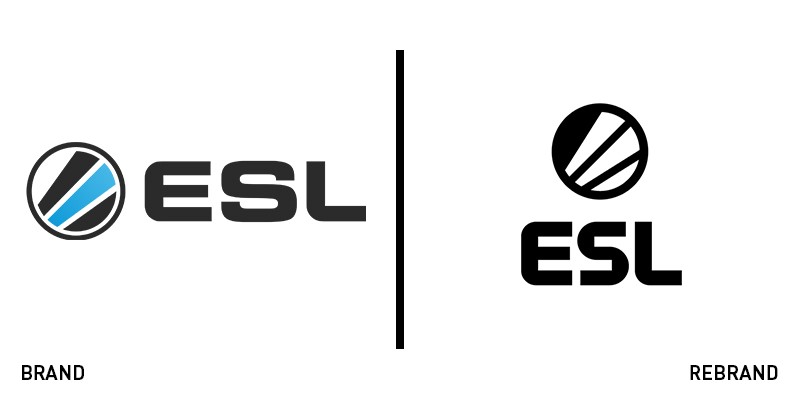
ESL
ESL, formerly Electronic Sports League, is in the midst of a global growth and brand integration strategy to unify the leagues, tournaments and products that have made it the world’s largest online eSports company. To reflect its growth, it needed a logo that would offer consistency and act as a global symbol for eSports, the world’s fastest growing sport. Designed by global brand agency Superunion, the renovated brand includes a unique typeface, a highlighter yellow and green colour palette and a slightly simplified version of their original circular icon. The bright colours match the excitement and intensity of esports, while the typeface and icon remain fun and approachable, reflecting the idea behind ESL as a place where ‘everybody can be somebody.’ The new logo reflects the enthusiasm for esports and commitment to inclusivity that have made ESL a leader in the online gaming industry.
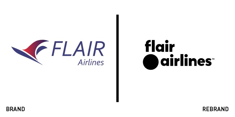
Flair Airlines
Canada’s only independent low fare airline, Flair Airlines, is ready to spread its wings once again. Just last year it transitioned from operating as a charter carrier to scheduled services and now its complete rebrand is preparing for another period of growth. The redesigned logo is a complete departure from the past, featuring a bold lowercase typeface, an eye-catching new colour scheme of fluorescent green and black and a simple dot icon. The rebrand exemplifies the minimal options the budget airline offers, while the colours espouse a sense of ease and fun. “The bright modern design is reflective of the positive spirit we want travellers to experience and makes a solid statement that Flair is on a mission to make travel more accessible, more affordable and more desirable while allowing us to add little humour along the way,” says chief commercial officer Charles McKee.
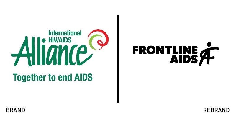
Frontline AIDS
The International HIV/AIDS Alliance had hoped to achieve a future free from AIDS by 2030. But today, the organisation admits that a 2030 finish line is unlikely. Far from admitting defeat, the organisation has renamed itself Frontline AIDS to symbolise its renewed purpose and dedication to combatting AIDS on a global scale. This clarity of focus and renewed energy is evident in the redesigned logo, which features bold, uppercase typography, an updated colour palette and an emblem that looks like an FA monogram and a person. As Brandpie, the London-based brand consultancy firm tasked with renewing the charity’s image, says, “The new name, Frontline AIDS, recognises the critical need to be active on the frontlines, wherever they are, geographically, financially, socially, to renew the response and drive the change required to end the epidemic.”


