#TransformTuesday: 16 January
Every week, Transform examines recent rebrands and updated visual identities. This week's picks are below. For more from #TransformTuesday, follow @Transformsays.
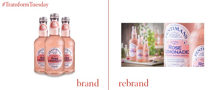
Fentimans
British ‘botanically brewed’ drinks brand Fentimans has relaunched its recognisable packaging, challenging an increasingly crowded category of upmarket soft drinks. Considered a more sustainable, artisanal version of classics such as Coca-Cola, the unique Fentimans labels were redesigned by Bath, UK-based design agency Brand Tonic. Marketing director at Fentimans, Andrew Jackson, says, “This is the biggest single change to the presentation of our brand in a generation. Building consistency across our range and improving shelf standout was key to this project alongside looking to refine our key visual equities to emphasise cues of modernity, quality and naturalness.” Fentimans’ new bottle and structural design was developed by 3D brand service Greeves Design.
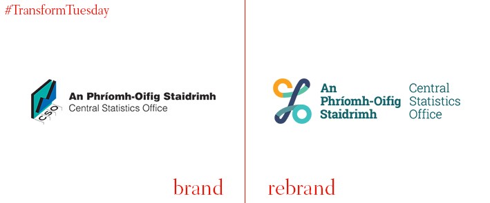
Central Statistics Office Ireland/An Phríomh-Oifig Staidrimh
In the Irish city of Cork resides the Central Statistics Office (CSO) of Ireland, or An Phríomh-Oifig Staidrimh in Irish. The central authority for statistical reasoning, research and analysis in the Republic of Ireland, the CSO also conducts Ireland’s five-yearly census. Embracing its Gaelic heritage through the logotype, the CSO’s new visual identity uses traditional colours while reflecting its numerical interests with an abstract percentage sign. Pádraig Dalton, director general of the CSO, says, “Our new identity reflects a modern and accessible approach to communicating and delivering official statistics, whilst still reflecting our important role in providing vital independent and objective data to support decision-making for government, businesses and the research community.”
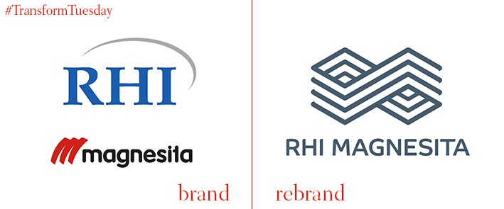
RHI Magnesita
International supplier of refractory products RHI Magnesita has launched a new identity, following a branding project by creative communications agency MerchantCantos. A recent merger between leading manufacturers RHI and Magnesita necessitated a brand that conveyed leadership while directing RHI Magnesita toward a bright future. MerchantCantos says, “The logo would be hugely important in establishing a sense of unity, especially for the company’s 14,000 employees. The new symbol is filled with meaning: constant improvement and connection, shown through the infinity shape, combined with the solidity and structure of the core products, shown through brick-like elements and layering.” MerchantCantos also worked with type foundry Dalton Maag to create a bespoke typeface for the new brand.
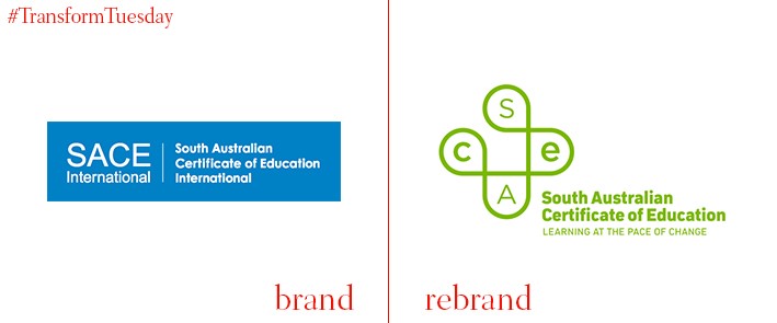
South Australia Certificate of Education (SACE)
A recognition unique to the region, the South Australia Certificate of Education (SACE) is awarded to learners who successfully complete their secondary school education in South Australia. The SACE Board of South Australia has launched a new brand for the certificate to coincide with the start of 2018 – colourful, vibrant and interactive, it is intended to complement the programme’s upcoming new digital offering and array of illustration and colours. A ‘plus’ mark leads the rebrand, described by the board as ‘…representing advantage and the positive change brought about by achieving the SACE qualification. Its continuous flow represents the continued renewal of the SACE programme.”
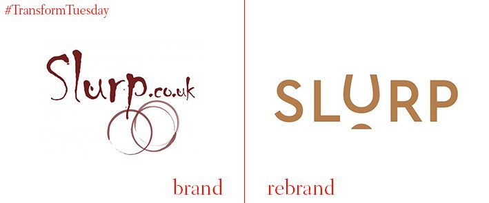
Slurp
Online drinks distributor Slurp provides a global array of alcoholic drinks on a subscription basis. While well-established in its sector, Slurp approached London-based design agency Studio Noel to create a visual identity that accurately reflects its aspirations to grow, while delivering high-quality wine at accessible prices. In redeveloping the somewhat outdated logo, toning down the Slurp colour palette and adopting a premium-style type, Studio Noel repositions Slurp as a sophisticated alternative to supermarket wine purchases. Studio Noel says, “We like the way Slurp think; they believe everyone should be able to enjoy exceptional wines sourced from around the world at reasonable prices. With two stores and an online shop we rebranded and repositioned them, creating a new logo, identity and tone of voice.”
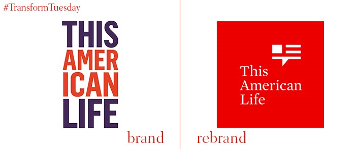
This American Life
First aired in 1995 under the name Your Radio Playhouse, 60-minute show This American Life is a weekly radio programme also available in podcast format. In a design project led by independent designer Erik Jarlsson, its new logo better reflects the show’s origins and format, embracing an abstract yet traditional US flag design conceptualised as a speech bubble. In moving away from the show’s historic orange and purple-based identity, This American Life’s visual identity is better aligned to the show’s content, which each week explores different aspects of society through fiction.
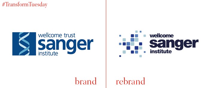
Wellcome Sanger Institute
Funded by biomedical research charity the Wellcome Trust, the Cambridge, UK-based Wellcome Sanger Institute is a research development project formed from combining the Sanger Centre and the Wellcome Trust Sanger Institute. Focusing on genome and genomic research, the Wellcome Sanger Institute needed an identity to reflect the scientific nature of its work while effectively communicating its purpose to a variety of stakeholders. Steve Palmer, director of communications at the Wellcome Sanger Institute, says, “Our logo is inspired by the four bases of DNA and the procedures of sequencing and analysis. We have paired this with a strong type lockup formed from the Wellcome brand identity. These are combined to create an easily identifiable logo that represents the Wellcome Sanger Institute.”
For more from Transform magazine, follow us on Twitter @Transformsays


