Five minutes with John Gambell

Yale University has a sprawling, urban campus, a number of sub-brands and a strong logo. How has typography shaped its brand touchpoints and influenced its brand management strategy? Yale's university printer John Gambell discusses brand and typeface
What were the origins of Yale’s bespoke typeface?
In the year 2000 or 2001, we were trying to really figure out what signs on campus should look like. And we had engaged a firm, 212 associates in New York. They were Yale trained – the person working on our project was not – but in any case they kept coming up with designs that were very ornate, that involved custom sign shapes, various things that became parts of the signs, posts that were distinctive. And we went through about a year of that back and forth around the design.
And at some point I didn’t think of it as being fundamental Yale design, which is a kind of clean, confident, unadorned but communicative approach. And so I said initially to myself but then to others, why don’t we have a totally plain sign, but use a typeface which is unique to the university so that we would be distinctive out of the substance of the project than out of something that you stick on to it?
What was the resulting wayfinding and signage system like?
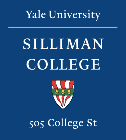
The signs are blue plaques, the ones on the buildings are essentially 18 by 20 inches and they have simple capital letters. But they are in the prototype Yale typeface which we call Yale Street, because it would be viewed from the street. It was meant to be really legible from quite a distance and kind of inscriptional in the sense of carving something into stone.
I brought that idea to [typeface designer] Matthew Carter and he was very excited about designing a typeface for the signs. He had been working on a typeface he was calling Thesaurus which was an updating of the typeface that typographically is called Bembo, which was traditionally a letterpress typeface. It was a late 15th century Venetian creation in the shop of Aldus Manutius. It was called the De Aetna typeface because at first it appeared in a little book called De Aetna from Pietro Bembo.
The capitals were still inscriptional like the Roman inscriptions and the lowercase was more scribal. He [Carter] that this would be especially good to use because of those inscriptional caps. And we didn’t use much in the way of lowercase except for the address line at the bottom.
"There's the idea that the Yale typeface can be sort of like a virus infecting the system of Yale. If it was good and free and a variety of fonts were available, without having to impose branding, it would become an important part of Yale’s brand."
"Our brand is sort of homemade in some ways, it has not been imposed upon us, and I think that that might be a little distinguishing from some of the current organisations that are trying to do similar things."
How did the typeface and signage designs become the Yale brand?
Once that project was in place, we had established the idea of a uni typeface being part of Yale’s identity and we extended the system to include a print based typeface; and then after that quite a number of different fonts of Yale typeface for different purposes – italics and bold and bold italics and a display version which is meant for being shown very large. It was in about 2007 or 2008 that we developed the Yale logo using the letterforms from the Yale typeface. In a sense, it’s become very, very fundamental to Yale’s identity over the last 20 years.
Yale really wasn’t looking in the immediate future [in 1998] to do a branding project. It seemed to me that what was called for was a kind of under the radar approach to creating a brand identity. In discussions with Michael Rock at [design studio] 2x4 – he was a teaching colleague at that point – he encouraged the idea that the Yale typeface can be sort of like a virus infecting the system of Yale. If it was good and free and a variety of fonts were available, without having to impose branding, it would become an important part of Yale’s brand.
How is the brand evolving?
One of the things that we’ve been doing is investigating other configurations of what we call the Yale wordmarks, so that they are more formally viable. The normal logo-wordmark configuration is this sometimes unwieldy horizontal thing, so we’ve developed other ways to constrain that. We’re looking at trying to figure out if there are any Yale entities that would benefit from having iconic marks rather than typographic marks. The issue there is more how do you create a line in the administrative structure so that you don’t just open the floodgates for everyone.
We try to move people away from the idea that once you create a logo your job is done. Instead we kind of constrain the form of the logos and then really encourage people by connecting them with good designers and by advising them related to design work. Their identity is created not from a logo but from the manipulation of content and illustrations and photography and other aspects of visual form.
How do you ensure the Yale branding works alongside all of its sub-brands?
I’m a little of what they would call an iconoclast. I’m not a big fan of every identity having a logo. First of all, they tend to be badly made. Secondly an institution like Yale, they just all run against the idea that it’s a unified place that we have a shared institutional core. [We try to] turn the focus inward to encourage people to work on making their content really appealing and really accessible to their particular audiences out of their particular culture, seems to do the trick. But it’s obviously a lot more work for them and sometimes more expensive for them even to do first rate design work.
How does Yale manage its brand?
Yale has had a university printer since 1920 and that person was not a printer ever, really. The first one was a printer by profession, but his role in the university was somewhat like mine which is to design stuff and to guide and, to some degree, police design. One of the advantages at Yale is that it has had a long history of 100 years now of having in-house art direction. Our brand is sort of homemade in some ways, it has not been imposed upon us, and I think that that might be a little distinguishing from some of the current organisations that are trying to do similar things.
For more on branded typefaces, see our recent feature, 'Light, Medium, Black'


