Spotlight on Inchcape Shipping Services
Beyond simply moving goods from place to place, Inchcape Shipping Services is becoming a technology solutions provider in the shipping industry. It needed a refreshed brand in order to communicate that new purpose and help it stand above the waves. Melina Thalassinou
reports on the rebrand
Shipping is not only one of the first sectors that ever existed, but it is also the least environmentally damaging form of commercial transport. Around 90% of world trade is carried by the international shipping industry, the importance of which becomes apparent if one considers that without shipping, the import or export of affordable food and goods would not be possible.
Shipping company Inchcape Shipping Services, part of Inchcape plc, has been working closely with established branding agency BrandOpus, to design a new brand strategy, positioning and visual identity. Due to Inchcape’s strong presence in the shipping industry for over 170 years, a lot of thought and care put into the process.
John Ramskill, executive creative director at BrandOpus, says the objective was to “transform Inchcape into a technologically driven business and create a brand narrative and brand identity that would distinguish it within the shipping industry.”
Despite the business of port management remaining fairly unchanged for centuries, Inchcape is at the forefront of change. Along with BrandOpus, the two companies aimed at reinventing the significantly fragmented market, by creating a visual identity that offers a new perspective into the business, differentiating Inchcape from its competitors.
Chris Crookall, senior VP of global sales at Inchcape Shipping Services (ISS), says, “The main idea was to create a new brand identity but also to find a way of explaining what we do in a language that is a little less specific than the we used up to that point. We wanted to redefine our message, redefine our look and find a new way to communicate with our existing customers, as well as the targeted audience, because we’ve got quite a significant level of ambition.”
Ramskill adds, “Inchcape had a vision to become a technologically driven global network but wasn’t clear on how to leverage its capabilities to enable growth and differentiate it from the competition. With a complex portfolio of services, ISS also needed a way to structure and present its offer in a compelling way to its varied audiences to strengthen its vast global network.”
In the early stages of the rebranding process, BrandOpus had to familiarise itself with the intricate world of shipping and port management, understanding its scale and importance, to have a better understanding of the task at hand. It was fundamental for both companies to understand what they wanted from each other. For that reason, long workshop type discussions took place at the senior level.
The focal point of the process, according to Crookall, was Inchcape making sure BrandOpus deeply understood what ISS did, what it was trying to do and how things were different in shipping, which resulted in a deliberation on how the brand could become consistent, and how it could communicate with its customers and employees in a clear manner. Through these extensive discussion, Inchcape and BrandOpus managed to come up with useful strategic language, imagery and ultimately a logo, a brand style and all the things that are now part of the new brand identity.
“Once we had wrapped our heads around the industry we set about working through Inchcape’s entire portfolio,” Ramskill says. With the help of BrandOpus’ knowledge and experience, Inchcape managed to identify what makes the company different from competitors in the industry. Ramskill says, “By forcing them to explain what they did in the simplest terms we were able to break down the complexity and work together to restructure their product architecture into ‘Inchcape 360,’ a suite of ‘smooth services’ and ‘smart solutions,’ allowing Inchcape to deliver a clearer and more compelling way to communicate their brand, products and services.”
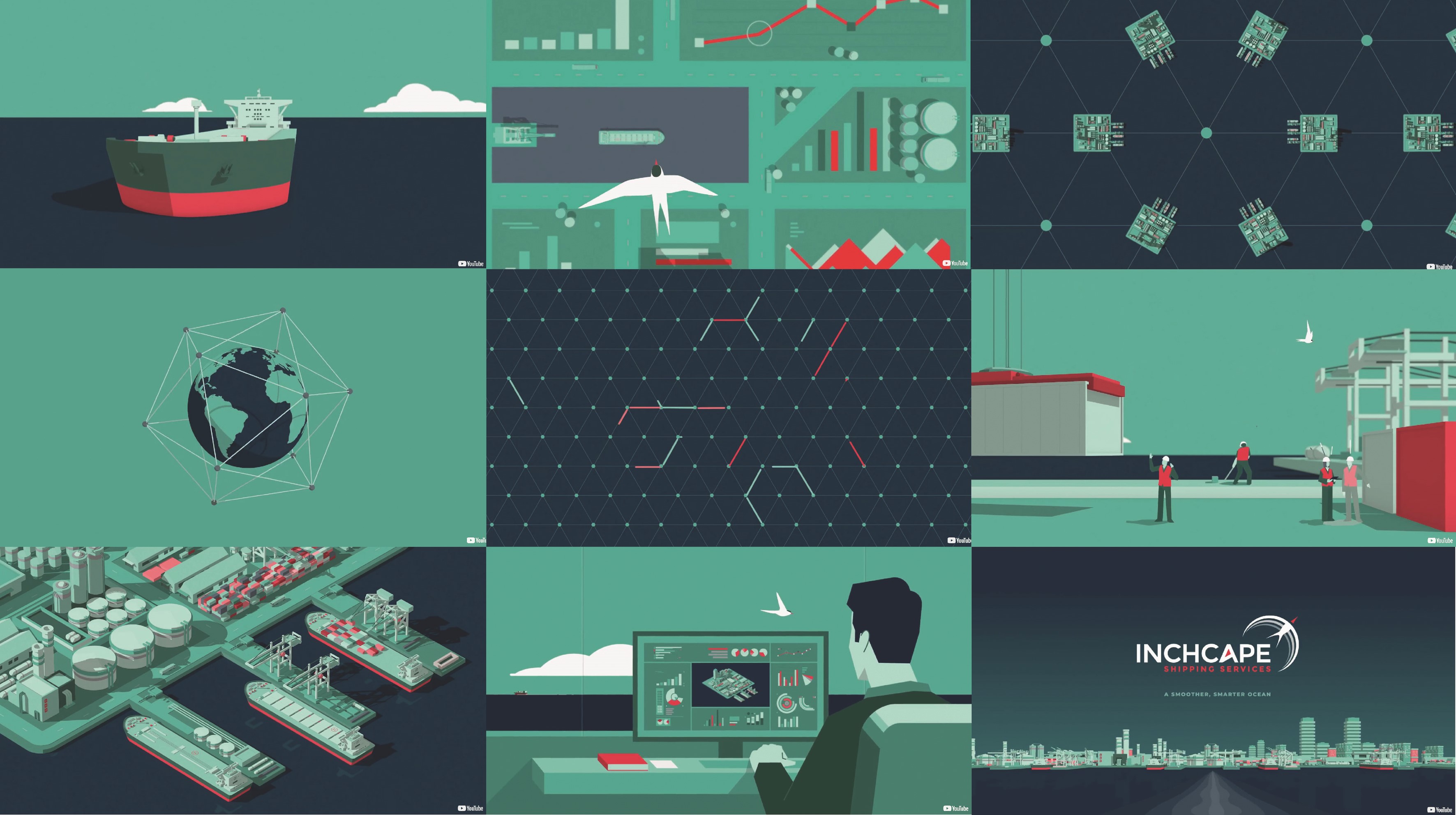
Another key point was the idea of connectivity. “Building upon the idea of connectivity we drew on the influence of an arctic tern for the identity to capture both the brand’s heritage and connectivity. Shifting it from a shipping company to technologically driven company, we wanted to steer clear of overt shipping references,” Ramskill says.
To ensure the best results, BrandOpus together with Inchcape’s team drew industry reports and desk research to fully comprehend the historic context and current climate they were working in. The stakeholder interviews and discussion sessions helped BrandOpus gain insight into ISS’ strengths and weaknesses.
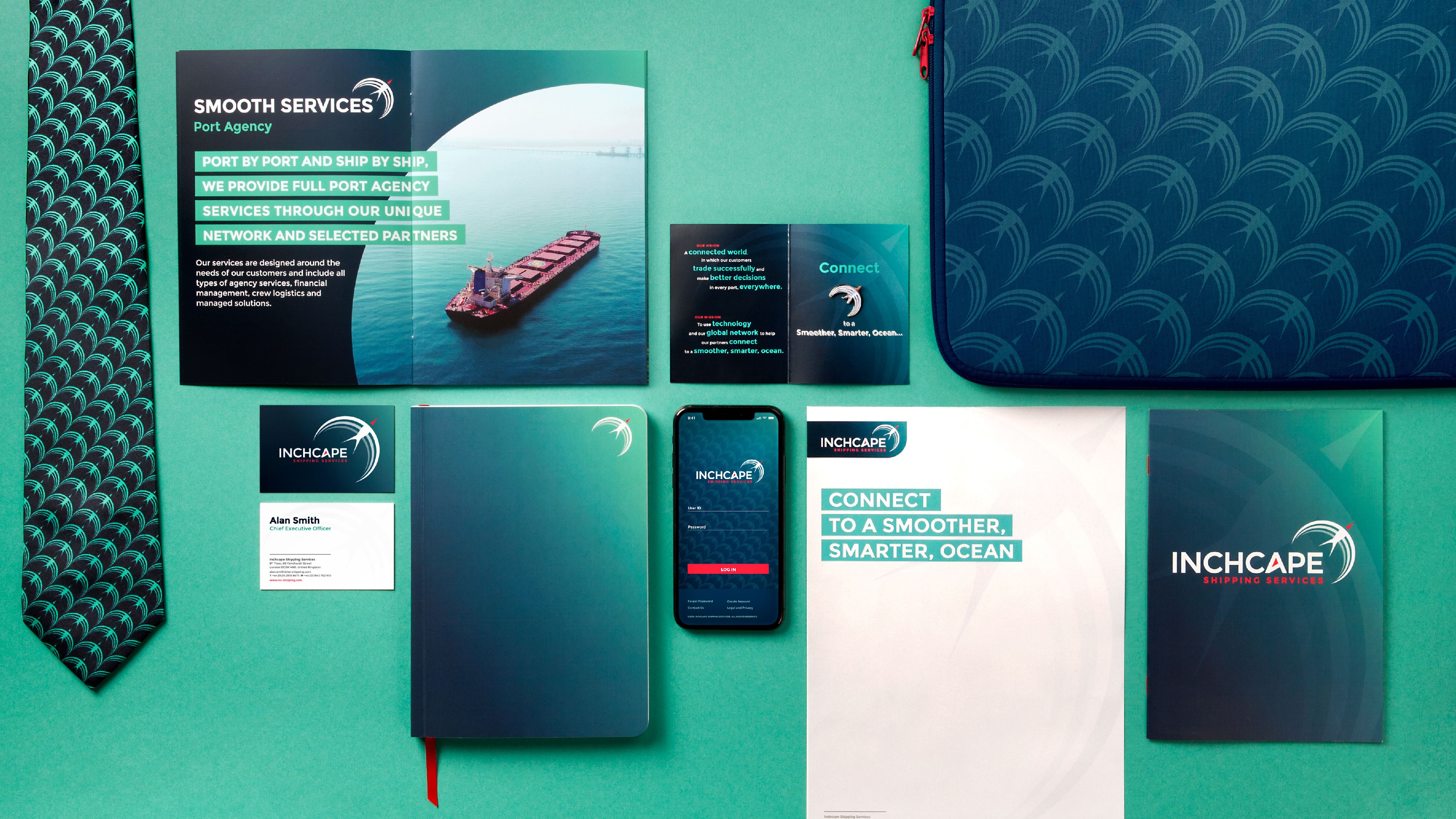
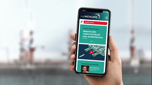
To reach Inchcape’s audience of around 3,000 employees worldwide, based in every major port around the world, BrandOpus designed an engagement programme that empowered the brand’s internal stakeholders. A series of presentations for the different business units, a brand narrative film and branded collateral were created to help staff understand the new brand, take ownership of it and learn how to articulate the new scheme.
The new brand identity conveys the message of connectivity and the change of perceptions about Inchcape; repositioning it as a modern network based on technology that is future forward and not another shipping company that has nothing new to offer.
Crookall says, “The core message is that we are trying to deliver a product that is simple to understand, innovative and new, but built on our history, our tradition and our expertise. We have a tagline which is ‘Connect to a smoother, smarter ocean’ and that encapsulates the idea of both people connecting, geographies connecting, because we do business in a lot of different places for a lot of different people, and the new the digital element of our strategy, the idea that we’ve got to use technology to connect people, places and information across the oceans.”
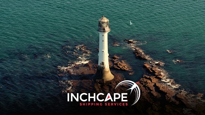
The new identity features an arctic tern, reflecting both the brand’s heritage and connectivity. Arctic terns are seabirds known to travel around the world on the longest migratory route of any animal. The choice of that bird is therefore not a coincidence, as it shares Inchcape’s travelling habits. The Inchcape Rock, is also displayed in the new visual identity – the rock is located eleven miles off the east coast of Scotland and was immortalised in a ballad by Robert Southey in 1802 – which seems appropriate as a symbol for the ISS brand.
When deciding on the colour palette, BrandOpus made a conscious decision not to use shades of orange and red as the main brand colour, which in the shipping world are indicators of danger and distress. At the same time, choosing the typical blue colour would fail to make Inchcape stand out.
Ramskill says, “The industry is awash with logos involving ships or some variation on waves, we made sure that visually we steered clear of these overt references instead focusing on something visually distinctive and engaging.” To keep with the theme but not become redundant, BrandOpus used the colours of rich navy blue and sea foam green with an applied gradient to add depth and distinctiveness. The agency incorporated accents of red for arctic tern’s beak. The typeface used is a clean and contemporary sans serif font applied in uppercase to enhance the sense of power and authority of the brand with its size and height.
Inchcape’s new brand fits well into the marketplace. The visual identity is consistent and relevant, but at the same time unique and eye-catching. The aesthetically pleasing visuals are creative yet business-oriented. Crookall says, “I don’t think there are many people in the marine space who don’t use a picture of a ship or a wave or the colour blue. The devices that we have are different, they’ve got a nautical marine edge and they work in that environment, but they are different and unique.”
Ramskill adds, “Crucially we also developed an emotive narrative for Inchcape focusing on connectivity rather than on the scale and size of their business which while a key advantage did little to differentiate them from their competition. Executed consistently across all touchpoints, now wherever you are in the world Inchcape looks and feels like a cohesive brand.”
When a company makes an impactful change, however, it is vital that it doesn’t cause distress to its loyal following. A smooth transition is key to not alienate the preexisting customers. As Crookall describes, there are two parts that need to be covered for a smooth transition, the internal and the external one. Internally, Inchcape tried to take it team along the journey of rebranding, “It is a cliché, but I think it is a journey and it was really important that we, as a senior seat, took our own team through that journey as best we could we had a dedicated large senior leadership team in Japan, we introduced the new strategy, which BrandOpus helped us define, the backdrop of which was the new brand identity and we did a nice job of making sure that people had the logo, the messaging and the visuals. We also gave them a few free gifts in a giveaway, which cemented that identity and created a sense of eagerness and enthusiasm for it,” Crookall says.
Externally, Inchcape introduced the branding on all of its material, such as presentations, proposals, but didn’t go through with a hard launch. “It is a soft launch, but I think it is more powerful because of that,” Crookall says. From BrandOpus’ point of view, making sure that the change is impactful without being too drastic lay in switching the focus of the branding from the products and services it offers, to the feelings of confidence and freedom it provokes with its business model.
When asked about the biggest challenge the two companies faced during the rebranding process, both agreed that the initial stage of trying to figure out what they wanted to say and in what way was the most challenging one.
Ramskill says, “Over the course of its 170 plus year history, the offering had evolved and expanded and become unnavigable but when we really dug down deep we found that connectivity has always been at the heart of the business and they just needed to present it in an ownable and distinctive way.”
Crookall adds, “What is it that we do? Who do we do it for? How do we it today and how we want to do it in the future? These are important questions for any company and if you don’t ask yourself those questions, you’re probably not doing justice to your stakeholders. Having that conversation in a constructive way, which ended up with some useful output was difficult.”
However, both Ramskill and Crookall agree that although the process was a long and straining one, the results were rewarding and essential to the rebrand’s success. “While this stage was the most challenging it was also the most rewarding. Our expertise and their willingness allowed us to challenge each other to think differently in order to find the best solution that would help them shift perceptions,” Ramskill says.
Although the new brand identity is still quite new, it has been embraced by the public, deeming the rebrand as successful. BrandOpus succeeded in giving Inchcape an engaging brand narrative and distinctive brand identity that is disruptive and stands out from the crowd.
More importantly, the brand now has a clarity it previously lacked. It has a framework on which it can hang all of its commercial offerings to its customers and it has got a confidence that it didn’t used to have before the rebrand. All that is encapsulated in the visuals, the consistency and the way things look and feel.
Peer review
Anthony Coombes, creative leader, The Team
What’s interesting to me is the tension of the logotype and the symbol. I like the smile in the mind element of the letter A in the logotype, you can see the beak of a bird. I like the smile in the mind element of the letter A in the logotype, you can see the beak of a bird, it’s subtle but effective.
The font and capital letters used in the logotype continue across the look and feel of communications, styling headlines and pull-out messages; clean, bold and confident. Technology-led businesses seem to deliberately simplify their logos, brands like Airbnb, eBay, Google, Spotify, Uber etc. now look very similar. Instead apps and social media have encouraged the use of symbols as a visual shorthand. Online, we are offered so much choice that we only get a split second to attract buyers. Colour and a simple silhouette is needed to pick out one brand from another.
The symbol for Inchcape Shipping Services is an arctic tern. I like the rationale, ‘This agile seabird effortlessly navigates the globe on the longest migratory route of any animal.’ I’m a fan of anthropomorphism or using archetypes to distinguish a brand’s personality, attributing human characteristics or behaviour to an animal. And when animated, it’s beautifully elegant. For me what is uncomfortable are the two together, the symbol feels like an awkward addition. I get the impression of having two punchlines in one visual gag.
I’ve been there too, it’s a common challenge for brands that need to work across a mix of media. Technology can help, responsive logos are able to expand and adapt to different applications. Alternatively set your animal free! Let it be the mascot, guide or champion it really wants to be. Not fixed to a logo in the corner of a page.