#TransformTuesday: 31 October
Every week, Transform examines recent rebrands and updated visual identities. This week's picks are below. For more from #TransformTuesday, follow @Transformsays.
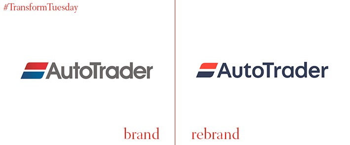
AutoTrader
A leading automotive magazine in the UK and Ireland, AutoTrader has provided classified advertising services since 1975. In a rebrand project led by London-based design agency Studio Output, the now digital-first car magazine has a fresh new voice. Its updated colour palette, associated imagery and marketing collateral aims to emphasise AutoTrader’s relevance for anyone who owns a car – a far cry from the historic images of middle-aged men in garages. Lei Sorvisto, audience and brand director, AutoTrader, says, “Despite becoming a digital-only business four years ago, many consumers still think of us as a print publication, a misconception we were keen to tackle. Key to this was creating a refreshed personality that was in keeping with our position as the UK and Ireland’s largest digital automotive marketplace, as well as reflecting our heritage.”
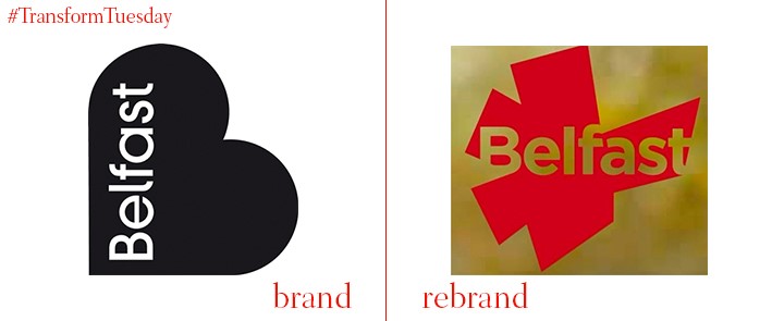
Belfast
Belfast, capital of Northern Ireland, is well-known for its industrial heritage, world-class education facilities and numerous parks and gardens. A new logo for the city has been launched by local design firm McCadden, with an angular polygon representative of Belfast’s outline forming the main outline of its new city brand identity. The latest iteration replaces Belfast’s previous logo, whose heart-shaped design was launched in 2008 by agency Lloyd Northover. It is hoped the most recent design will see Belfast compete as a tourist destination among its European counterparts and continue to be recognised as one of the island of Ireland’s most important cultural hubs.
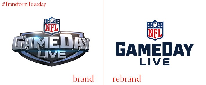
GameDay
Since 2006, coverage of the US’ National Football League (NFL) games has dominated the Sunday sports channels. NFL Gameday, as the programme is known, runs on the NFL Network channel and provides coverage of the 32 NFL teams, as well as commentary and punditary from the show’s presenting team. However, with the programme expanding across a wealth of channels, a new identity was needed to ensure GameDay remains visually exciting and relevant for its widespread audience. Led by brand and design studio Trollbäck+Company, the rebrand ensures GameDay is a content-driven source of entertainment. Led by a custom typeface and crisp aesthetic, the result is, “[An] authentic content-first strategy [that] positions GameDay as the premiere Sunday destination for football fans, attracting record numbers of viewers through the first half of the 2017 season.”
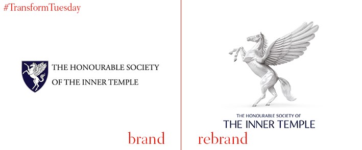
The Honourable Society of the Inner Temple
London, UK-based design studio SomeOne has launched a new identity for one of the oldest surviving not-for-profit societies in England and Wales. The Honourable Society of the Inner Temple was founded in 1340 and is one of the four Inns of Court. This means anyone wishing to practice as a barrister must join. The winged horse forms an integral part of the society’s logo, as well as its identity and remains a major feature of the rebrand. Simon Manchipp, executive strategic creative director at SomeOne, says, “To be trusted with the future of such a fundamental part of English law has been an incredible opportunity and a responsibility we have taken very seriously. The branding was crying out for a crafted, rich and detailed approach that could somehow translate seamlessly from the digital realm to print and product. The branding is now ready to adapt and flex to accommodate any communications task, while remaining coherent throughout all channels.”
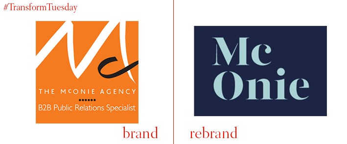
McOnie
The B2B communications agency previously known as the McOnie Agency has rebranded, including a name change and development of its colour palette and logo. Henceforth known as McOnie, the agency continues to work for leading brands in the technical and industrial markets. Yet it needed a new identity to reflect its continuing, working to the brand signifier ‘the power of clarity’ to inform its continued development. Managing director Sarah McOnie says, “Since the agency launched in 1990, our services have evolved to reflect the changing communications landscape. We want everyone to know this and to understand our ability to take complex messaging and make compelling stories that amplify brands and build businesses. As well as bringing clarity to B2B PR, our new look is industrial, confident, bold, modern and professional and that’s what we are.”

Mr Kipling Australia
Being 31 October, today is not only Halloween – it also signifies the beginning of the Christmas retail period. This is something ubiquitous baked goods brand Mr Kipling has been quick to recognise, with its products taking on the imagery suitable for the spooky and festive seasons. Design by Leeds, UK-based design agency Robot Food, the Halloween packaging reflects an international focus for the famous Mr Kipling brand. Its designs are being released in Australia amid future plans for a wider international expands in both the country and overseas to the US. Robot Food says, "[We] focused on simplifying and amplifying the brand, heroing the Mr Kipling name front and centre, and incorporating its beautiful festive products into the design through aerial food photography. Traditional seasonal cues were modernised, with clean shapes set against bold, bright colours that shout loudly from shelves. Stripped back, streamlined and very brand proud; the new range marks the beginning of Mr Kipling’s new international expression as a contemporary brand with plenty of stand out."


