Packaging roundup: bread, bars and coffee beans
This autumn has seen many food brands unveil new packaging. Here is a closer look at three recent rebrands in the food and drink sector
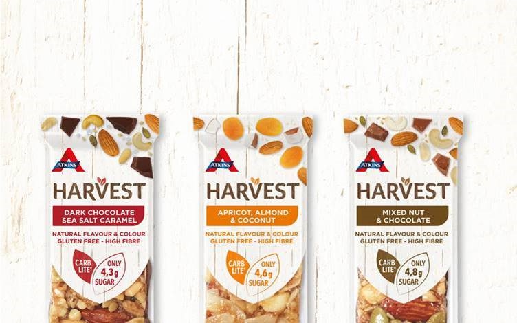
Atkins Harvest
Atkins Nutrition, a health food brand in the UK, has launched a new range of healthy, gluten-free bars under the Atkins Harvest brand. The company worked with design agency Brandon to imbue the packaging with the products’ healthy benefits while also providing insight into the ingredients. That sense of transparency is carried through with a clear panel making up half the pack.
Steve Conchie, creative director at Brandon, says, “We wanted to let the naturalness of the products speak for themselves and the use of a large window to clearly display the bar, allows that immediate transparency. A simple colour palette of white, with three earthy shades communicates the three flavour variants, creating a much more product-reflective approach.”
The ‘V’ in ‘harvest’ is host to a two-leaf, v-shaped device that is reflected in the key information-provider on the pack – which proves the products’ healthy benefits.
Conchie adds, “Due to the many health benefits of the product, it would have been easy for the packaging to have been flooded with messages, making it over-whelming for people to decode at speed. The simplicity of the transparent window, ingredient cluster and leaf graphic for the two key messages ensures the benefits are easily communicated.”
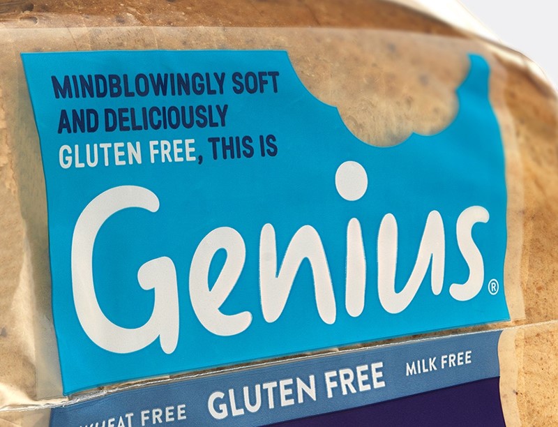
Genius Gluten Free
The free from category has become mainstream. The BBC reported in April that 54% of UK households purchased a free from product in the first quarter of 2017. Genius Gluten Free, one of the stalwarts in this category since 2009, has recently unveiled a new brand to better compete in the growing category.
Working with B&B studio, a London-based design firm, Genius is now colour-coding its product lines, while uniting the range with a core colour of sky blue.
Shaun Bowen, creative partner at B&B studio, says, “Genius Gluten Free is a market leader in its field however we saw an opportunity to help consumers rediscover the intelligence and ingenuity that has made Genius the number one bakery brand in the free from category. Our new visual identity gives weight to the ‘genius’ concept in a playful way whilst increasing the brand’s impact on the shelf.”
The new range also has a ‘bitemark’ taken out of the blue panel, allowing for more versatility in the visual identity.

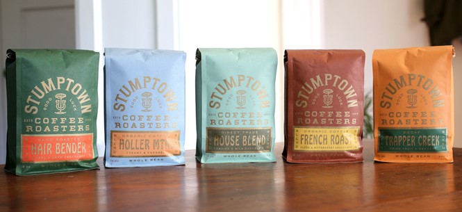
Stumptown Coffee Roasters
Portland, Oregon has made a name for itself not just for its openmindedness, environmentally friendly lifestyle and influx of Millennial residents, but for its homegrown food brands that have become national sweethearts. One of those is Stumptown Coffee Roasters, a newly expanded brand that has worked with LAND, a Texas-based design firm, on a new visual identity.
The previous packaging was toned down with plain brown packs, muted coloured labels and simple Stumptown badge. The new approach is more vivid, and ever so slightly confusing. The colour palette takes a cue from the existing muted tones and provides navigation through Stumptown’s range of single-origin coffee. Little icons accompany the text on the front of the bags, adding a touch of personality. The new bags are also biodegradable.
The company says in a blog, “After many good years with our much-loved (and collected!) coffee-carded brown bags, we are floating into the new utopian world on a comet of fresher coffee and a less-trashed on planet. In other words, we are packing our coffee in new bags.”


