Museum roundup: gardens, science and espionage

From science to natural history to plants and brands, museums remain a source of curiosity across all age groups. So far, 2017 has seen real variation in the strategies that museums, new and old, are adopting to attract diverse audiences. Below are three museum rebrands that captured imaginations.
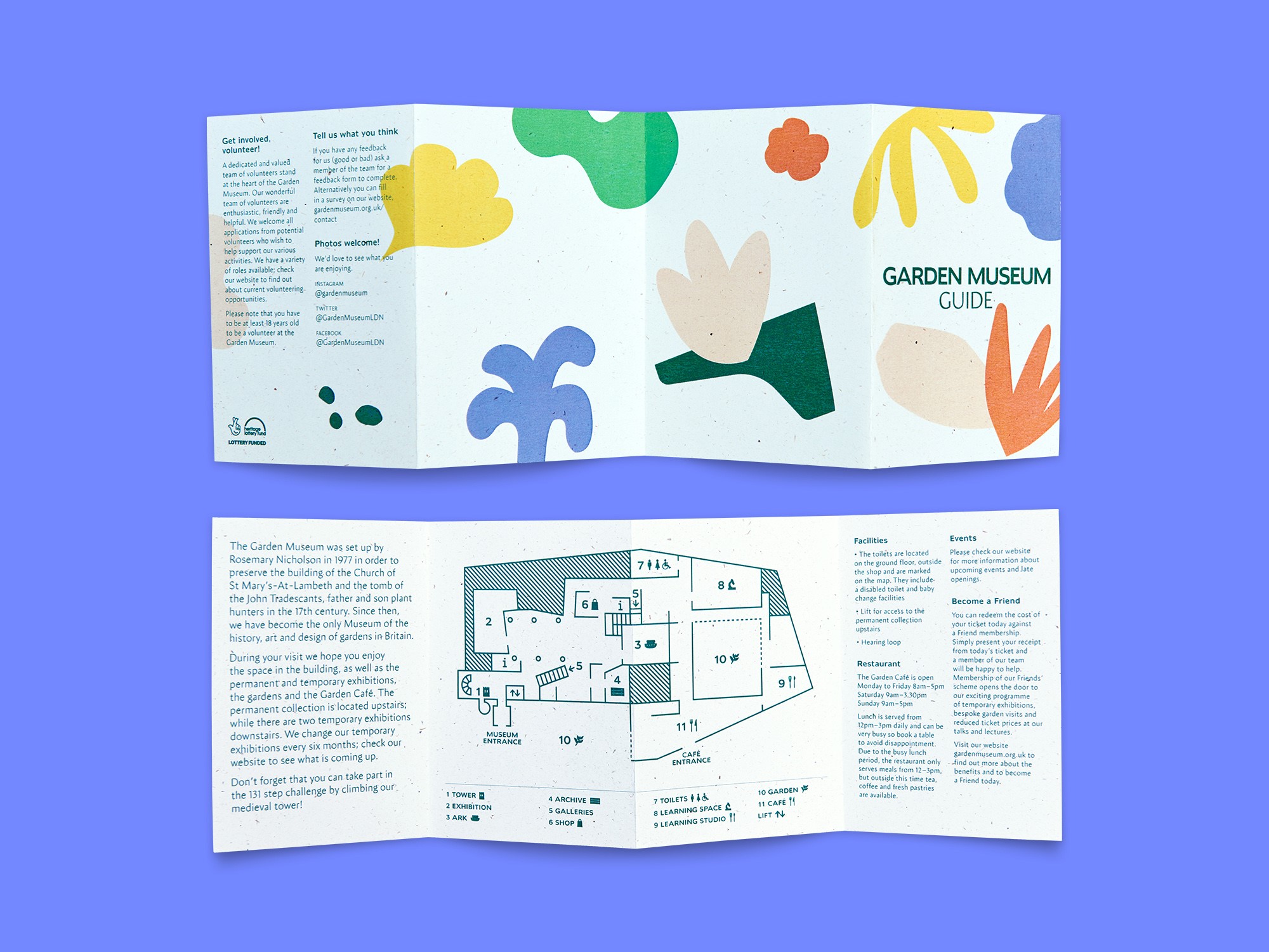
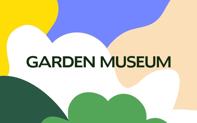
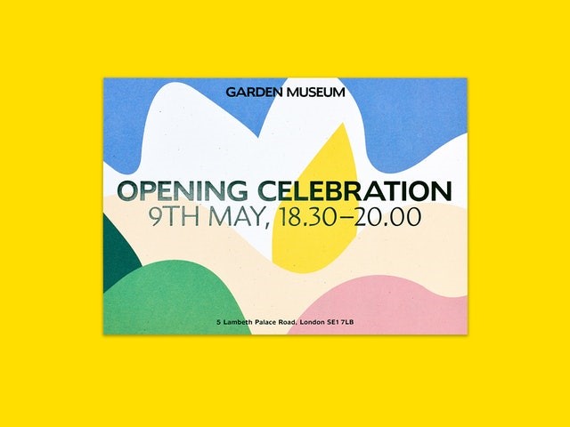
Garden Museum
The Garden Museum, located in Lambeth, South London, has recently reopened following a two-year closure. However, visitors will notice the changes extend beyond just the physical ancient church and its grounds; the Garden Museum recognised its reopening as the perfect opportunity to reposition its brand. While easy to develop brand designs around traditional horticultural tropes such as plants, flowers and insects, the London office of international design studio Pentagram, which led the project, took a different approach. Developing a design style based on the notion of ‘organic,’ Pentagram has launched a new visual identity, digital offering and signage for the Garden Museum. Based on its connection to life, earth and the renewing of the natural cycle, Pentagram hopes to instil the fun and energy back into the most vernacular of British traits.
Leading the project, Pentagram partners Jody Hudson-Powell and Luke Powell based the agency’s unique approach on the work of Brazilian landscape artists Roberto Burle Marx. Abstract forms and colours represent the changing seasons and immeasurable floras found across gardens around the world, "These shapes are deliberately imperfect and abstract, but when constructed into compositions give a feeling of a living garden," says Powell.
For Pentagram, developing a bespoke type has also been integral in completing the new Garden Museum identity. Humanist 970, the lead font of the new visual identity, is based on Doric, a font dating from 1816 whose imperfect nature reflects the imperfect nature of gardens. However, the clear-cut nature of secondary font Amira provides balance to an identity that relies on the unique and varied nature of flora and fauna to deliver its visual language.
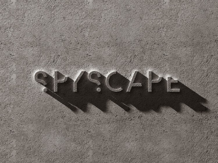
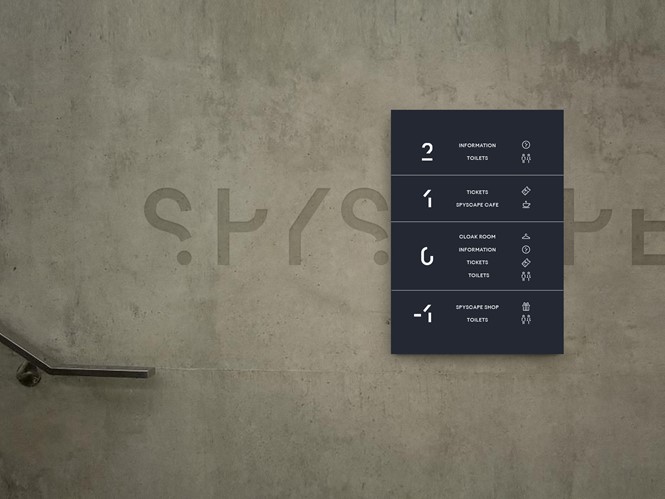
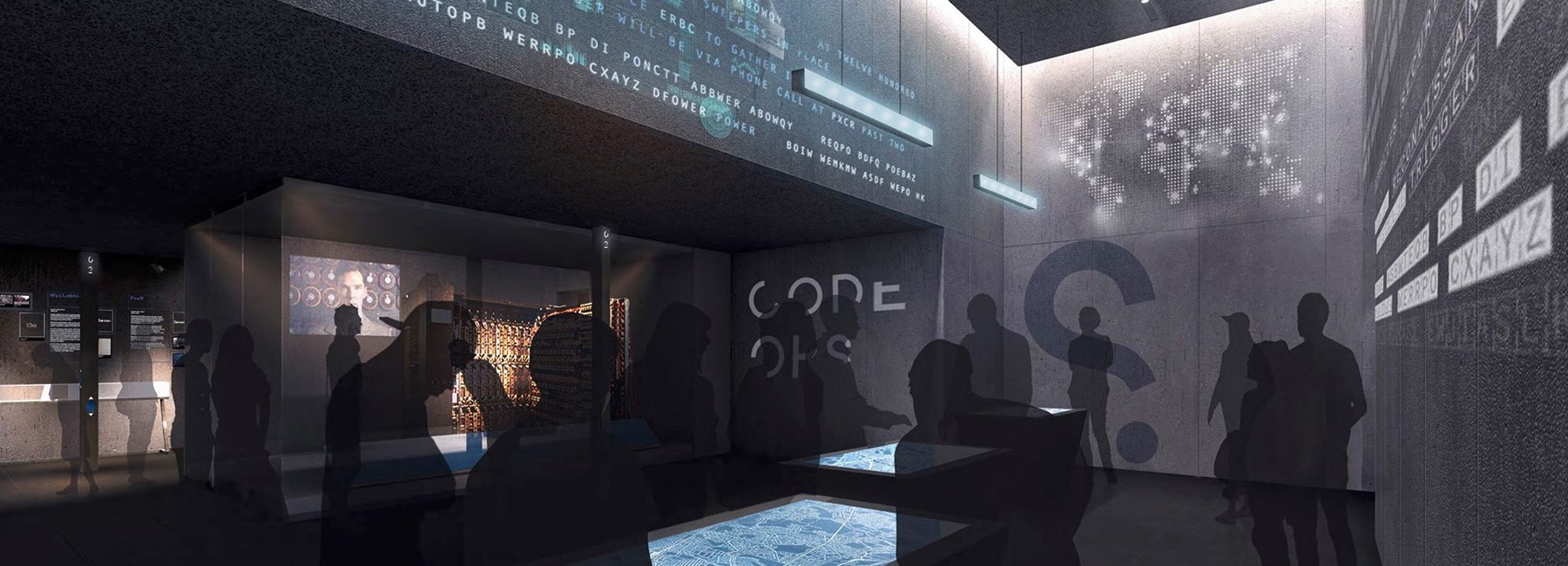
Spyscape
Unusual in its outlook, new brand Spyscape aims to immerse visitors in a multisensory experience, exposing them to the type of espionage usually confined to James Bond novels. With a wealth of experiences lined up to enchant visitors across both its digital and physical space, Spyscape has enlisted the help of London-based brand agency SomeOne to create a bespoke identity for its museum space. Simon Manchipp, founder of SomeOne, says, “This is a brand that is tackling one of the greatest topics of our time. Privacy. Their approach is both erudite and entertaining. The new branding to helps manage their reputation and stimulate curiosity in the audience.”
With the exhibition space, designed by architectural firm Adjaye Associates, based on the architectural tropes common to global spy organisations, the material makeup of each pavilion is crafted to offer an authentic experience to visitors. Visitor senses are also tapped into, with SomeOne developing the museum’s light and colour design to truly deliver an experience fit for any spy novel.
The tagline is also integral in cementing the overall atmosphere of mystery and uncertainty. Jamin Galea, digital design director at SomeOne, says, “The branding centres around the strategic position of taking nothing for granted. So we developed the brand’s ‘Question everything’ tagline.”
Emily James, project lead designer at SomeOne, says, “The typeface is unusual as it consists of three cuts that can be connected. Two ‘redacted’ cuts show only part of the letterform, but often enough to distinguish what character it is. The third cut is a complete letterform that can either be used to hint at the remaining stroke, or used in its entirety for total clarity.”
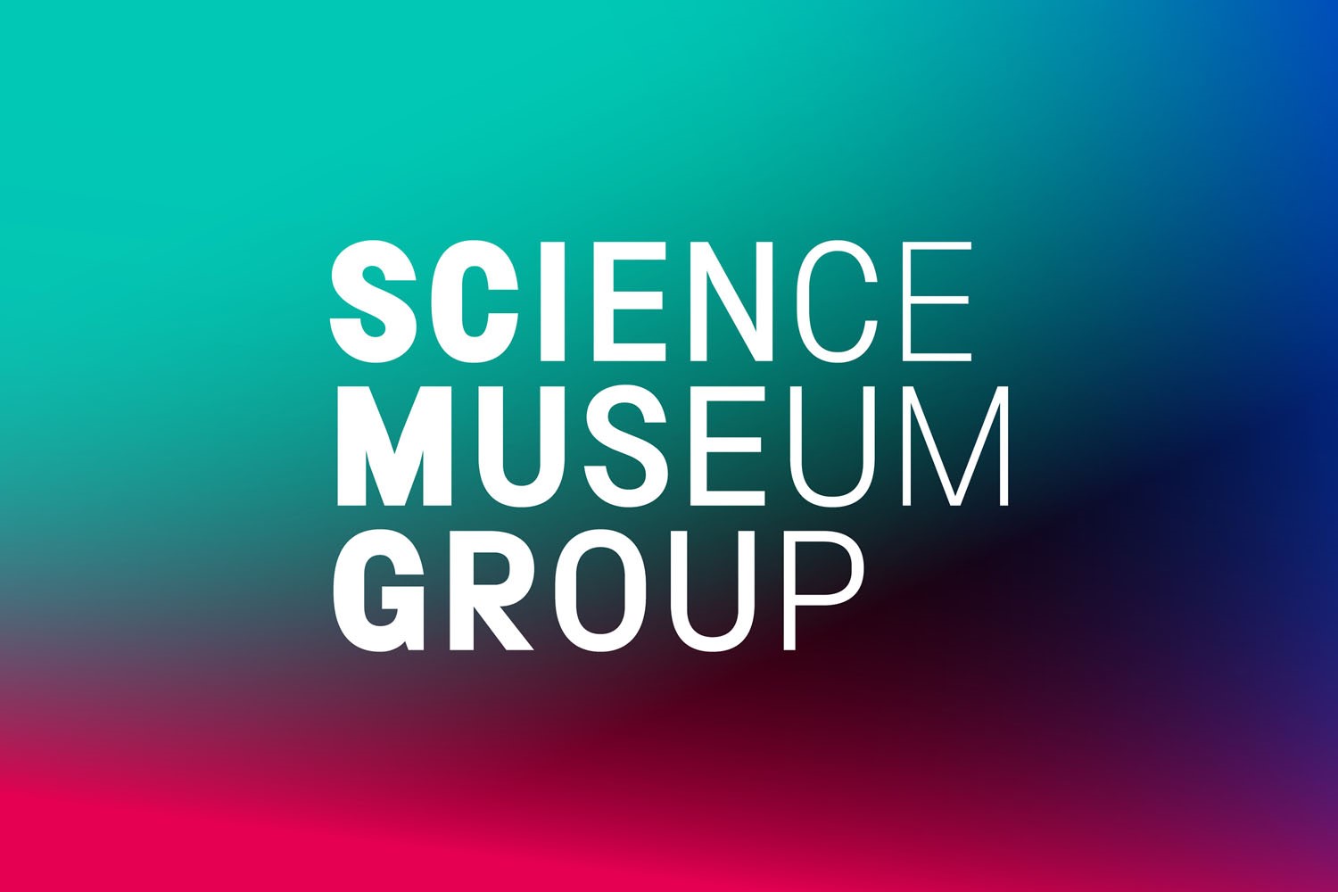
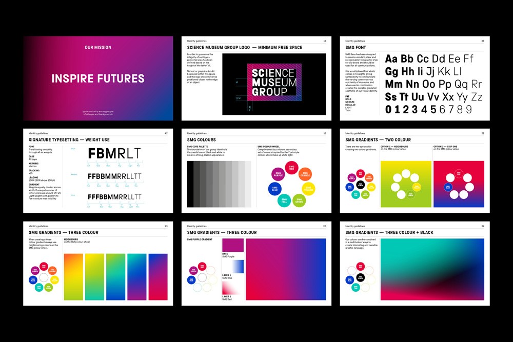
Science Museum Group
Although most famous for its South Kensington, London, edition, the Science Museum Group is in fact a UK-wide brand with visitor centres in Manchester, York, County Durham, Bradford and Swindon. Founded in 1857, the museums aim to entertain and educate legions of visitors of any age – yet it was felt the previous brand did not sufficiently reflect the various outposts of the Science Museum Group.
In a year-long project by London-based design agency North, the Science Museum Group has developed and released a new identity which it hopes will align the group’s vision across its museums and better demonstrate to visitors the contribution of science across all of the UK. Sean Perkins, founding partner of North, says, “In developing the new identity, we drew on the innovation and inspiration that personifies the work both of the Science Museum and the wider group. Just as the museums explore the ingenuity behind scientific advance, so we set out to create a brand that was both beautiful and innovative.”
Using the brand mission ‘Inspire futures,’ North could get to the heart of what the Science Museum Group wanted to achieve as a unique beacon of scientific information among a culture and heritage sector with much choice. It was not, however, a solo project. North also collaborated with type foundry Fontseek and digital agency Numiko to develop the group’s bespoke SMG Sans and online offering respectively. SMG Sans particularly provides a unique outlet for the group’s unique yet widespread identity, with its uniwidth qualities ensuring the type retains a consistent height and width despite its manipulation for various uses and in differing images.
Science Museum Group deputy director, Jonathan Newby, says, “We are the world’s leading group of science museums, but our existing, disparate brands do nothing to celebrate our shared values. North has created a confident and elegant visual identity that proudly projects our unity yet will allow each museum to continue to express its different focus as the identity is rolled out at all sites.”