Spotlight on King's Cross and Union Square

Two neighbourhoods across two major cities unveiled rebrands recently. How was place branding approached in New York and London? Amy Sandys investigates
For the transport hub-cum-entertainment centre of King’s Cross, London, and the bustling, neighbourhood-oriented Union Square, in New York City, updated brand imagery and rejuvenated area design coincide with the establishment of a new sense of identity. Both places are well-known, developing over decades to offer more than just good coffee, but each was liable to be overshadowed in favour of newer, more modern developments in their respective cities.
Yet, both denote important points in London and New York history; an intriguing mix of character, heritage and community mean King’s Cross and Union Square are spatially, economically and socially primed for change. Recent intervention by urban development agencies imbues each place with a renewed urgency, firmly rooting each area in its historic sense of place while forming a future-facing identity enduring enough to ensure success.
For King’s Cross, ‘ghost signs’ and the area’s industrial history are highlighted. For Union Square, it is the concept of partnership which filters through each facet of its identity. London and New York have always been linked by a common sense of identity and purpose. By identifying each place’s distinctiveness, their value endures.
King’s Cross, London
The central London district of King’s Cross has had, at the least, a turbulent history. Dominated by large railway stations since 1851, the area surrounding the transport hub was for many years notorious as a place of poverty, crime and public housing projects. However, the latter half of the 20th century saw increased investment in major public building projects, such as the British Library. The King’s Cross Partnership initiative, run between 1996 and 2003, saw £37.2bn invested into helping local residents enter the labour market, as well as contributing towards an image update for the neglected area. And this trend for material improvement continued throughout the 21st century.
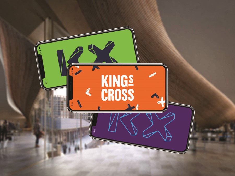
Once a hub for transport, now a hub for entertainment, dining, activities and cultural immersion, the area surrounding King’s Cross is fast becoming a London destination in its own right. To further consolidate the area’s image in a city subject to ongoing socioeconomic change, London-based design agency SomeOne has launched a brand which reflects the dynamic and ever-changing personality of a place that means so much to so many.
Encompassing brand positioning, marketing collateral, wayfinding, signage and digital, SomeOne aims to unite the multitude of stakeholders that enjoy and engage with King’s Cross. Simon Manchipp, founder and executive strategic creative director of SomeOne, emphasises the democratic processes that informed how the direction for a new area identity was decided. “We were very careful to make sure this wasn’t a design project that was imposed, but co-created by the people who live in, work at, and visit King’s Cross,” says Manchipp. “A vast amount of research was taken into consideration to ensure the new work not only resonated with the current and future King’s Cross community, but would keep on working for them.”
As well as adopting a universal approach, SomeOne had also to ensure the King’s Cross place brand was flexible enough to allow the many activities that take place within its boundaries to feel part of a unified brand. “This is a district permanently on the move,” Manchipp says. “Events roll in and out of the squares, parks and spaces with inspirational speed. We hope the constructs and systems we have developed help connect a district that authors a hundred stories every day.”
Despite its place brand for the future, the ghosts of King’s Cross past are never far away. A key feature of the area’s new place brand is the typeface. Designed by international type foundry Colophon Foundry, alongside SomeOne, the agencies considered carefully how the previous inhabitants of the diverse, vibrant area could help inform the experience of its future. This, says Manchipp, involved looking away from the screen – and looking up, onto King’s Cross’ building facades. “A tremendous feature of King’s Cross is how it’s been curated and constructed in such and artful and considerate manner – significantly, the ghost signs seen on some of the buildings, and the ‘Coal Office’ building seen from Granary Square.” Taking inspiration from the visible ‘Victorian sans,’ Colophon and SomeOne developed a new sans serif font, ‘Battlebridge.’ Named after the area’s historic moniker, by which it was known until the early 19th century, the industrial vernacular of King’s Cross is given pre-eminence in a city increasingly characterised by post-modern, digital-first design.
“We wanted something industrial and strong, something that could’ve been cast into an iron girder back in the day,” says design director at SomeOne, Karl Randall. And, with careful consideration to the nuanced context of an area that has experienced change since the first Roman settlements, the resulting headline and display achieve just that.
Union Square, New York
It can be tempting to view the Manhattan as a melee of high-value real estate and shiny office buildings, interspersed with bars and entertainment venues ready to serve weary commuters. However, appearances can be deceiving.
Delve further into the urban jungle of New York City and find the Union Square district, situated between 14th and 17th Streets. A neighbourhood hub that welcomes New York’s residents, visitors, commuters, students and business owners alike, Union Square is viewed by urban dwellers as a retreat. “Union Square is a dynamic and fast-paced neighbourhood centred by its crown jewel, Union Square Park, a beautiful oasis in the midst of all the activity generated on the surrounding streets and from the transit centre located below,” says Jennifer Falk, executive director at Union Square Partnership. The area’s status as a Business Improvement District (BID) drove the creation of a place brand to propel Union Square into the city’s collective consciousness.
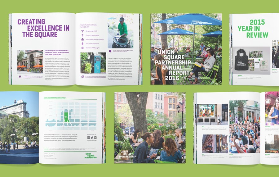
In 2015, the organisation behind the BID, Union Square Partnership, approached New York-based design consultancy C&G Partners to oversee the organisation’s rebrand. Specialising in cultural design, C&G Partners developed a visual system to allow the square’s visitors to recognise the relationship between the Union Square Partnership and the area as a BID. But, says Jonathan Alger, managing partner at C&G Partners, the identity extended beyond merely the name. “Because the name of the BID is nearly the same as the name of the neighbourhood and the famous park at its centre, we realised that we had an opportunity to rebrand a neighbourhood,” says Alger.
The partnership raised $1.5m in addition to its annual assessment revenue, and multinational tech organisations Facebook and Buzzfeed have recently contributed 1,200 further employees to office space on nearby Park Avenue South. For Falk, the square’s brand refresh reflects the partnership’s impact on the surrounding community – as well as consolidating its previously disparate brand into one unified identity. “Our goal was to not only modernise our look, but to also distil it into something recognisable and consistent across all of our neighbourhood services, public events, and communications efforts both in print and online,” says Falk.
This meant creating a brand suite to emphasise Union Square Partnership’s role in the community. A key consideration for C&G Partnership and Union Square Partnership was creating an identity aligned with the nuances inherent to the neighbourhood, while sufficiently differentiating the area from the many competing BIDs across New York, such as Times Square, Madison Avenue and SoHo. Alger says, “NYC is a pretty distracting place. You need a strong, clear visual strategy to stand out.” And, with Union Square one of the only truly round-the-clock communities amid the commercial bustle of New York City, the collaboration between C&G Partnership and Union Square Partnership pinpoints the square as cultural, social and welcoming retreat in a city that can often feel manic – as well as highlight the importance of the work done by Union Square Partnership. “Millions of people passed through Union Square every day that were unaware there is an organisation dedicated to taking care of the neighbourhood, before the rebranding,” says Falk. “The added attention has made our role as the primary advocate for the neighbourhood easier, and the additional support allows us to increase programming and do more for the community we love.”
Peer review
Ryan Tym, director, Lantern
Despite representing iconic areas in two of the world’s best-known cities, the brand identities of King’s Cross and Union Square couldn’t feel more different. On the surface, SomeOne’s King’s Cross identity system has the feel of a polished, developer-led project, while Union Square’s identity feels like a neighbourhood, resident-led initiative. In both cases, that’s probably the point. Place branding can live or die through authenticity, so it’s crucial that the vision the identity promises is matched by the in-person reality.
The KX monogram is the hero of the King’s Cross identity system, perfectly capturing the decade-long transformation of the London destination and reflecting a creative, cultural hub that’s dynamic and ever-changing. This is emphasised when the marque is deconstructed to form the supporting, graphic pattern. Colophon’s unique typeface is an intelligent nod to the area’s heritage and when headlines are paired with soft, pastel colours, the two create a premium look that reflects the ‘post-industrial chic’ SomeOne describes.
C&G Partners has undoubtedly focused on the people of Union Square. Photos of residents and visitors play a crucial role in showing the diversity and energy of the neighbourhood. Conversely, the logo seems to consciously avoid capturing that spirit, or any unique sense of place. Instead, the wordmark appears wholly functional, acting as a sign-off to communications or a lock-up device for events, partnerships and messaging.
The identity system comes alive through event sub-brands, such as ‘Summer in the Square’ and ‘Harvest in the Square’, where illustration begins to provide a sense of energy. As a brand for the community, Union Square hits the right tone, but as an outsider, it could do more to capture what makes the place so special.
For more from Transform magazine, follow us on Twitter @Transformsays


