#TransformTuesday: 30 January
Every week, Transform examines recent rebrands and updated visual identities. This week’s picks are below. For more from #TransformTuesday, follow @Transformsays.
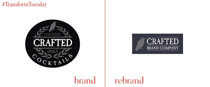
Crafted Brand Company
California-based cocktail mix company Crafted Cocktails has rebranded as Crafted Brand Company following an announcement that it will be expanding its product range to include Crafted Sodas. The renamed company will now operate two divisions, Crafted Cocktails and Crafted Sodas. The latter will debut four new flavours of its sparkling drinking vinegars - blackberry, strawberry, ginger, and club soda with Hawaiian sea salt. The labels of these new beverages are colour coordinated to match the colour of the flavour they represent, and an image of each fruit will adorn the front of each bottle for easy identification. Founder and CEO of Crafted Brand Company, Felicia Vieira, says of the rebrand, “Rebranding our company gives us the ability to continue to develop unique, high-end flavours and expand our product offerings.”
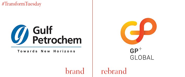
GP Global
Gulf Petrochem Group, a leader in the oil and energy industry, has rebranded and announced a new corporate identity, GP Global. The company says the new name more accurately represents its global presence and recognition. Ashok Goel, chairman and founder of GP Global, explains, “Our new corporate identity is a compelling testament to the evolutions and transformation of our organisation from a UAE-based entity to a global player.” The new name comes accompanied by a new logo. The fluid lines forming an abstract “GP” represents the path of an atom, while the warm colour palette used to create it represents warmth, energy, and intensity.
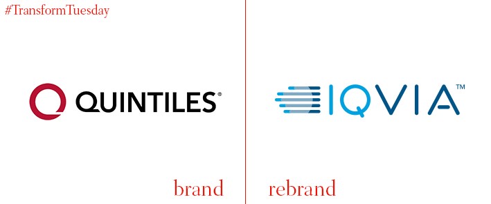
IQVIA
Quintiles, a health information technologies and clinical research company, has been renamed to IQVIA as of November 2017. The company, now trading under the ticker IQV on the New York Stock Exchange, is the result of a merger between Quintiles and health information technologies company IMS Health. "Today is a critical moment for our organisation,” says IQVIA chairman and CEO Ari Bousbib, “As we are launching a new name that underlines our vision of helping healthcare stakeholders move forward with healthcare.” The company’s new logo abandoned Quintiles’ red circle in exchange for a wordmark and logo featuring various shades of blue. The new logo features five horizontal lines of varying lengths, each coloured in three shades of blue, drawing comparisons by some to a human hand. The bright blue “IQ” contrasts with the navy VIA, in part to place emphasis on the names of its pre-merger companies.
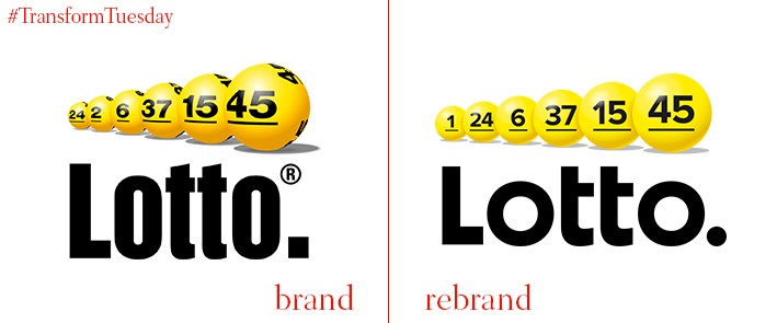
Lotto
Lotto, the Dutch state-run lottery, has announced a new visual identity courtesy of Dutch branding agency Millford. The logo remains extremely similar to its predecessor, only being given a minor style upgrade to capitalise on the flat design trend. The yellow lottery balls above the wordmark remain intact, but are presented in a flat horizontal line instead of facing an angle as before. The wordmark has also been adapted, with the vertically stretched, boldfaced logo now replaced with a more contemporary font. Millford announced, via its website, “Together with Lotto we developed the visual identity of the brand. The style we have laid down is in line with the new Lotto game. The balls of the game are the hero of identity and so we have been able to visualise the essence of the game.”
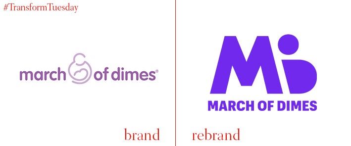
March of Dimes
March of Dimes, founded by US president Franklin D. Roosevelt in 1938, is a non-profit organisation that works to prevent birth defects, premature birth and infant mortality. The organisation, to mark its 80th birthday, recently unveiled its new logo and wordmark. March of Dimes has traded in the pastel purple of its former logo for a bold royal tone, and the wordmark’s rounded lettering and fluid lines are now geometric and sharp. The former logo featured a mother cradling a baby, while the new logo uses the O and D in MOD to create the silhouette of a pregnant woman. March of Dimes’ new promotional material now features thick purple banners with angled edges, overlayed by the same bold, sans serif font of the organisation’s new wordmark. The condensed logo and square advertisements are clearly optimised for social media use, and the new visuals serve to make the 80-year-old company more eye-catching and contemporary.
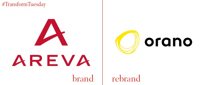
Orano
French uranium mining and nuclear fuel company Areva has rebranded under the name Orano. This is following a company restructuring in 2017 that resulted from falling uranium prices that wiped out Areva’s equity. Areva’s former logo, a simple red A, has been replaced with a spiralling yellow circle that represents the yellowcake uranium concentrate Orano extracts during the processing of uranium ores. Areva’s red, geometric wordmark has also been replaced by white, rounded off lettering that emphasises the rounded letters found in the name “Orano”, as contrasted with the harsh, angular letters in Areva. “We had to change our name,” says chief executive Philippe Knoche. “We are a new company with a different perimeter, focused on the fuel cycle.” The new name and logo mark a fresh start for the company, which hopes to rebuild itself to once again be profitable. “We will do it with humility,” says Knoche. “That is why the name is written in lowercase.”
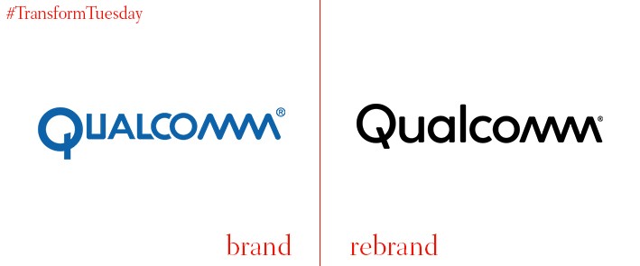
Qualcomm
California-based telecommunications technology company Qualcomm has unveiled a new visual identity. This design, created by Interbrand, most notably features an updated wordmark for the company. The previous wordmark had inconsistent typefaces, incorporating both squared and rounded lettering. It also featured a distinctive “Q” which had an off-centre, vertical tail. In the updated wordmark, the unique tail is abandoned for a more traditional one, while the rounded lettering compliments Qualcomm’s signature combined “mm,” which was kept in the new version. The new visual identity also includes a set of icons, which appear layered and 3D. According to Interbrand, “The design system is based on layers that show Qualcomm is at the core of innovating these platforms... Their products and the products their customers create always exist on the top most layer of the system. Qualcomm’s brand colours are found on the lower most layers to reinforce that their inventions and breakthroughs are there to support their customers’ next innovation or product.”
For more from Transform magazine, follow us on Twitter @Transformsays


