Photo finish for sports media rebrand
Since it was founded in 2007, Bleacher Report has become the go-to site for sports fans and writers. It curates content across sport and news in the UK and US. Its initial brand focused on the initials ‘B’ and ‘R,’ separated by a slash. The blocky font evokes American sports uniforms, but didn’t make for a particularly vibrant site
The company, now owned by Turner, introduced a rebrand this month, done in-house. The online brand book says the site’s ethos is to, “Own and believe in everything you do. Take chances and provoke conversation. It’s not what we do, but how we do it. Our voice is rooted in tone, edge, swagger, style, energy and at times irreverence. It is the thing that is uniquely ours and what pulls our audience to us.”
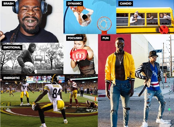
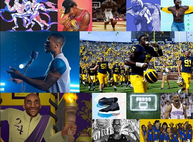
Bold statements are complemented by vivid, colourful photographs of sporting events and athletes, offering contrast to the otherwise monochrome guidelines.
The new guidelines around imagery bring a new life to the site. Rather than the typical game day photography that adorns most sports sites, Bleacher Report is aiming for something a bit different. “The best images tell a story themselves. They should capture the moment, the mood, the feeling...They should evoke an emotional response from the viewer. When possible, use images to make a bold statement by favouring high contrast and high saturation.” It is this outlook that should help set the Bleacher Report apart from its competitors, though the policy is yet to be implemented across the site at large.
The new Bleacher Report logo is still a blocky typeface, though less cliché than its predecessor. It is styled in black and white, all caps with a shorter slash separating the letters. The wordmark lockup features ‘Bleacher Report’ rendered in black in all caps alongside the white-on-black logo. The online guidelines are descriptive in terms of how the new brand is to be used because of the collaborative nature of the site. It accepts pieces from fans and other content providers as well as curating its own content. Thus, the guidelines offer defined boundaries on the use of the new logo.
Like many logos these days, the B/R in the mark can be used as windows through which to view images a facet which makes for an effective application in video as well. The new palette is black and white with a green accent. The fonts are Effra and Proxima Nova, across multiple weights.


