Highways in the sky
For much of the world’s working population, flying nationally and internationally is part of everyday life. According to the Civil Aviation Authority (CAA), in the second quarter of 2016 the UK alone saw 71 million terminal passengers pass through its airports – as well as 588,000 commercial flights. Yet, often forgotten by passengers in the process of taking off, travelling or landing, is the job of the air traffic controller, standing by to ensure all journeys run smoothly.
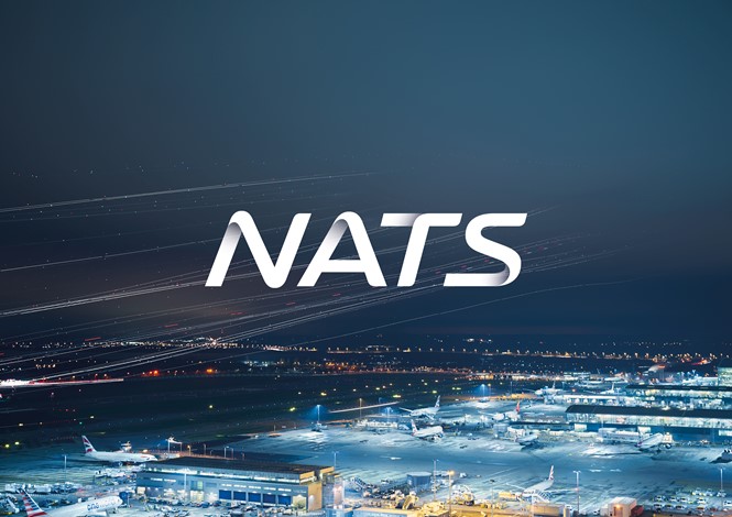
Air traffic control for commercial flights in the UK began in the 1920s; National Air Traffic Service Holdings (NATS) is the UK’s main air navigation service provider. Responsible for the 2.4m flights and 250m passengers traversing UK airspace annually, NATS has operated in a public-private partnership since 1998. The company recently adopted a new visual identity, created by London-based communications and branding agency The Team, to consolidate NATS’ organisational positioning and unify its previously disparate brand architecture.
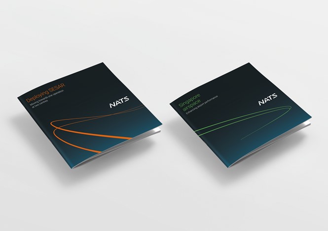
Embedded within the updated visual identity is the redefined purpose behind NATS – ‘Advancing aviation, keeping the skies safe.’ With many travelling airline passengers unaware of NATS’ work, the rebrand project aims to make visible the organisation. Its logo aims to unify all the airports and products operating under the NATS brand, while tailoring its brand architecture according to the airport in which it operates.
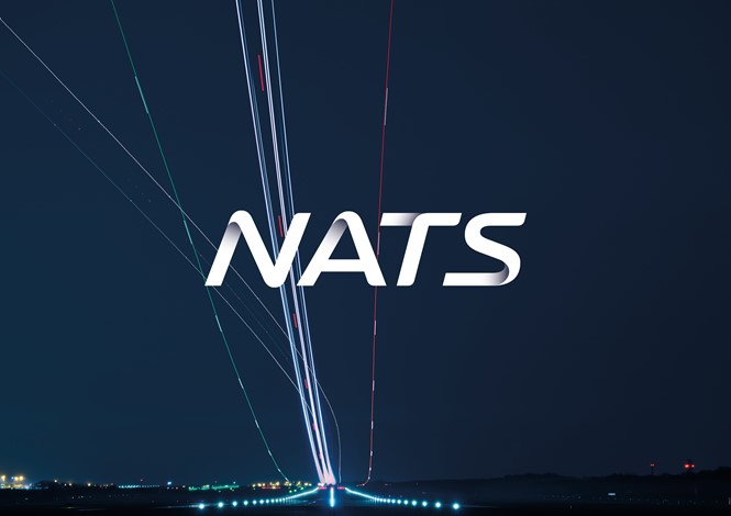
David Recchia, executive creative director at The Team, says, “‘Advancing aviation, keeping the skies safe’ is a very clear purpose for NATS. Long exposure photography enabled us to illuminate what NATS does every day, revealing the invisible ‘highways in the sky.’ This inspired the thread which runs through the identity, from logo, photography, graphics and even iconography. We created a design system inspired by the world within which NATS operates and tells the NATS story in an inspiring and engaging way.”
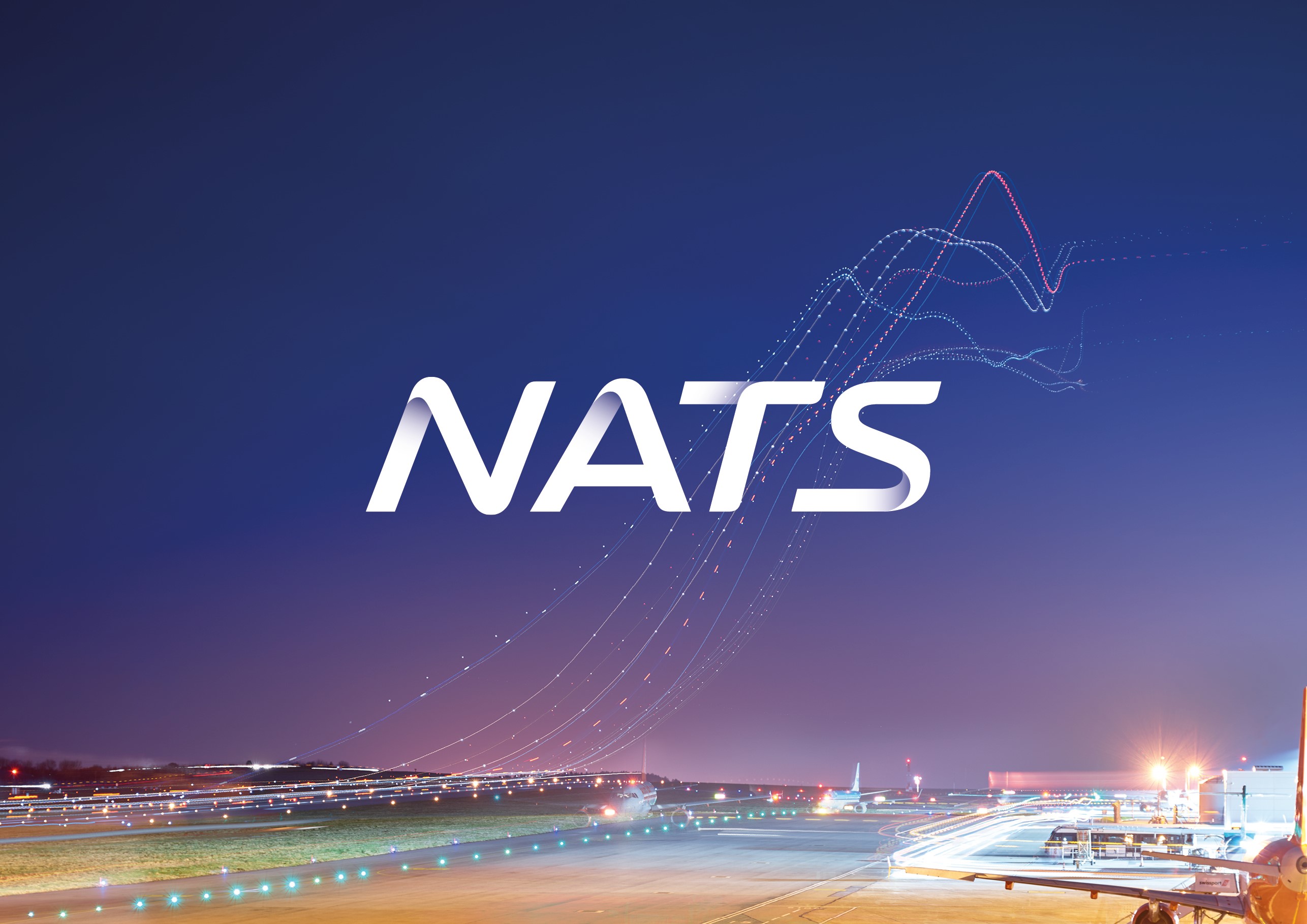
Despite the additions to its consumer-facing brand, The Team has ensured the NATS brand heritage is also acknowledged. The almost 100-year history of UK air traffic control adds unique longevity to NATS; The Team’s strategy builds on the culture inherent to a high-pressure yet rewarding environment. This is exemplified through such additions as the Flightmark logo, whose inclusion reinforces the NATS aviation culture, and an interpretation of the ‘invisible paths’ plotted by NATS.
Kevin MacKenzie, brand strategist and managing director at The Team, says, “The new identity draws influence from the past that connects and sets a pathway that represents the focus NATS has on the future. The refreshed identity will help NATS along the way echoing the new purpose of the organisation, its values and brand clarity.”
Practical application of the NATS brand is also considered. Jonathan Palk, head of marketing communications and brand at NATS, says, “Our refreshed brand is more user-friendly in a print environment and is also more suitable for use in digital channels – which was not the first consideration when we launched our previous brand seven years ago.”
“From start to finish, The Team pursued perfection to develop a brand and identity system that would accurately reflect the basis of our culture, our actions and our purpose.”
The updated NATS branding will roll out from spring 2017.
NATS previous logo


