Making brand architecture magic
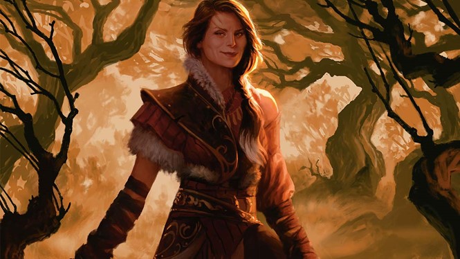
What began in 1993 as a game convention attendees could play in the awkward time periods between events has since become a global phenomenon with fans of all ages. Magic the Gathering is no longer a single brand but a family of games available across digital and physical platforms. Its world also appeals to artists who design unique imagery for the ever-expanding game universe.
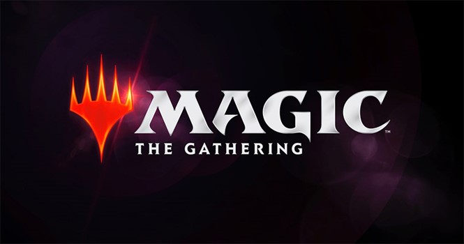
Senior creative art director for Magic the Gathering, Matt Cavotta, writes, “Over the course of Magic's history, there have been points where a gap opened between what is true about the brand and what is represented on its ‘banner’ – the brand logo. Last year we felt that gap widening, so we set out to close it, committing ourselves to designing a new logo that respects our rich history while amplifying the qualities that make the brand strong going forward.”
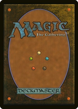
This shift marks the third rebrand in Magic’s history. However, the new system comes with one notable exception – the iconic and consistent card back designs. Their consistency is not only a beloved brand touchpoint, but integral to the game’s hallmark of allowing players to create individualised decks.
Cavotta says the 2015 edition of the brand identified the brand well, but didn’t accurately represent the company’s status as an entertainment brand, rather than just the purveyor of playing cards. The anchor of the new brand is the ‘Planeswalker’ symbol – a facet of the game since the beginning and one that has been increasingly made prominent in branding and communications.
He writes, “A banner was needed that could fly proudly over all of Magic's worlds and themes, in the tabletop card game as well as in digital games, apps, narrative entertainment, fashion and lifestyle products, animated and live-action entertainment, and anything else that the future could hold. This would require a bolder step forward than another refresh of the original logo. With one eye on the original and the other on the future, we took that step.”
The new brand does away with the previous iterations’ focus on integrating the logo with art from the game itself. This new approach is much simpler and should allow for a more cohesive brand architecture. That step is already being seen with the introduction of the ‘Magic: The Gathering Arena’ logo, part of the company’s digital strategy.


