Leisure and shopping centres escape outdated branding

With 470m of ski slopes, 792,500 sq ft and millions of visitors per year across two locations, the two Xscape leisure centres in the UK needed a brand that could support their lofty goals.
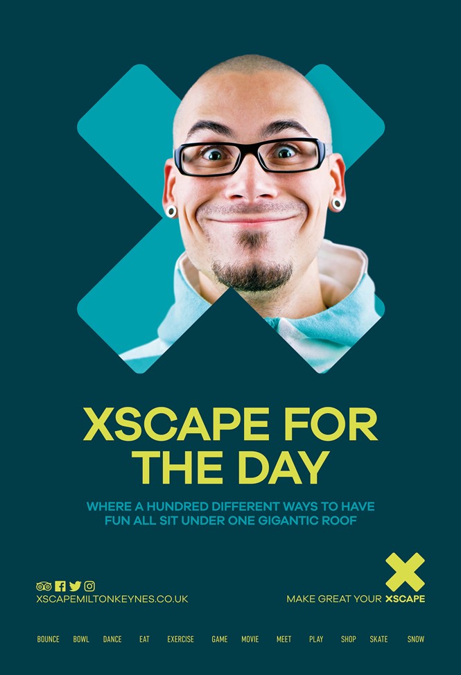
Owned by Land Securities, the sites previously boasted a logo worthy of an ’90s-era arcade. The pink-and-white shadowed text on a steely grey disc didn’t quite cut it for a modern leisure brand trying to capitalise on the growing desire for experience-driven activities.
That ethos was one of the driving forces behind the rebrand, which was undertaken by Yorkshire-based 10 Associates. Jill Peel, founder and creative director of 10 Associates, says, “The new brand has a modernity, a relevance and an elegant simplicity that is not only current but can stand the test of time and will resonate with audiences young and old. In addition, the all-inclusive nature of the brand story and personality aims to inspire and excite audiences to make the most of life.”
The dynamic brand uses colour, a blocky white typeface and a window-frame treatment for the ‘X’ to transform Xscape into a modern, fun destination for all ages.
Jade Elliott, marketing manager for Xscape Yorkshire, says, “We required a new brand that better encapsulated the Xscape offer and could work hard in-line with our shift in marketing strategy. Our ultimate aim is to appeal to the family market across the whole of Yorkshire, and beyond, positioning us as a day-out destination.
Both Xscape centres are crucial destinations in their respective communities. Milton Keynes – the so-called newest city in the UK – boasts a massive shopping area, theatre and leisure centre in its city centre; Xscape is a key part of that. In Castleford, Yorkshire, the centre has helped bring 600 jobs back to the former coal mining town. They also serve as destinations in their own right for skiers, families and shoppers alike.
The new approach has to also be easily identifiable, without overshadowing the many brands that comprise one of the Xscape centres. Its distinctive tone, but subtle colour palette should do just that.


