Spotlight on W
New UKTV channel W has set out to redefine television branding in Britain. Amy Sandys examines the new brand and its unique approach to positioning
Beginning to broadcast television in 1936, the BBC was the first organisation to use the airwaves on a regular basis for viewers across the UK. After a six-year hiatus during the second world war, broadcasting began in earnest in 1946; since, the BBC has become a multimedia brand recognisable across the world. Despite its longevity and associated heritage, the BBC is one of many broadcasting organisations to change its visual identity and some content styles in the past year. Along with Channel Four, channel Five and the digital arm of ITV, ITV2, the BBC overhauled its visual identity for its BBC3 channel. Despite retaining its characterful purple and pink colour palette, the BBC optimised BBC3 to become an online-only platform, characterising an age where the relationship between television and the internet is increasingly less defined.
Such total overhaul of channel brand strategy is a trend increasingly characterising the entertainment sector. On a platform with an ever-growing number of competitors, visual identity is more than ever a key differentiator. No network, the archaic BBC included, is immune from this – as UKTV is all too aware.
Jointly owned by BBC Worldwide and Scripps Networks Interactive, UKTV’s plethora of channels each harnesses a separate visual identity. Dave, which focuses on a mostly male demographic, is perhaps its most well-known, and broke boundaries with its initially controversial name, called after the simple fact, ‘We all know a bloke named Dave.’ Other offerings include Good Food and crime drama- focused channel, Alibi – all have a clear genre focus, around which their visual identities are formed.
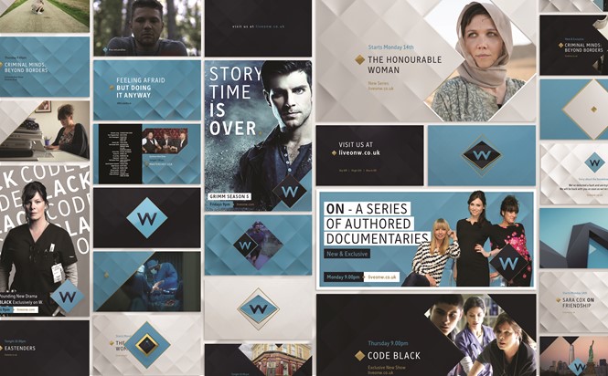
In February 2016, UKTV announced the replacement of its flagship entertainment channel, Watch, with new channel W. Its aim, to provide ‘smart escapism and rewarding journeys’, is reflected in an entirely new visual identity, as well as a disassociation from the previous Watch channel. W has a more niche demographic focus than its predecessor, towards females aged 30-39. The brand identity has been constructed accordingly and spans many styles of TV entertainment; including contributions from US television series, such as the popular Code Black, as well as documentaries fronted by British personalities Grace Dent, Sara Cox and Sophie Ellis-Bexter.
The challenge lie in developing a television channel brand that could encompass the break from the Watch iteration, while forging its own unique identity. Mike Moloney, founder and creative director of Art&Graft, the creative agency tasked with designing W, explains, “We have a very clear understanding of who we’re speaking to, and how that connects with the actual content of the TV channel. They’ve obviously got a whole range of shows, so the branding needs to be relevant to that as well – they’re the kind of two pointers. And really our challenge then is to find a language and tone of voice and a visual approach to join those dots.”
This is a vast change from the original design Watch began broadcasting with. Designed by creative agency Red Bee Media, its visual identity was anything but subtle. Literally drawing on the concept of ‘watching,’ an eyeball named Blinky was the channel ident – this invariably drew criticism from some commentators, who compared its likeness to that of a CCTV camera. Aiming to capture a variety of audience demographics, the channel had no specific genre loyalty. The variety of programmes broadcast reflected a wide scope of the British and US broadcasting landscape – perhaps to its detriment, considering the vast choice of channels with a much clearer audience focus.
Yet, following the decision to move the BBC’s light entertainment channel, BBC3, exclusively online, replacement W has been able to capitalise on the void left by BBC3’s mixture of factual documentaries and light-hearted comedy dramas. Furthermore, the channel has secured the rights to same-day and Sunday omnibus repeats of leading BBC1 soap Eastenders. Reaching an all-time high of 1.4m viewers in 2007, second-showings of the soap are a lucrative investment for the channel – Eastenders viewing rights should allow W to establish itself as a channel popular enough to carry one of the UK’s most- loved soaps.
“We tried to find a way we could explain this multifaceted layered design to market to the modern woman. We’re trying to show a journey through different set ups which could be perceived as challenges or situations to take the viewer out of their comfort zones”
Popular in the 30-39 age group, the soap is just one of several programming choices designed to refocus W on a female-centric demographic – its previous shows were general entertainment from the BBC archive with no specific focus. UKTV has also been sure to schedule a variety of other genres to ensure it is not alienating other potential viewers, programmes covering major life events, such as marriage and house buying, tap into the cultural paradigms often experienced by women below 40. Thus, the female focus of W is universal across its branding, and has created an identity entirely separate from its previous iteration.
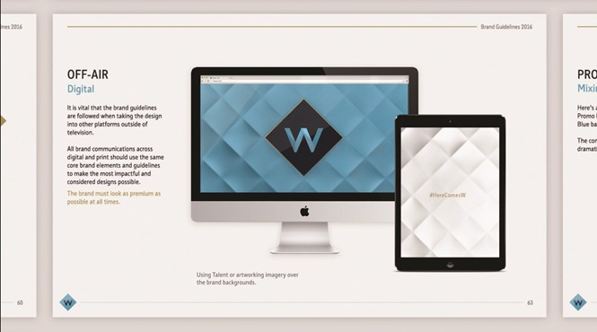
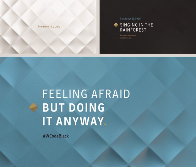
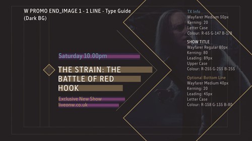
W therefore surpasses branding itself around a purely visual identity, ensuring its content reflects the ‘premium’ label on which its brand direction is now based. Arguably an unusual development for channels in the UK, which often develop their identities exclusively around the channel number, content and audience are the guiding forces behind the development of W’s identity. As such, a black, teal and silver colour palette is the leading component around with the brand is developed. On Art&Graft’s colour choice, Moloney says, “We presented this idea of these three colours. So in the day time we had this white silk, and in the evening we had a dark blue texture, and then in between the two time zones we had a lighter blue. I think for a female-focused audience, the choice of colour was interesting – historically, blue’s not connected with a female audience.” The unusual colour palette also forms a striking backdrop to the variety of innovative visual imagery employed, with Art&Graft using 3D techniques to develop the brand identity.
A key component of reimagining Watch as W, a channel predominantly targeted at women, was avoiding design tropes associated with ‘traditional’ notions of femininity. For example, the use of right angles to form a diamond-like texture on the inset background alludes to the quality entertainment provided for that specific audience. Yet, by being implemented in a steely grey, notions of seriousness and power are also conveyed. It is design tropes like this, says Moloney, that ensures the femininity built into the W brand’s specifications is not a patronising reuse of clichéd tropes about women. “We didn’t want to go down this patronising route,” he says, “and so we started looking at different ways of capturing what it means to be a modern woman.”
The W channel launch has been about much more than just its content. In fact, the programmes scheduled for broadcast have almost taken a back seat, at least during the design phase – pleasing the female viewer is central to the new positioning.
“We looked at textures and this kind of premium branding that you see a lot of in fashion editorials,” Moloney continues. “Bold, strong typography combined with luxurious textures – imagery the audience would feel comfortable with while watching the shows, and feel comfortable with the kind of visual language we were using, because they’re used to seeing them in magazines which they may read as well.”
Bring in textures, they have. The lines constructing the background diamond shapes of W ident act as a network, joining up the channel’s viewers around one common trait – the W brand sits in the middle of the brand ident. The diamond’s gold outline marries elements of longevity and elegance, continuing the sense of luxury already generated through the plush blue background. Moloney says, “The on-screen presentation, that revolves around these really soft, tactile beautiful textures, ripples and waves over this quite solid, secure, strong diamond grid. And really the thinking behind that was the multi-faceted nature of the modern woman.”
He adds, “You can still be soft and delicate and sensuous and all those kind of things, which we try to replicate in the textures. But underlying all that, women can be strong, and determined, and brave.”
Yet this diamond pattern also creates a quilted effect, ensuring notions of comfort are evoked, as well as the ‘solid, determined and brave’ character of UKTV’s target audience. What the channel offers to its viewers is precise and clear – yet viewers can expect to be challenged, and the inclusion of programmes which seek to broaden the mind is high up on the W agenda. Both UKTV and Art&Graft were keen to distance themselves from programmes that did not provide stimulating entertainment. Moloney says, “The research led [UKTV] to a character described as ‘Emma.’ She was mid-to-late thirties, she’d been to university, she was educated, she had a good job, and then she’d settled down. She’d had kids and was watching daytime TV, but she still wanted to be spoken to in a more intellectual way – she wasn’t really into the fluffy, pink stuff.”
So far removed is W from the ‘fluffy, pink stuff’ that even its animated ident has been designed with empowerment in mind. Moloney continues, “We tried to find a way we could explain this multifaceted layered design to market to the modern woman. So what we’re trying to do with the ident is show a journey through different set ups which could be perceived as challenges or situations to take the viewer out of their comfort zones.”
He adds, “As we move through the idents, we’re put through situations which might scare us. What we’re saying there is if you come on this journey with us, if you stay with us on this journey, it will be ultimately worth it.”
However, for all the focus on enablement and the multi-faceted nature of women, perhaps the most striking aspect of Art&Graft’s design focus is the references made to jewellery and glamour. Traditionally cited as feminine tropes, the inclusion of a diamond as the focal point of the image redesign especially suggests a certain broadcast quality – this is down to, Moloney says, “[W] wanting to look at female-focused brands in a more intelligent way.” Graphics are again the driving force behind this brand idea, using the simplicity of the channel name to employ a detailed yet uncomplicated brand identity. Capitalising on a channel name, rather than its listings number, is not a complete departure from its original Watch iteration, which based its brand character on abstract versions of eyes. This corresponds to the network overall – all UKTV channels are identifiable through a channel name, rather its listing number.
While the development of W is a complete break from the Watch identity and channel content, the previous Watch brand itself experienced a variety of iterations from its inception eight years ago, never retaining a single identity for more than a few years. For UKTV, W is a chance for the network to complement its existing channels and enhance the network’s overall credentials. For Moloney, the real satisfaction comes from the channel’s sophisticated femininity. “The way we position W in terms of speaking to its audience in a more intelligent way,” he says, “is probably the highlight of the project for me.”
Peer review
![]()
James Packer, creative director, Industry
Men get Dave, an overt tongue-in-cheek play at gender stereotyping. But will women switch on to W? The latest gender focused channel, ‘W’ is aimed primarily at women. What does the brand tell us about the content we can expect to see? The W identity borrows from the language of luxury branding, accentuated by the use of steel blue and gold. However, the ‘W’ lacks character and, perhaps to compensate, the overall identity is unnecessarily overworked with the addition of the crystal texture, the placement of the ‘W’ in a diamond form and the metal effect edges. On screen, the transitions help bring the brand alive. Overall the design feels a bit superficial and it does not give me an inkling about the content I could expect to see. Of course, the proof of its success will be in the viewing.