King of rebrands
Despite the influx of artisan craft beer on the international market, Budweiser retains its place as one of the most popular lagers sold. To ensure its classic appeal is compatible with the modern day, design firm Jones Knowles Ritchie (JKR) has led a creative rebrand for the American lager.
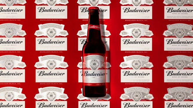
Currently, only 80% of Budweiser worldwide has identical packaging. The rebrand aims to ensure that all Budweiser sold adheres to the same design, bringing a taste of American lager into every market possible. Its new packaging has taken on a global, unified feel while retaining the historic sense of identity which ensures it is appealing to consumers - even today.
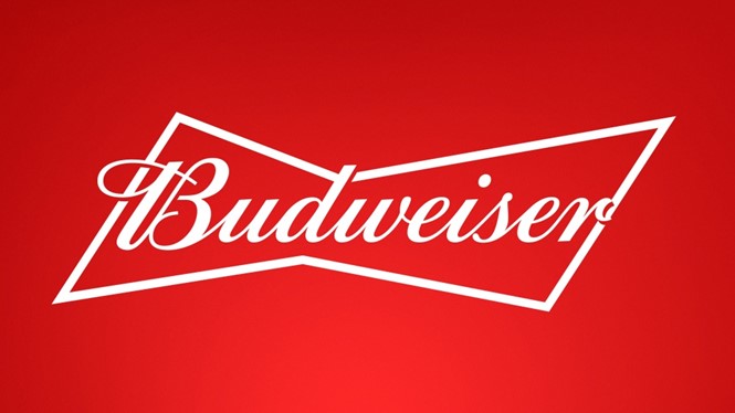
A Budweiser brand element instantly recognisable to any beer drinker is the red bowtie which has been at the forefront of its visual identity since its inception. JKR has retained this, although it is no longer the central focus on the redesigned cans and bottles. Instead, the gold from the original logo has gone, as well as the crown which rested atop of the Budweiser script, and only red and white remain. The logo font is still based on the original 1860 typeface, but has been gifted a two-dimensional feel.
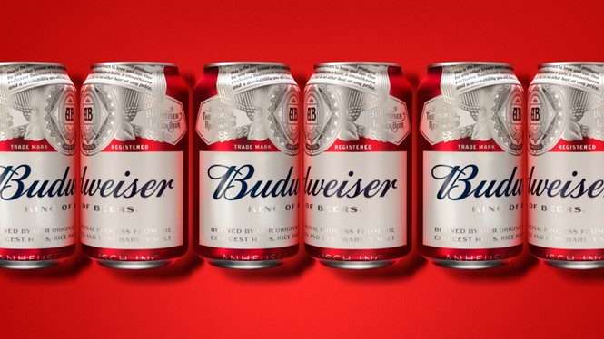
For aluminium cans and glass bottles, the red bowtie emblem has been replaced altogether with a navy blue offering, underpinned with silver typeface. Two new fonts, Bud Bold and Bud Crafted, were created especially for the redesign - both are based on Budweiser’s industrial heritage.
This European-style redesign is classy and slick, ensuring Budweiser can keep pace in a global market increasingly characterised by independent breweries and innovative lager choices. There will be no doubt among consumers that they are drinking a historic American beer, while its packaging indicates that Budweiser is ready to innovate for the modern world.


