#TransformTuesday: 26 January
Every week, Transform examines recent rebrands and updated visual identities. This week's picks are below. For more from #TransformTuesday, follow @Transformsays
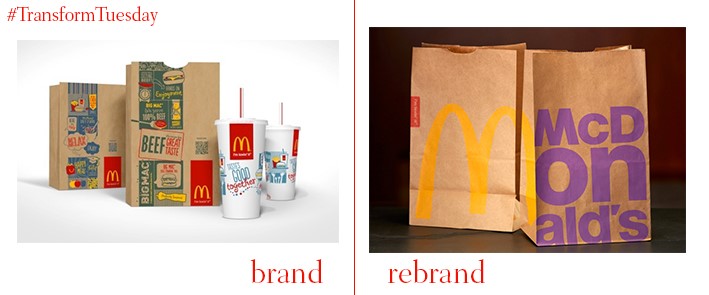
Back in 2015, McDonald's issued a statement saying it wanted to launch a campaign to become known as a ‘progressive burger chain’. At the beginning of 2016, with the help of branding agency Boxer, it seems the fast food giant is one step closer to achieving this aim through the launch of a new visual identity. With a bold typeface on its trademark brown paper bags, and reds and purples to offset the classic golden arches, the historic global brand is given a modern twist. An ad campaign featuring food containers appropriated into fashion accessories adds a playful element; the overall effect is sophisticated and fresh.

Although there has been no dramatic logo change, Nando’s has adopted a new visual identity which aims to reflects its South African roots. The ‘Peri red’ design colour undoubtedly highlights the product for which the chain chicken restaurant is most famous – its Peri-Peri sauce – and the font is the same design as that used on road signs in Johannesburg, where the first restaurant was opened. Nando's cultural heritage is the theme for this new visual identity, and contributions by South Africa-based design agency Sunshinegun give the brand a modern, African vibe. This redesign is contemporary, refreshing and embraces South African culture.
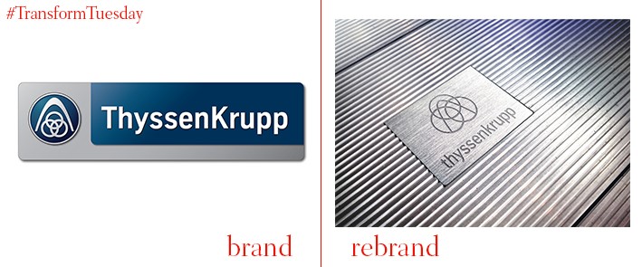
German-based engineering firm Thyssenkrupp recently rebranded to highlight the integration and unity at the heart of its services. The rebrand cements its place as a diversified industrial group and, with a legacy dating back to 1811, a new logo stabilises the firm’s history as a key player in German engineering. The new, light blue logo is bold and clear, uniting the previously separate Thyssen and Krupp elements into a visually recognisable symbol. It also aims to put customer service at the heart of its visuals, emphasising the high-quality care customers can expect.
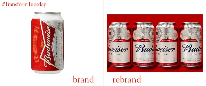
A new logo design for Budweiser marks the first time in the beer’s 140-year history that all of its packaging is identical – previously it was only 80%. Its new visual identity, created by global design agency jkr, adds a stylish, sharp edge to ‘the King of Beers’, hinting at a quality previously unrecognised in the bright red bow icon which adorned earlier packaging. Two bespoke navy blue fonts have also been created to lend Budweiser a more distinct edge and create a sense of legacy – blue was always used on the beer’s packaging until a previous redesign in 2011.
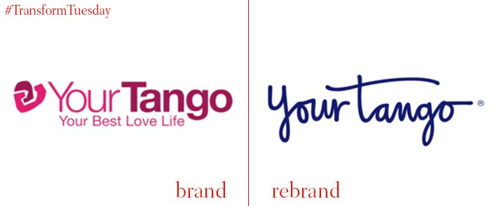
YourTango, a publisher focused on love and relationships, has unveiled a rebrand which aims to capture the playful, joyful nature of the service it provides. Unveiled by design agency and brand strategists Lippincott, also behind the YourTango website redesign of late 2015, the new logo aims to, "Emotionally engage users", according to YouTango CEO, Andrea Miller. The hand-drawn element adds a personal touch, with its sophisticated blue font colour a world away from the original, slightly awkward branding.

International design consultancy Dragon Rouge has taken on well-loved dairy brand Jacky, in a bid to reinstate its appeal to a teenage audience. The Finland-based dessert, milkshake and yogurt creators, part of Orkla Foods Finland, moved away from a generic Angry Birds design to embrace notions of fluidity and transformation. The cows on its packaging capture ‘cool’ English phrases; dynamic images and bright colours will help the products stand out among a range of competitors.