Johannesburg Stock Exchange has revealed new identity
SIMON SMITH – 8 MAY 2014
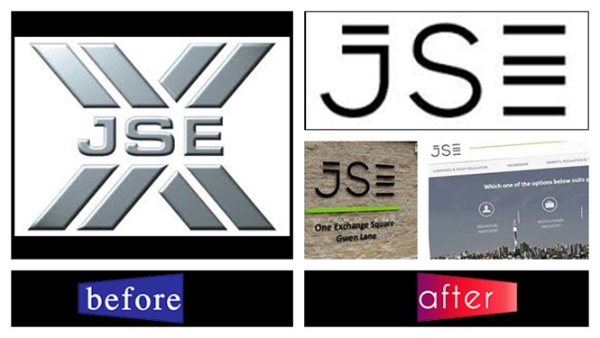
The Johannesburg Stock Exchange (JSE) has revealed a new identity that aims to communicate a modern and well-connected brand positioning with an African feel.
Research was conducted among clients, employees and other stakeholders prior to the rebrand, identifying their perception of the JSE brand. The research found that while JSE was seen as professional, reliable and honest, it also came across as old and somewhat conservative.
The new logo and colour palette is a bold black, white and green combination and the typography has a clean and digital feel. The stacked lines in the logo are intended to illustrate JSE as a secure platform for growth. A large portion of the rebrand is digital-based and the new website is a key aspect of this.
Zeona Jacobs, director of issuer and investor relations at the JSE, says,
At the JSE we’ve been doing some serious thinking about our positioning in South Africa and the world. Our visual identity needed to represent our position as a leading African exchange which is driven for stakeholder growth and to showcase the strong technology component of the business. It also needed to be more accessible to investors.”
JSE will also lose the brand names of some of its acquisitions since they are now deemed to be fully integrated and this will create a more cohesive brand.
The rebrand, undertaken by Interbrand, took a year to complete. All elements of the new brand will be gradually implemented up until December 2014.


