Is hidden meaning in logo design important?
SIMON SMITH – 8 MAY 2014
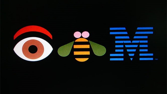
I’m a huge fan of the legendary Paul Rand, who designed such iconic logos as IBM, ABC and the original logo for UPS. His designs are simple and timeless, yet more importantly, distinct and instantly recognisable.
As much as I love his work, one of Rand’s quotes has haunted me as a designer. He said:
“A logo derives meaning from the quality of the thing it symbolizes, not the other way around.”
He continued:
“It is only by association with a product, a service, a business, or a corporation that a logo takes on any real meaning, If a company is second rate, the logo will eventually be perceived as second rate.”
Why does this short statement bother me so much? It’s because my whole life, I have looked at logos and wondered to why it is the way it is. Sometimes I make my own opinions, sometimes I go online to find out more. For example, did you know the two rings within the Toyota logo represent “The heart of the customer and the company overlapping to express a mutually beneficial relationship and trust between each other.”?
Now let’s look at the Paul Rand design for IBM. I had always perceived the lines to represent computer data loading and transferring and the font choice to symbolise a strong, secure business. How disappointed and intrigued was I when I discovered a YouTube interview with Rand in which he reveals that the stripes are there simply to create a distinctive mark. Was there no more to it than that? The stripes were simply a visual choice?
Did I, as a viewer, relate it to computers because its one of the original logos associated with computers? It’s hard to tell as the association is embedded in my mind, but I believe this is likely.
Since IBM is one of the most recognisable logos in the world, and the design decisions were not intended to have meaning, how important is hidden meaning in logo design? Does it really matter what the design looks like as long as it’s distinct? Does our association to and opinion of fonts and colours change based on the product and service offered? Do our design decisions really matter or is it simply down to the success of the business?
Personally, I love meaning in logo design and I try to apply it to every logo I create. Even though the average Joe will rarely notice the hidden meaning, I love that when you do discover the tale behind the design, you feel a sense of ownership. This connection with the audience is important. As a designer, I like to justify my design decisions, explain the reasons behind each choice I make and support them with research. It makes me feel confident in my design work; and its hard for the customer to dislike the design when it represents everything for which the business stands.
Paul Rand’s quote is entirely true. It’s something every brand designer needs to realise. I’m sure that if IBM’s service was poor, the logo would also be perceived poorly. However, because the company succeeded, so did the design, with Rand along with it. Perhaps I’m making things too complicated as a logo designer and I should just have more fun making pretty pictures.