Cathay Pacific’s subtle modernisation

The primary challenge of rebranding an airline is the extent of its reach. Airline brands must strike a balance between being intrinsically tied up with their home country’s national image while remaining accessible to their international customers.
Cathay Pacific is an airline with its roots in Hong Kong, but with 111 flights per week it also has an extensive international service. Its new brand, created over 18 months by Hong Kong branding agency Eight , is a simple modernisation of the previous brand.
Iain Richardson, creative director at Eight says, “Essentially we simplified the logo, and we set the brushwing free. In addition to making it more contemporary, the changes align with our overall approach to refining the Cathay Pacific brand — editing, simplifying and aligning the brand across all areas, around a well-defined design ethos.”
The brushwing and the typography are altered to appear more modern and the box and red line that used to sit behind the brushwing stroke have been dropped altogether. The intended effect is a cleaner, crisper and more contemporary identity that symbolises comfortable and efficient travel.
Simon Large, general manager of marketing at Cathay Pacific, says, “We are looking closer at every step along the customer journey, the overall experience and the touchpoints where our brand can resonate. Ultimately, everything we do is about the experiences we create for our passengers, and design has a huge role to play.”
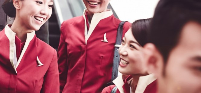
The first redesigned lounge will be revealed this month in Haneda, Japan. The new design will also feature across new websites, airline interiors and on staff uniforms.


