The simple life of mobile payments


In a world in which money is whizzing from and to all the ends of the Earth, online payment systems are more important to businesses than ever. Yet, they are of the most invisible brands in the consumer services sector because the work they do is often hidden behind their customers – the businesses that are selling things to consumers.
Thus was the challenge presented to consultancy Ellare and brand strategy firm SomeOne in the case of 10-year old mobile payment provider Mi-Pay.
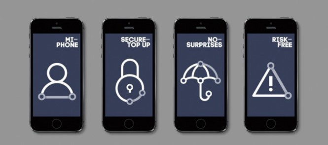
The new brand was designed to simplify the visual and user experience. With a new tone of voice that eliminated impenetrable jargon-filled language, Mi-Pay’s communications have been simplified with the end-user in mind. The existing Mi- construct, including the hyphen, informed the new language and visual identities of the Mi-Pay brand.
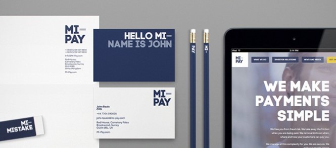
SomeOne’s executive creative director Gary Holt, says, “The brand world doesn’t stop with sector descriptive headlines. For a B2B, or even B2B2C business, whose communications to customers are often few and far between, we needed every touchpoint, every presentation, every word to work as hard for Mi–Pay as possible. And as ever, we weren’t going to rely on the logo to do all the heavy lifting. So business cards announce Nice–to meet you, financial statements are Mi–Numbers and Mi–Words, even the office eraser is Mi–Mistake.”
The simplified language then led to changes within the Mi-Pay business in terms of driving simplicity and clarity throughout its services and sales.
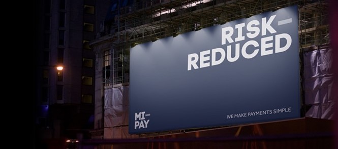
In terms of design, an outdated red and grey logo, with gradients, and a clip-art ‘I’-shaped mobile phone has been mercifully replaced with a simplified brand. The new Mi-Pay is rendered in a simple block sans serif and complemented by iconography depicting connectivity. The Mi- idea Holt mentions carries throughout the brand, as does the hyphen element, which becomes a connector in the visual identity as well as in the new ethos of the company.


