Logo design’s sea change
In recent years, design agencies have started making the most of advanced technologies to tell new and exciting stories through brand logos. Jack Cousins discovers what all the fuss is about.
It is a truism to suggest that as culture and technology change, so do brand logos. Early examples of the logos we instantly recognise today – from Shell to Levi’s to Nokia – started life out as black and white, highly complicated and not particularly easy on the eye. But as time moved on, they became shaped by the world in which they live.
As the western world became wealthier and companies no longer needed to save on ink costs, the possibility of vibrant, colourful logos in the early 20th century was a game changer for designers. In the following decades, more simplistic logos became popular as societies moved away from neoclassical design. Then the most popular brands, like McDonald’s, Apple and Mastercard, realised they could be recognised from symbols alone, so they needn’t bother including all the unnecessary features. Simplicity was the aim of the game, and it remained that way until recent times.
With the digital revolution pushing the boundaries further each year of what was ever understood to be possible in design, a new wave of hyper-sophisticated logos is slowly becoming a reality. One such example came following the inception of the Saudi Space Commission (SSC) in 2018. Hoping to promote the global benefits of space science, while also aiming to become a major contributor to the future Saudi economy, the SSC turned to Landor & Fitch in a bid to create a visual identity that could resonate beyond Saudi Arabia.
The previous logo, featuring the national emblem of a green palm tree with two crossing swords underneath, felt inherently Saudi. But it failed to signify with the magnitude of the organisation and its goals. The SSC required an identity which could push back against negative public perceptions of space agencies being a waste of money. The agency therefore had to demonstrate how it is in fact a long-term investment that will benefit everyone.
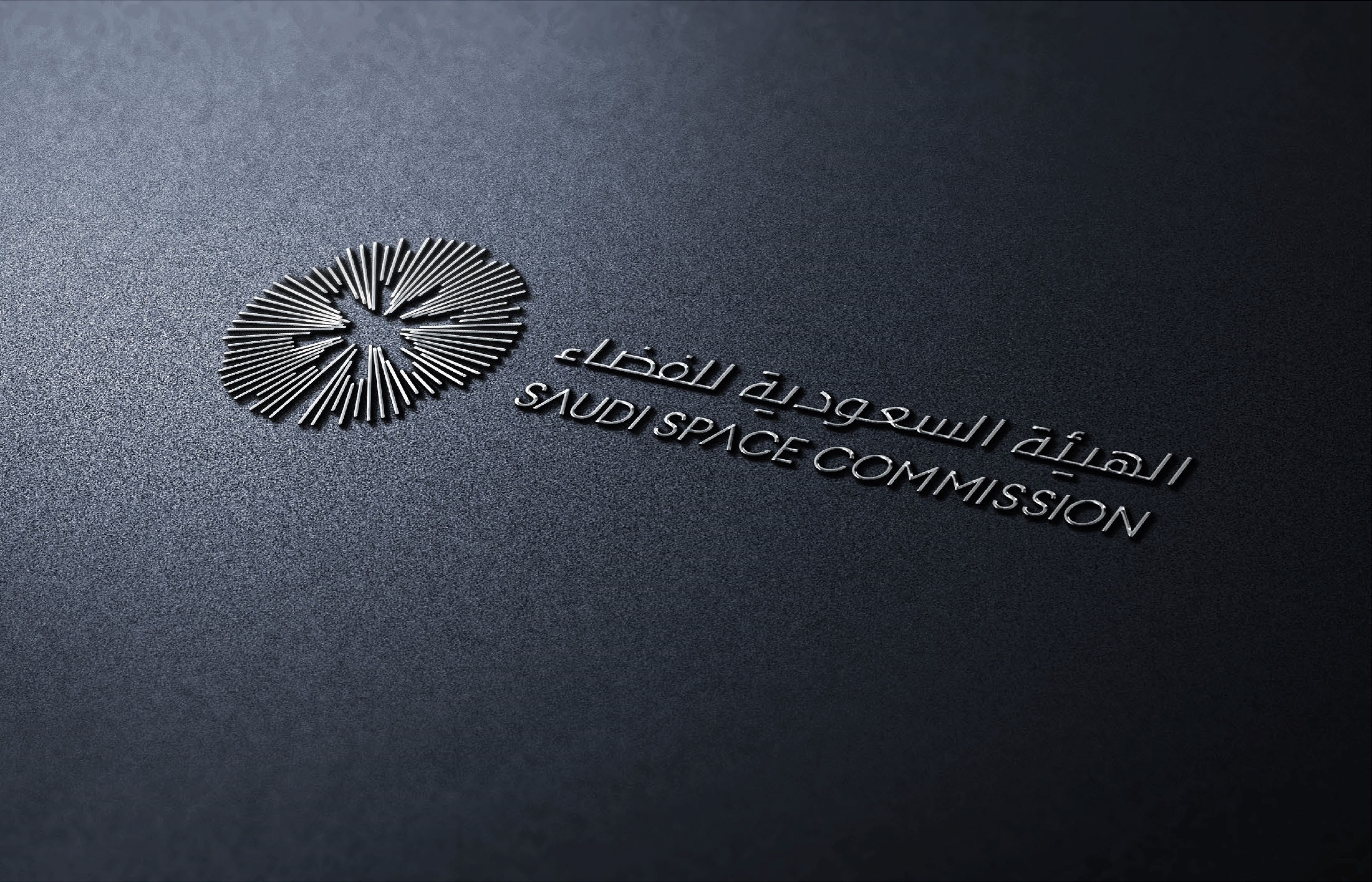
Looking further afield than the Middle East, Landor & Fitch took inspiration from sound recordings of Earth taken from the Van Allen space probes. Utilising an extensive library of sound data, the recordings of Earth’s magnetosphere was then synthesised and processed through a graphic visualiser. By then arranging the data streams in a circle, the visually reinterpreted logo reveals the outline of a palm tree formed in the negative space. This clever, data-inspired logo is paired with a green accent to ensure the new brand doesn’t stray too far from the previous design.
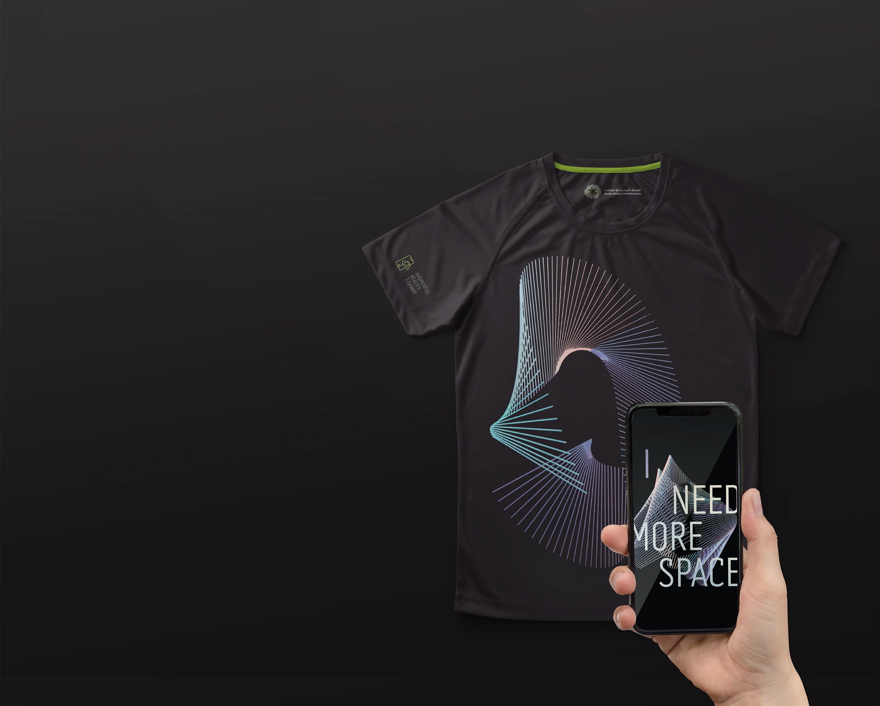
The unique graphic language was then used across all brand touchpoints. From T-shirts to digital spaces to the employee on-boarding kit, this format could be personalised using live data. The visual identity simultaneously works in motion as well as a still graphic capture, truly going above and beyond conventional brand logos. By integrating it with the environment in which the organisation operates, Landor & Fitch had successfully paired the SSC brand with space itself.
‘The sound of Earth’ was a huge success, scooping up a gold in ‘Best use of audio brand’ at the Transform Awards Middle East and Africa 2020. The project showed the world how using real-time data to create an ever-evolving visual identity could open up endless possibilities to a brand. Around the same time, French agency Carré Noir was discovering just how far this principle could be taken.
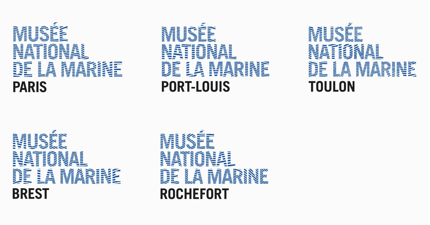
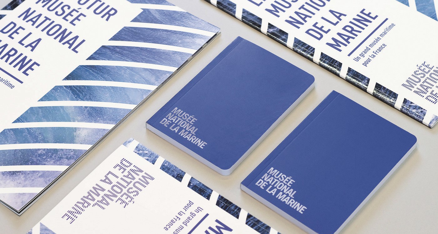
Its client, Musée national de la Marine (National Navy Museum), had tasked the agency with designing a future-orientated brand. Located at the Palais de Chaillot in Paris, the maritime museum has been closed since 2017 while a huge project to remove all asbestos from the building is undertaken. This was the perfect opportunity for a complete rebrand. But rather than utilising sound, as had worked for the SSC, Carré Noir’s vice president and chief creative officer, Reza Bassiri, realised harnessing motion was the way forward.
A fan of the museum, Bassiri jumped at the chance to work on the project. But was adamant about one thing: the brand simply could not look corporate. Fortunately, this tied in with the client’s exciting plans of pushing the museum towards being at the heart of geostrategic ambitions and concerns. “It's not only military,” says Bassiri, “it's ecological and geopolitical. The migrant crossings we see in the Franco-British channel or the Mediterranean Sea; the ocean is at the heart of it all.”
Carré Noir set out on a mission to place the ocean at the heart of the museum’s visual identity. For a creative like Bassiri, the possibilities were endless. He mused about going to the beach, drawing a logo and putting it in the water for the sea to alter the ink. Other rejected ideas included eroding the logo design with sea salt. The overlying concept of the ocean designing the logo was there, but the format was difficult to settle on.
“The ocean is never the same twice, it's constantly moving,” says Bassiri. “Every time you go to the beach it's the same ocean, but it's different. That's what I want to express: a constant evolution, so this had to be a dynamic logo.”
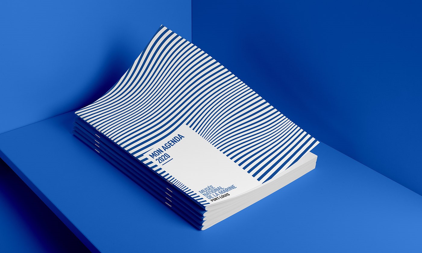
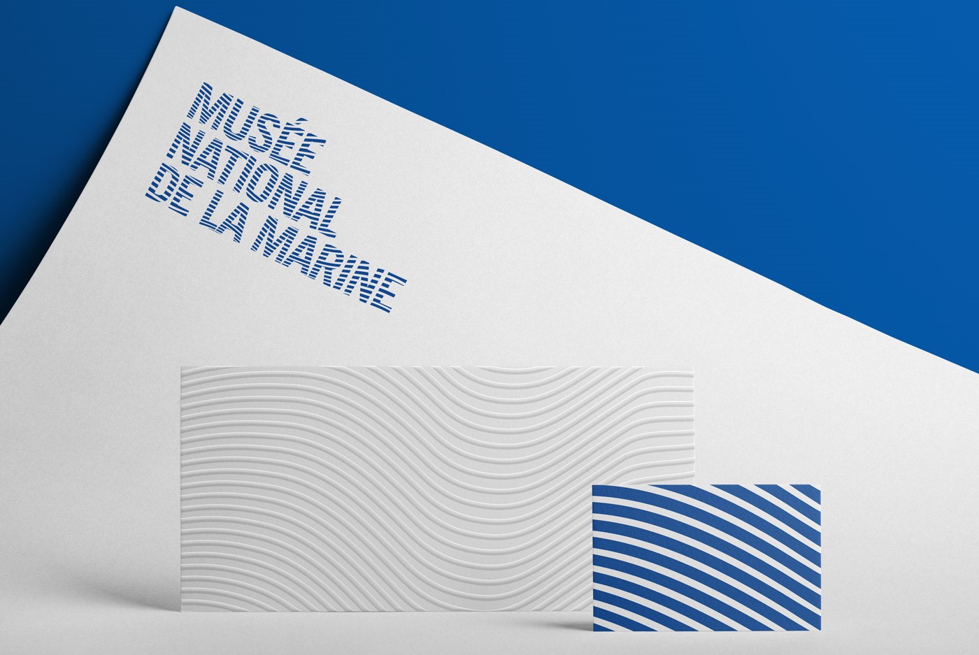
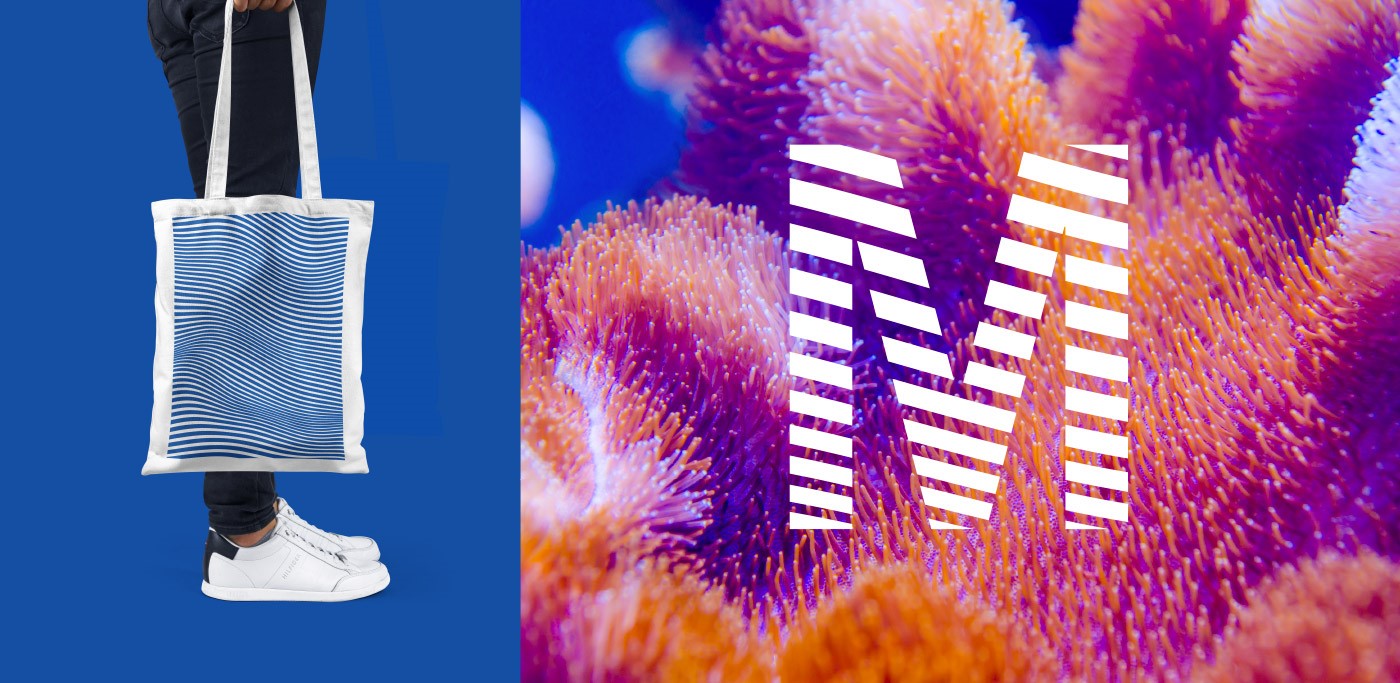
It was clear that data would have to be retrieved from the ocean to tell this story. So, the agency suggested a buoy be put out at sea which could retrieve data on how the ocean is moving at any given moment. Bassiri created the basis of a logo: the brand’s name across three lines with horizontal lines to reference the marinière (the white and blue striped shirts worn by seamen in the French Navy). However, it would be the data extracted from the ocean that would truly bring it to life. The lines would move in correspondence with the data being transmitted to it from the Atlantic Ocean.
After presenting the logo idea to the client, the “blown away” museum president called up Shom, the Naval Hydrographic and Oceanographic Service, and was told the data could in fact be delivered to them. With the buoy located far out at sea off the coast of Brest, it would be easy to wonder whether the museum would therefore be too dependent on the weather. If there was a storm, could the data be cut off? And if the water was too still, could the logo become too dull? But Bassiri had these issues covered.
He says, “First of all, these buoys withstand the greatest of storms. So, on the end of the buoy, there's no issue. On our front, we set in a minimum and a maximum in the programme, so the logo remains readable – even in a mega storm. This means you'll also never have the logo with perfectly horizontal lines in case of a complete standstill.”
With the Musée national de la Marine finally set to reopen in October 2023, brand touchpoint plans are still being developed. One idea is using blue light to project the animated logo on a large wall using semi-real data, while the logo on the website and digital screens will display actual ocean activity. Regardless of how the project eventually turns out, it is one Bassiri will always cherish.
“This is a project that I'm so proud of in terms of creativity, but also as an example of what design should be for a designer,” he says. “When I tell the logo’s story, people get so caught up in it because everybody's got a relationship with the ocean. Some people are fascinated by it, some people are freaked out by it. But the ocean doesn't leave anyone indifferent, and I wanted this logo to have the same effect.”
While many brands still push for simpler and simpler logo designs, the emergence of a complex yet suave design system, as seen with SSC and Musée national de la Marine, perhaps tells us the world of design is once again on the cusp of change. If one thing is for certain, however, it is that logos remain an excellent way to reinforce a brand’s story. Should designers realise the vast quantity of tools at their disposal – from outer space to the depths of the ocean – a brand’s potential may be unlocked.