From humble beginnings
If a brand’s past glistens with charm, it may then be leveraged to help with differentiation. But how can this be accomplished without the brand becoming a mere dusty museum piece? Jack Cousins investigates.
What is the greatest level of success a brand could conceivably achieve? Perhaps it’s when it clearly demonstrates its identity over such a long period of time that it becomes inextricable from a society’s culture. Consider the significance of Guinness to Ireland, Audi to Germany or Disney to America. Their importance extends far beyond the products they offer and the problems they solve. These brands weren’t always there, but it feels as if they were. They successfully leverage the past so they will be known – and loved – in the future.
But this cannot be achieved through evoking history alone. Recounting the past is one thing, but creating a story from it, otherwise known as crafting a heritage, stirs up emotions in a far more powerful way. Andrew Lipscombe is the director of brand strategy at London-based FreshBritain and an expert in designing heritage brands. As he says, “Everything has a history, a timeline. But heritage is an emotionalised history which carries value and meaning.”
Finding that gem
Of course, not all brands are forged the same, and utilising true brand heritage is easier for some than others. Indeed, not many have a past so rich and fertile to call on as global beauty giant Avon. The company began in the 19th century with David H. McConnell, a travelling book salesman, who quickly realised his housewife audience was far more interested in the free fragrance he offered when pitching. Setting up The California Perfume Company in 1886, he employed Mrs P.F.E. Albee as his first representative, who retrospectively went down in history as the inaugural ‘Avon lady’.
While hard to imagine now, the idea of offering economic freedom to women was radical at the time. The seeds were therefore planted early on about who this company was and what its heritage story would come to be. Come the 1970s and the company had long been renamed Avon (after Shakespeare’s birthplace, Stratford-upon-Avon). It also had a global army of around six million women selling direct-to-consumer at its disposal and was well recognised for its perfected ad tagline that ran from 1954 to 1967: “Ding dong, Avon calling!”
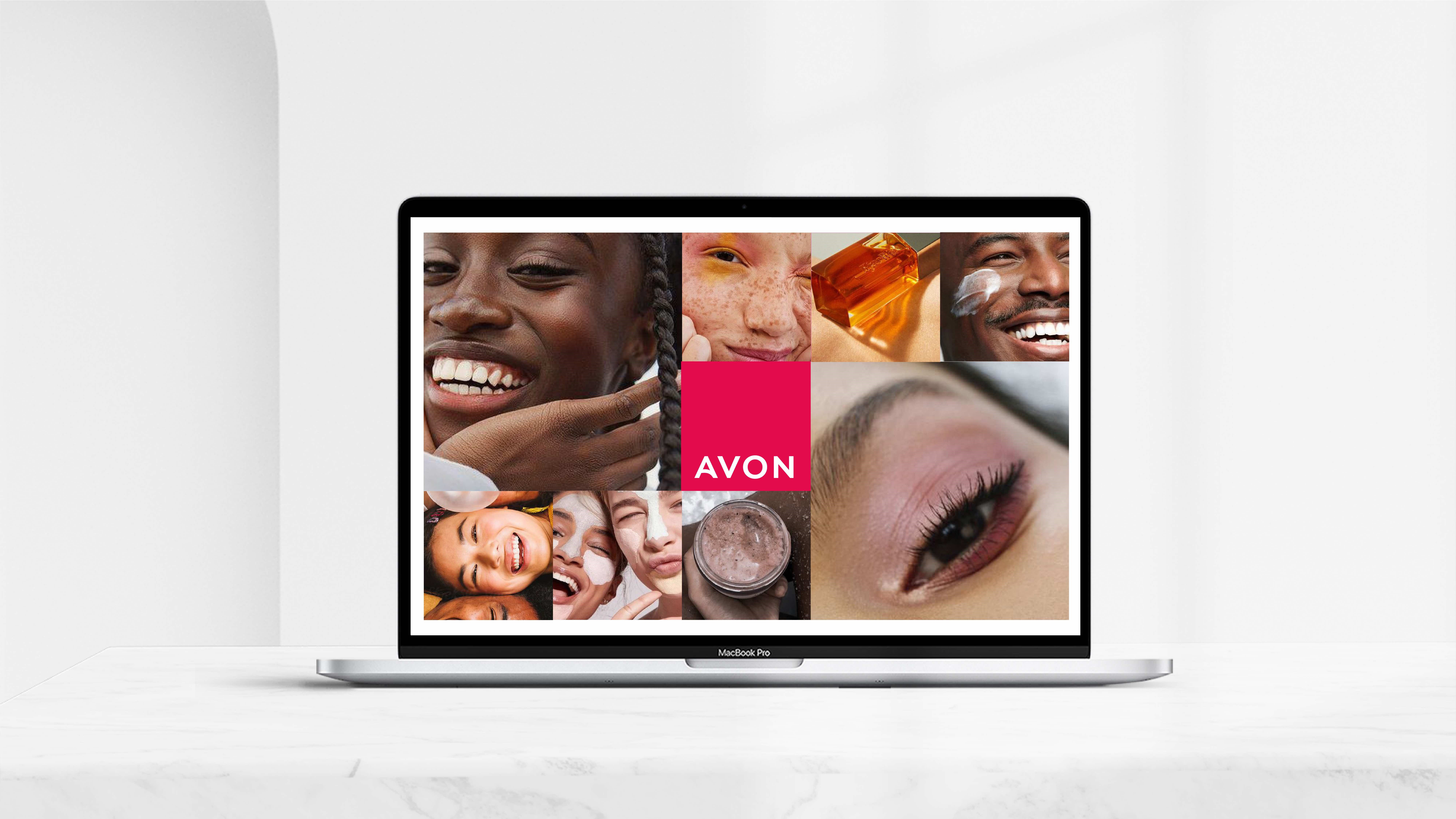
Come the 2020s and Avon has had to weather a monumental slump. With revenue having dropped by 60% over the prior decade, its North American business split away in 2016, while the rest of the business was bought by Brazilian beauty company Natura & Co. Worse still, its brand identity had become confused and even “apologetic”, according to Nick Vaus, partner and creative director at design agency Free The Birds. Following on from the designing of a new brand strategy, ‘Embrace Your Power’ by Wunderman Thompson, Vaus’ agency was initially tasked with reimagining Avon’s packaging. But following talks with CMO Kristof Neirynck, Free The Birds successfully convinced him that a visual identity overhaul was required.
Vaus explains, “It soon became obvious to us that we needed to give it a lot more stature and presence. On some of the brands there were old logos, on some there were new logos – it was a whole mismatch. So our brief really was moving from a house of brands to a branded house.”
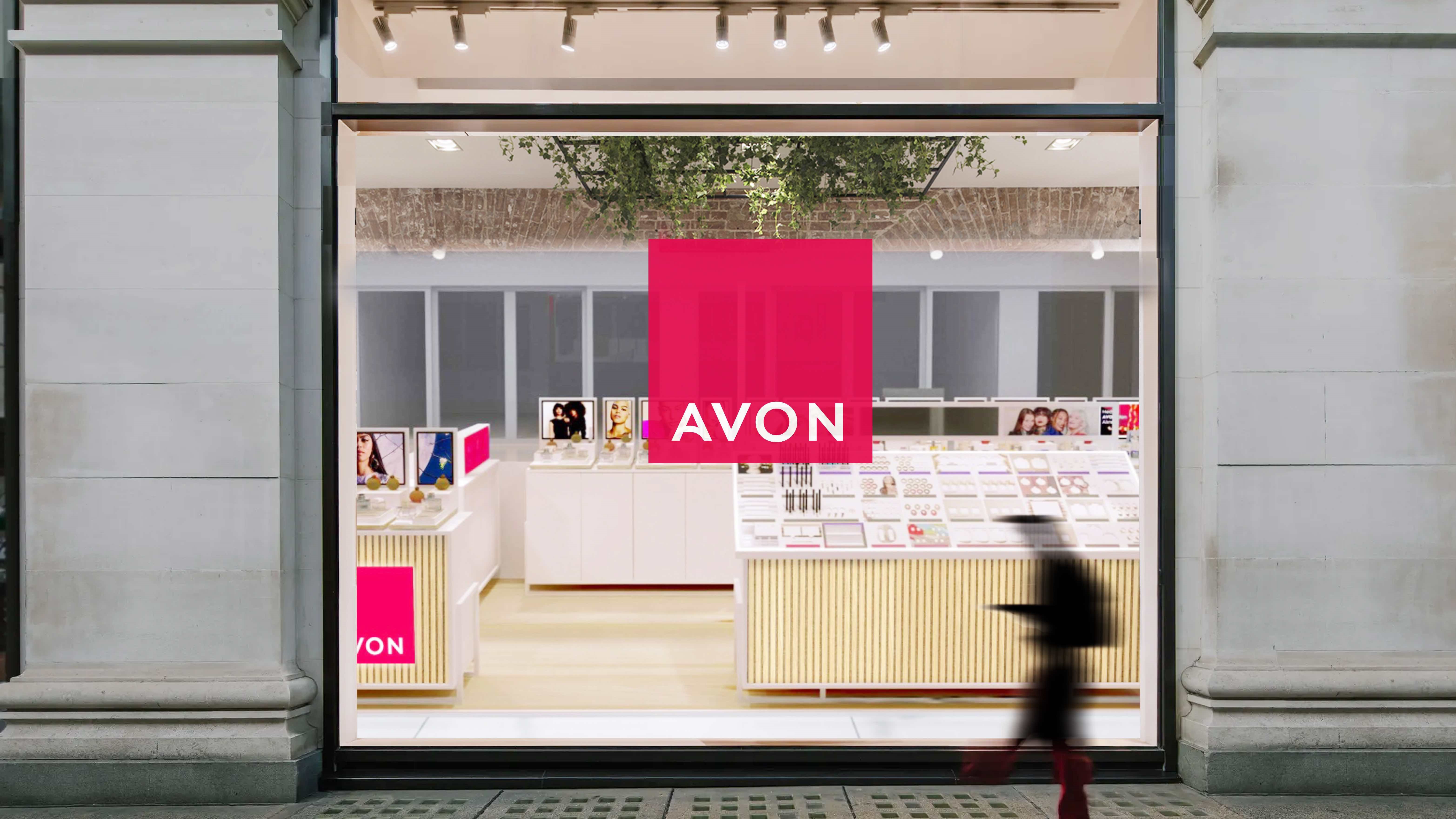
Free The Birds’ strategy revolved around maintaining design cues that were working and giving attention to those that were failing. For instance, the design agency deemed the little curves in its relatively new logotype to be “beautiful” and “welcoming”, such that it didn’t require great revision. But by partnering with typeface design studio Dalton Maag, Free The Birds ensured the Avon typeface was slightly refined while also maintaining brand recognition.
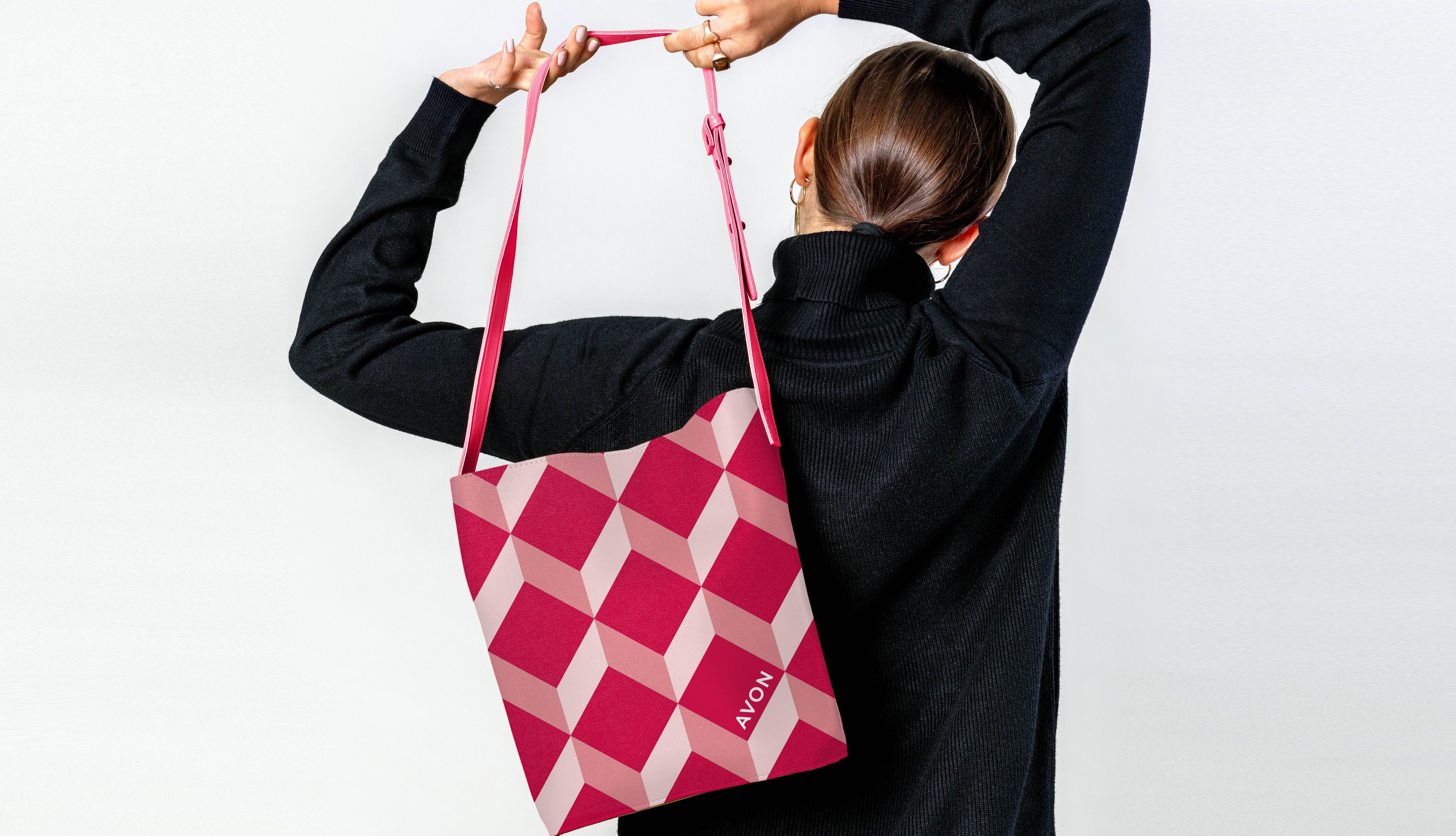
But the project moved beyond polishing up what was already there, drawing inspiration from the heritage of the brand. Not content with just pointing to Avon’s history, its long-term values were baked into the revised brand. One of the more radical moves of the project was placing the logotype within a ‘plinth’ – a metaphorical stage on which the empowerment of women is set. Evolving from an inconsistent pink-to-purple colour gradient also saw Avon adopt a bolder pink which harks back to the brand’s many years of endorsing breast cancer awareness.
Vaus believes his agency’s work is a testament to designers becoming increasingly sensitive when working with heritage brands. Throwing the baby out with the bathwater can lead to a hollowed-out, banal brand. Recalling the logo redesign of Procter & Gamble hair care brand Herbal Essences, Vaus says, “They did a whole revamp and lost everything great about it. I think everyone has learned over the past 10 years it’s not about just throwing everything away, building it again and then losing even more market share.”
The pioneer
There are certain tricks to be learned when designing the identity of heritage brands. A common and often successful strategy is to focus on the company’s pioneering act – often when an industry is evolved through innovation or when a novel piece of technology is brought back home from afar. As Lipscombe, who was once global marketing director at heritage brand Ben Sherman, testifies, “I think it's much easier when you have a pioneering idea.
“It took me a while to understand the heritage of Ben Sherman, but I then realised that he, Sherman himself, was the first person to pioneer the idea of a shirt as a fashion garment. He went to the West Coast, USA, saw this vibrancy of colour and fashion through shirts and the different fabrics and technologies that had been created in San Francisco. He was the first person to bring it over to the UK.”
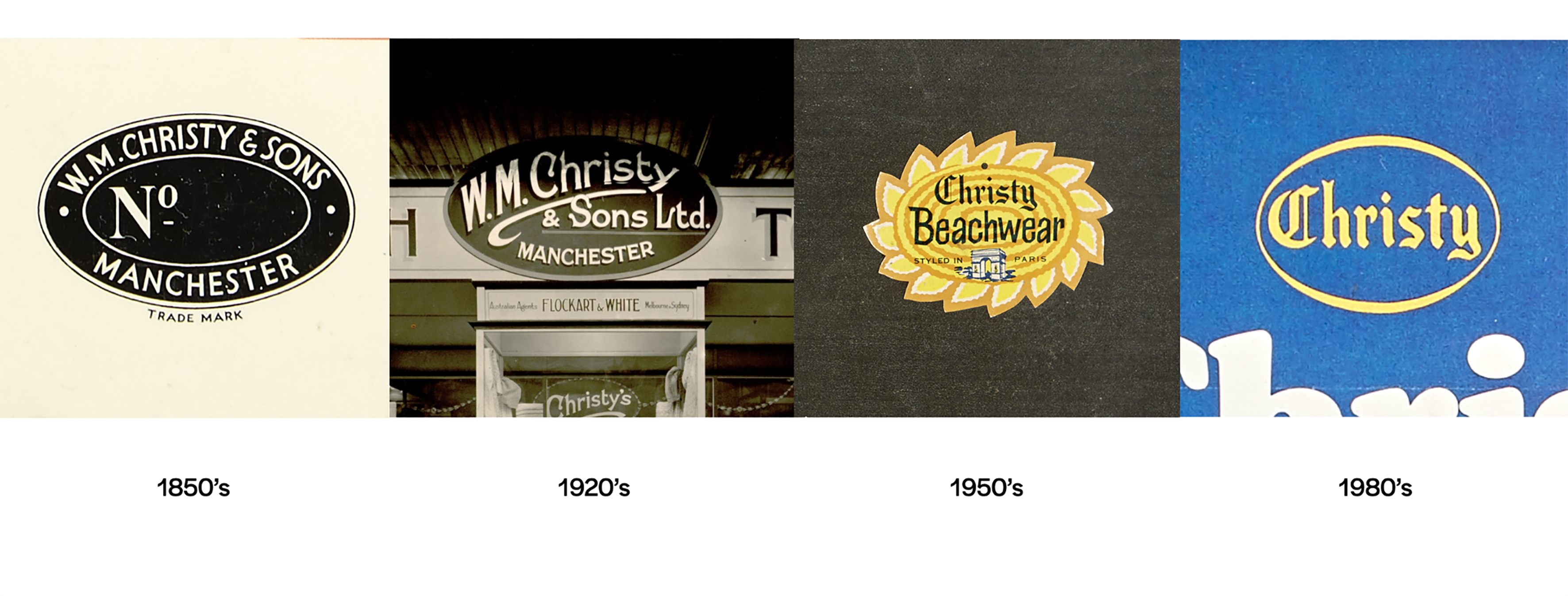
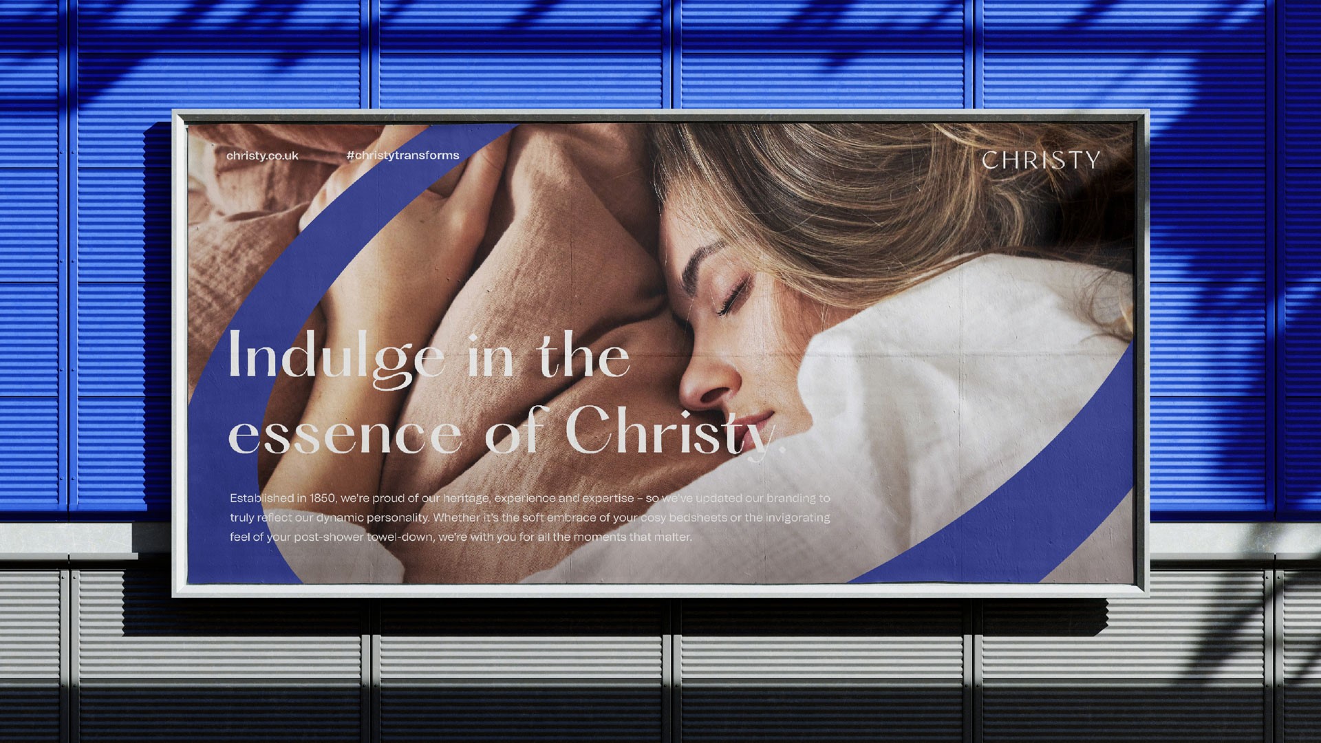
Placing the pioneer or pioneering act at the heart of the brand can lead to new dimensions for designers to explore, just as forgetting its inception can result in the dilution of the brand story. This was precisely the problem 173-year-old British towel manufacturer Christy faced before turning to London-based design agency The Yard Creative. The company had changed its business model from bricks and mortar to digital, while its visual identity had become somewhat complicated and wasn’t easily transferable to the online world. The key would be evoking Christy’s undeniable heritage while also allowing it to comfortably exist within modern touchpoints.
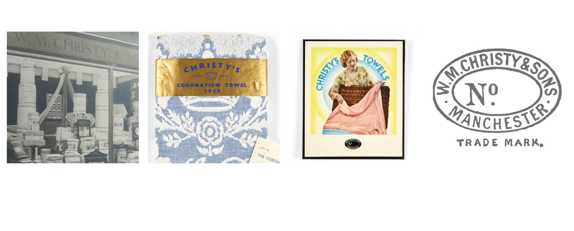
And what a truly remarkable but somewhat untapped history to call on, beginning all the way back in 1850 when Henry Christy returned from Istanbul with unusual fabrics. His brother, Richard, was so fascinated by these looped pile fabrics (now known as terry towelling) that he started to manufacture his own. It wasn’t long before Queen Victoria became an early client after the products caught her eye at the Great Exhibition in London. The brand’s existence became epitomised by the production of souvenir Coronation towels, glamorous collaborations with the likes of Agent Provocateur and becoming the official towel supplier to The Wimbledon Championships. By the 2010s, Christy had expanded to also producing bathrobes and bedlinen.
Never throw the towel in
Initially tasked to work with the identity Chirsty had inherited over time, The Yard Creative’s CEO, Tom Edington, was determined to prove that the brand’s extensive heritage was a blessing that could be used in its modern, digital venture. A presentation to new CEO Vanshika Goenka Misra was enough to convince her this could be achieved.
Remembering how excited he was by this prospect, Edington says, “There were so many rich patterns, colours, wordmarks and fonts that Christy had used across its brand going back to 1850. They have a really strong archive, so in terms of inspiration for us there was almost too much!”
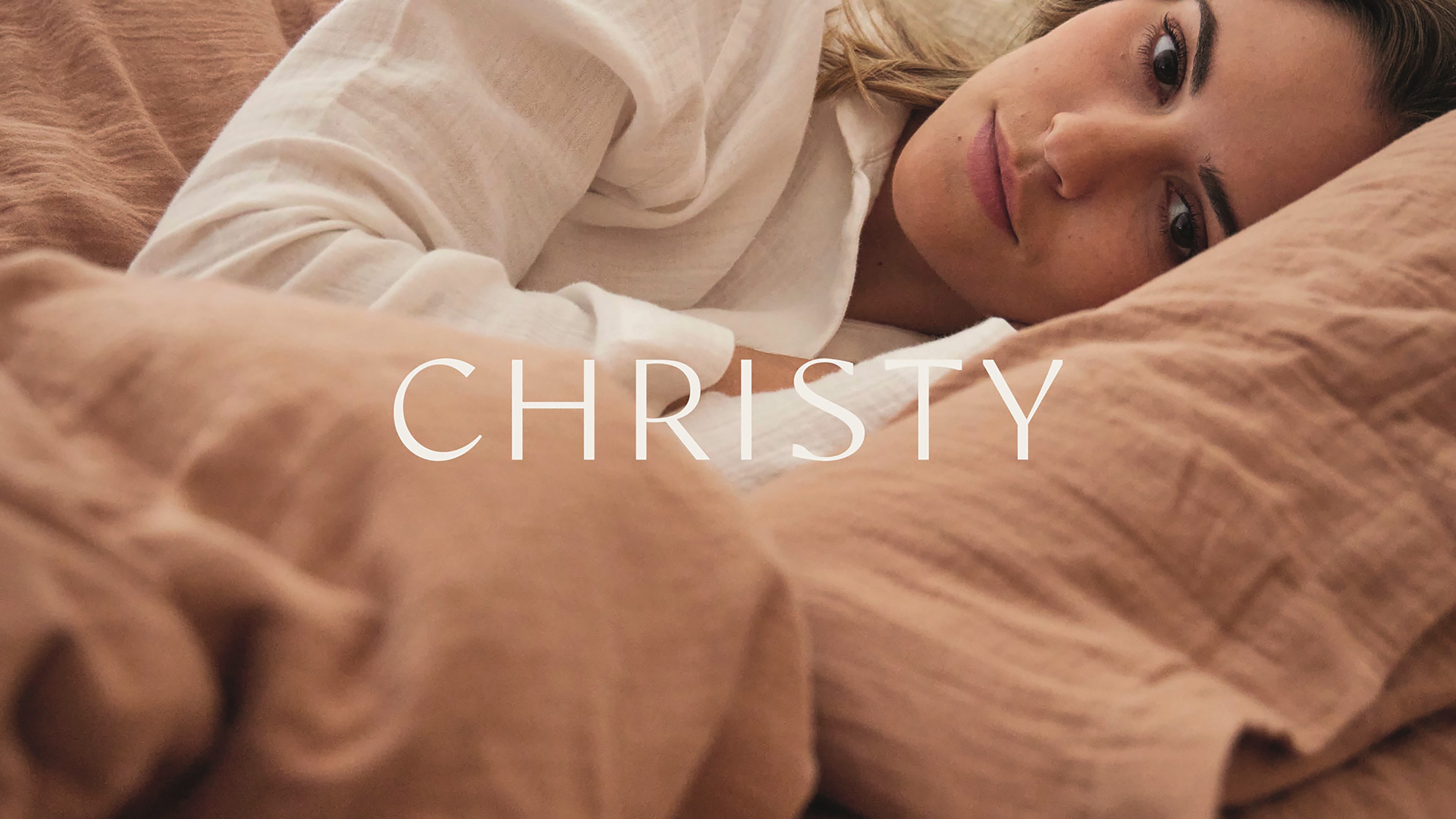
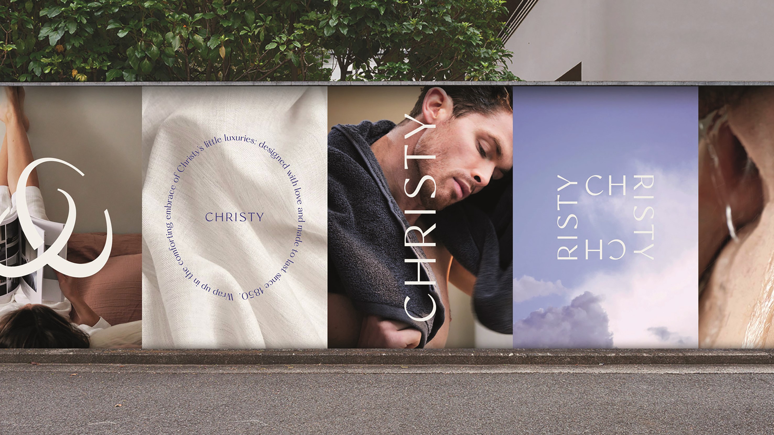
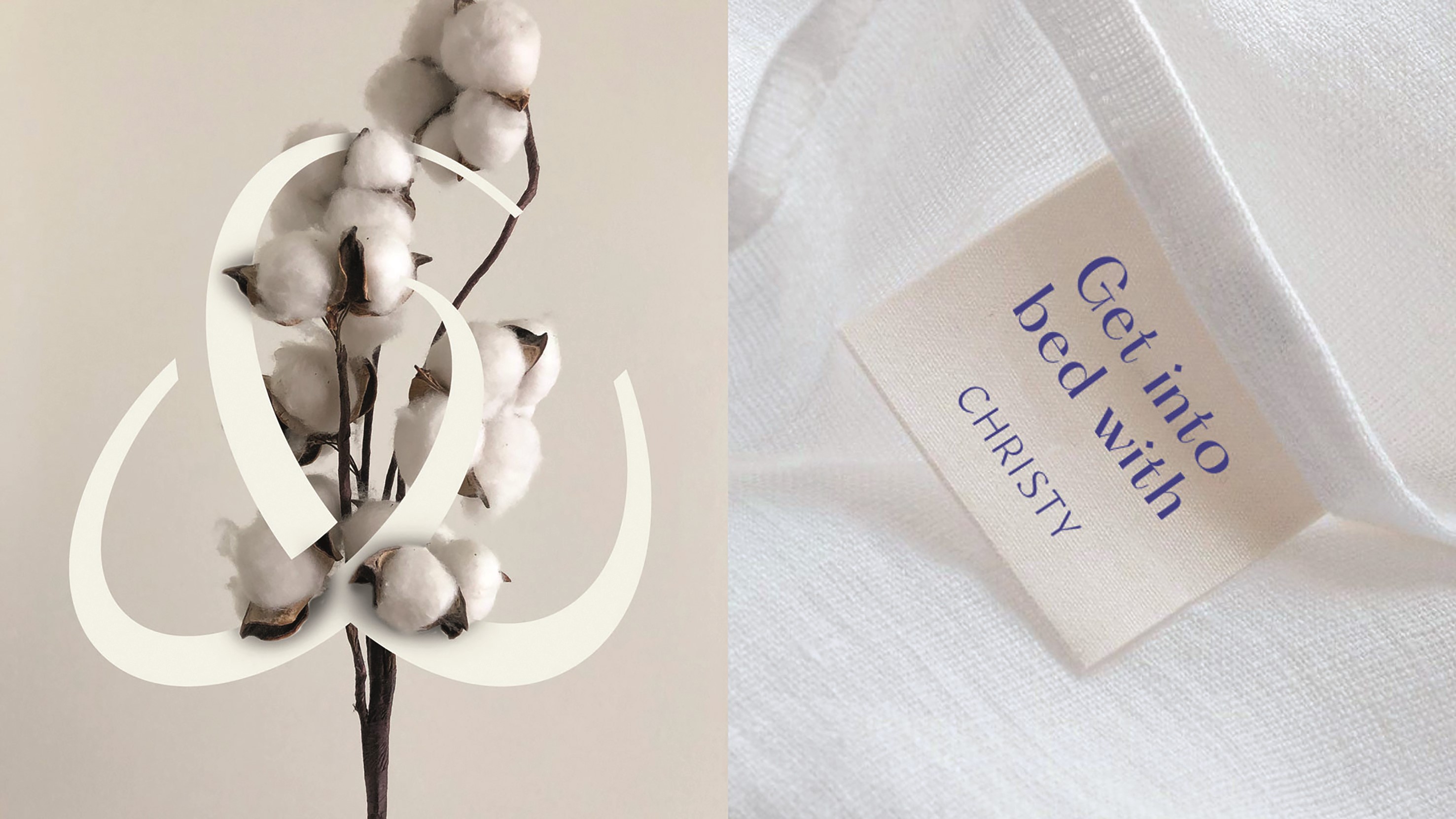
Some deep research uncovered the original wordmark, which heavily inspired the latest reinterpretation. Characterised by strong capital letters and a sophisticated feel – almost gothic in appearance – the new wordmark by The Yard Creative was nuanced and finessed. This simplified design simultaneously meant the brand’s heritage was once again brought to the forefront while also being digital-friendly.
Another thing Edington quickly picked up on was the “cheeky” nature of Richard Christy, who wanted to push the brand further – an attitude underpinned by a risqué art direction. To contemporise this for the 21st century consumer, Edington and his colleagues crafted a humorous tone of voice. For instance, bedding labels would encourage customers to ‘Get into bed with Christy’.
Elsewhere, the iconic Christy blue was freshened up in a punchy manner, making it brighter for packaging and digital touchpoints. This was then paired with a cotton white, rather than the pure white that had come to be used, lending the visual identity more to the brand’s DNA. Everything done was “to evoke emotions,” says Edington. “They've been in a period of standing still, and now we've worked on strategies where they are not as restricted and there’s a lot more opportunity to evolve,” he adds.
The aim of the game for heritage brands like Avon and Christy is to leverage their unique past, but only in a way that keeps them moving into the future. According to Lipscombe, the idea of conservation is quite important because it allows for the brand’s survival. Preservation, meanwhile, is a death trap to be avoided. It is identifiable when the brand remains unaltered and shackled up by inflexibility. He concludes, “By all means venerate your history, but don't become a museum piece.”
Lipscombe’s rules of heritage
- Connect the best of the past with the best of the future, with contemporary design updates to classic products. This means being immune to short-term irrelevant trends and evolving and defining iconic products
- Partner with contemporary ambassadors that are relevant to a modern audience but uphold the values your brand has been built on. This means your brand and products can transcend the age of the consumer
- Use your unique heritage as the foundation for your product range architecture projects. This reinforces original brand meaning in every future product expression, and means products become archetypal
- Ensure product design is driven by tradition, authenticity and detail. Products should evolve through small and subtle changes, so products of today remain recognisable to our ancestors
- Understand that value of your brand’s historical positive impact and build on your heritage of doing the right thing. This creates a deeper emotional connection based on cultural importance
- Always celebrate provenance and the unique meaning of your place of origin in the eyes of the world. This helps embed your brand in the national psyche as a pioneer and an original that matters
This article was taken from Transform magazine Q4, 2023. You can subscribe to the print edition here.