Angus’ A-Z of logos: British Rail
In his latest monthly Transform column on the A-Z of logo design, Pentagram partner and creative director Angus Hyland takes a nostalgic look at British Rail.
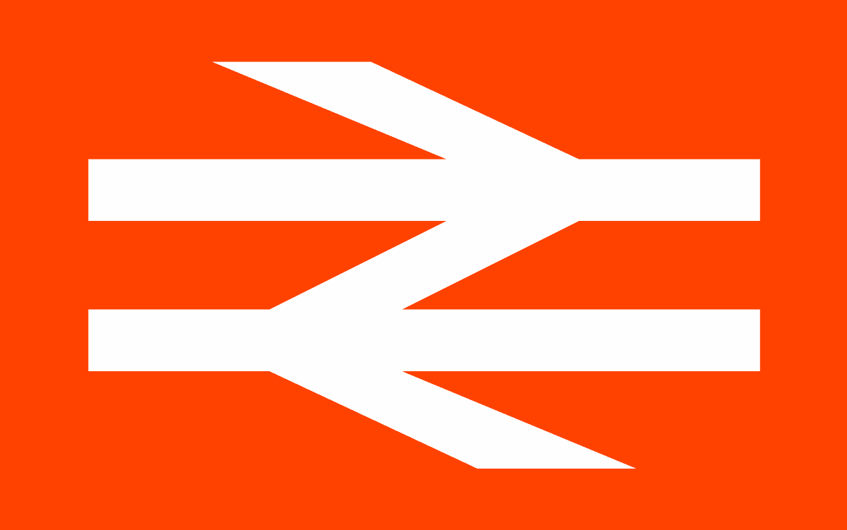
Some of the best logos work because they have a narrative embedded within them, and British Rail’s ‘Double Arrow’ symbol is a fine example of this.
Borne out of the modernisation of the railway system, it’s a logo which has influenced the branding of transportation systems around the world. It was originally designed by Gerry Barney in 1965 as part of the BR corporate identity by Design Research Unit (DRU was the country’s first multi-disciplinary design studio, and was established nearly 30 years before Pentagram first opened its doors).
Formed of two interlocked arrows across two parallel lines, the BR logo symbolises a double-track railway, and an outward journey and a return. As well as being a memorable logo, it contains a visual trick that makes it very satisfying when the penny drops.
While it’s had minor refinements over the years, the BR logo has survived nearly 60 years without any major designer interventions (which is always the sign of a really good logo). During the 1970s and 80s, while the logo retained its integrity, British Rail became the butt of many jokes, mainly about always running late and serving terrible food. There was some truth in the latter accusation, as BR was awarded the dubious honour of selling the worst ham sandwich known to man (despite this, records show that during 1993 over eight million sandwiches were sold).
Under the stewardship of John Major in the mid-1990s, the UK’s railways were sold off and the Double Arrow’s trademark registration was transferred to the Secretary of State for Transport. It still appeared on tickets and on station signage, but as we entered the golden age of privatisation with its promise of cheap tickets, gourmet food and trains that are never late, it remained very much in the background.
Fast forward to 2023, and the dream has become a nightmare. Six railway franchises are currently back under public ownership after failing to provide even a satisfactory service, the food is worse than ever and rail workers are striking about pay and safety concerns. It’s estimated that since privatisation the average price of a train journey has increased by at least 23% in real terms and rail prices have risen twice as fast as wages since 2009.
Amidst this doom and gloom, the Double Arrow is currently undergoing something of a renaissance, with a carefully updated version of the logo and guidelines created with the input of graphic designer Nick Job and the Design Council.
Could this be in preparation for the promised renationalisation of the railways under a new Labour government? Who knows? It’s just nice to see one of the all-time great logos being given some proper care and attention, making it fit for purpose and ready for the challenges ahead. Which sadly is more than can currently be said for the railways themselves.
Angus' favourite 'A' logo can be found here.