Access cookies?
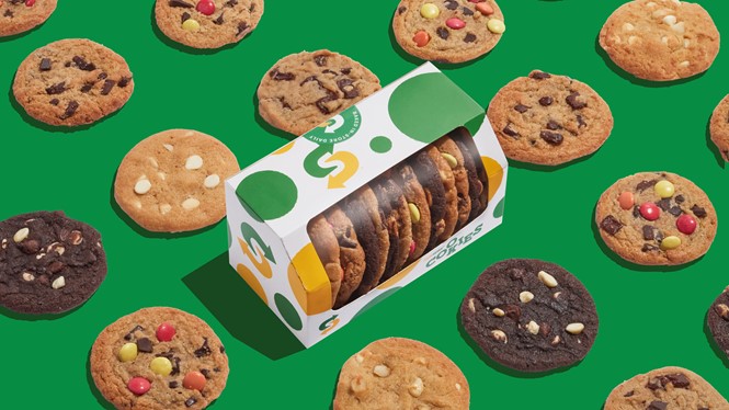

Fast food chain Subway is known globally for its sandwiches. But, its cookies – baked fresh in the store – have long been fan favourites.
Now, Subway is doubling down on its cookie offer by introducing a unique cookie brand positioned around bulk buying and celebratory moments. London-based agency Above+Beyond crafted the new EMEA brand.
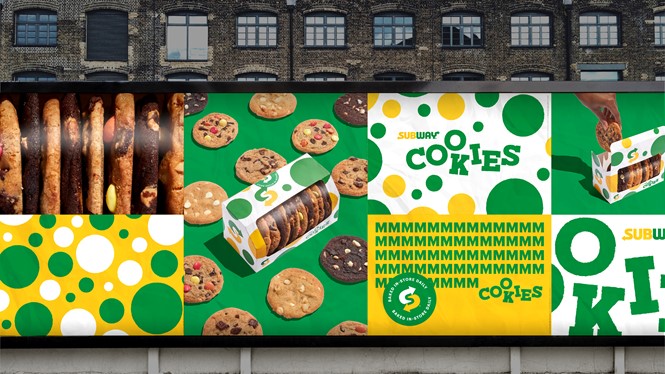
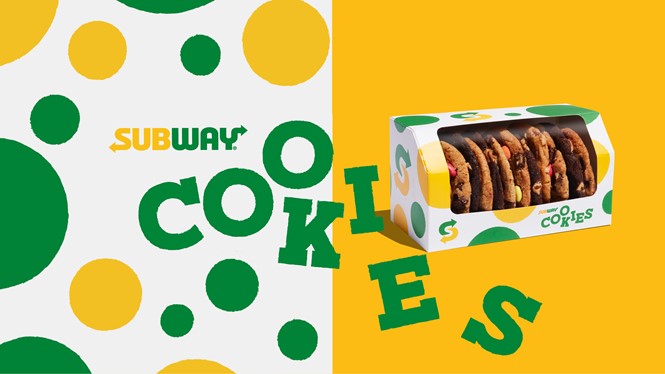
The fresh approach sits nicely within Subway’s existing brand umbrella, with the iconic green and yellow colour palette taking centrestage. The company’s existing typeface has been rendered in a slab serif. The word ‘cookies’ benefits the most from this moderation, as it is delivered in a loose layout to deliver a sense of fun and evoke the look of cookies baking on a tray.
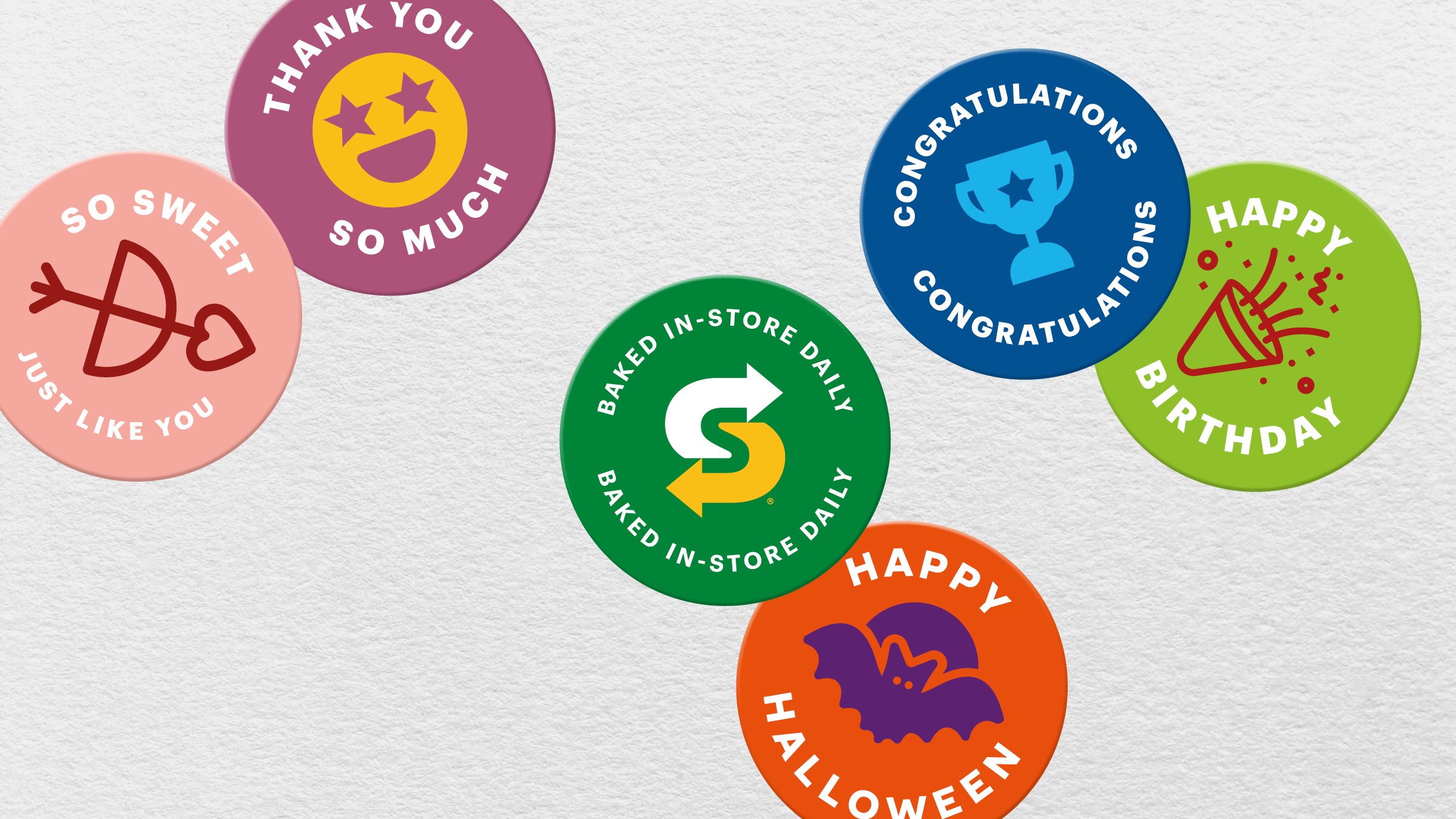
That same ethos is echoed in the multi-sized dot pattern that runs across the packaging. Above+Beyond developed this to communicate that the cookies are freshly baked. Each cookie – and each dot – is unique in size, shape and profile. A series of stickers, speaking to different gifting opportunities or moments, has also been developed, reinforcing the experiential element of the cookie offer.
Tom Munckton, creative director of design & branding at Above+Beyond says, “As the cookies have always been such a key part of a Subway guests’ experience, it was important to create an identity that was as memorable, and joyous, as the fast-food cult-classic itself.” To that end, the new brand will be delivered across 14 EMEA markets.