#TransformTuesday: 25 February
Here's this week's selection of rebrands from around the world, from Spotify playlists to one of the world’s largest condom manufacturers. For more from #TransformTuesday, follow @Transformsays
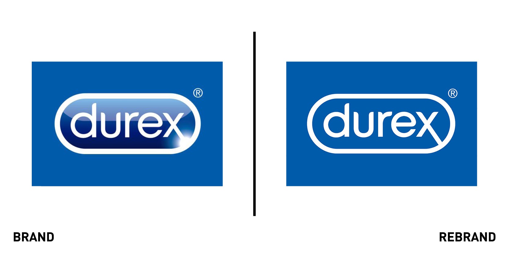
Durex
Durex, one of the world’s largest condom manufacturers, teamed up with creative agency Havas to design a new visual identity that would accompany its updated brand strategy showcasing the ‘positive reality’ of sex. The logo, written in a bespoke sans-serif typeface named One Night Sans, retains the brand’s classic blue colour but introduces a flat design, replacing the old 3D logo. The company says this is to challenge restrictive sexual norms and inspire healthier conversations around sex. Campaign posters and social media posts accompanying the new identity feature different couples kissing while lying on beds with the classic pill-shape cut-out laid over the images, enlarging certain details in their faces. The Instagram posts are captioned with quotes that encourage people to talk openly about sex without forgetting, however, to take precautions, to engage in safe sex. The posters, which include facts from Durex’s 2017 Global Sex Survey like ‘We’re faking it – 2/3 of us are not fully satisfied with our sex lives’ and ’71% of young guys go online for inspiration in the bedroom’, are aimed at fighting misconceptions and unrealistic expectations about sex.
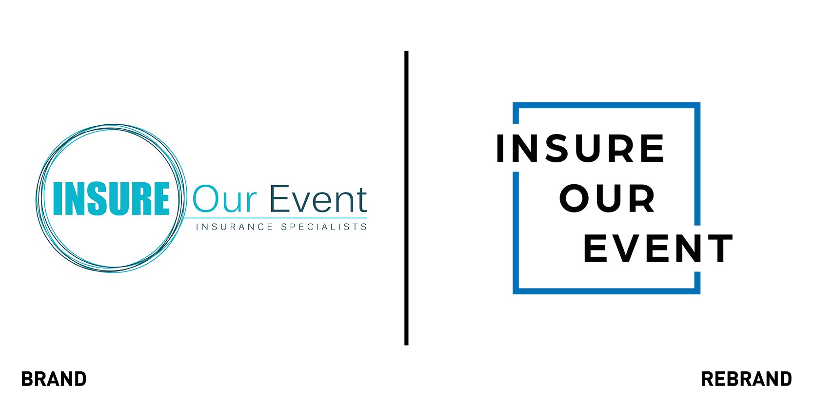
Insure Our Event
Insure Our Event, a UK even insurance broker part of Romero Group, launched a new visual identity that includes a website redesign and new social media assets. The bright colours, including hot pink and deep blue, used in the rebranding, led by Romero’s in-house marketing team, presents a fresh and welcoming feeling to the company.. The logo, which epitomises the simplicity of purchasing event insurance, is flexible so as to be used across different platforms and uses. The website is redesigned to convey this sense of openness by being very user friendly. The first thing that pops up is a ‘get an instant quote,’ hot pink button so that even if costumers are not technologically agile, they can easily locate pricings. By using eye-catching images, the rest of the website lays out the policies the company’s policies and common questions .“We want to stand out from the competition and show the industry we’re delivering something different – quick, low cost insurance available to purchase online, yet with a team of specialists ready and waiting to offer that personal service the Romero Group is so well known for. We’re really excited to see how the brand develops over the next few months,” says Victoria Romero-Trigo, director of Insure Our Event.
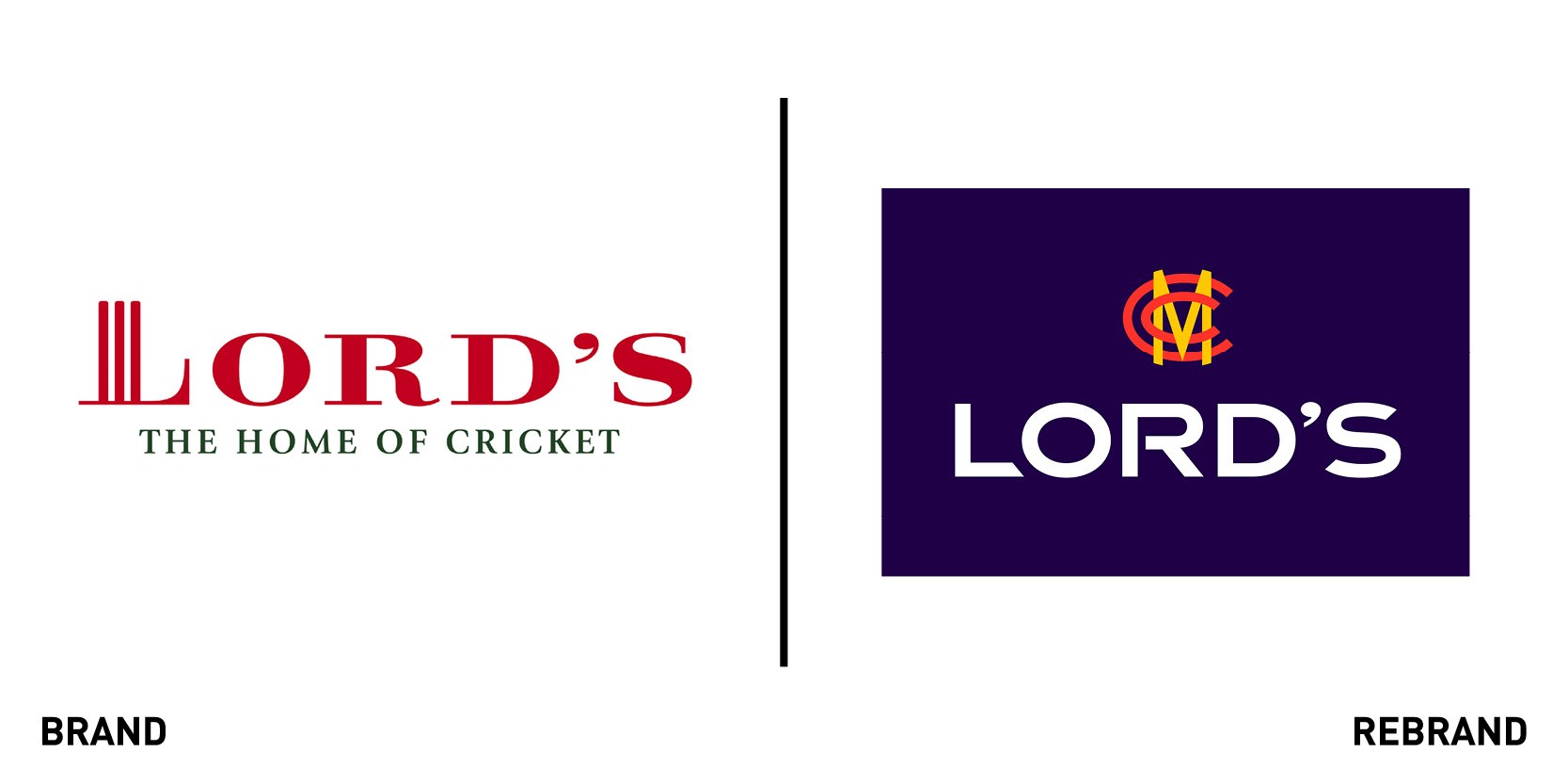
Marylebone Cricket Club
Marylebone Cricket Club (MCC) worked with brand consultancy the Clearing to launch a new brand for the club and its home at Lord’s Cricket Ground to increase MCC’s global presence and work better in a digital space. Although the rebrand gives a future outlook, it retains the centrality of the club’s heritage and the relationship between it and the ground. This is reflected by the fact that the new visual identity retains some of the MCC’s iconic features, such as the ‘egg and bacon’ colours which have now been threaded through both brands, and the monogram that has been slightly changed to work better on digital channels and merchandise. Guy Lavander, chief executive at MCC says, “At MCC we take pride in our rich history and global status as the ‘Home of Cricket’. This fresh approach to the MCC and Lord’s brands, will help drive the club’s activities and deliver greater impact to everyone we engage with; as a cricket club, a commercial business and custodians of our world-famous cricket ground, whilst continuing to be a driving force in the global game and as a modern cricket club.” The new brand was launched across all MCC and Lord’s digital and social channels and communications. The rebrand comes just months after Lord’s played host to the Cricket World Cup final in July 2019.

Molson Coors Beverage Company
Molson Coors Beverage Company, an American-Canadian brewing company, unveiled a new visual identity in the wake of a corporate restructuring and revitalisation plan that includes the consolidation of business units and the reorganisation of its North American office locations. The new corporate identity keeps the Molson and Coors names and heritage while signalling the company’s future will extend beyond just beer. This is reflected in the tagline which no longer recalls beer but is a more general ‘beverage company’ open to include several possibilities of different beverages. The clear and snappy new logo, which features a new colour of orange and blues, is designed to give equal importance to both Molson and Coors but also includes a 3D pint glass that pays homage to the former U.S. unit, MillerCoors. The website, news blog (renamed Beer & Beyond) and social media channels were also all transferred under the Molson Coors banner.
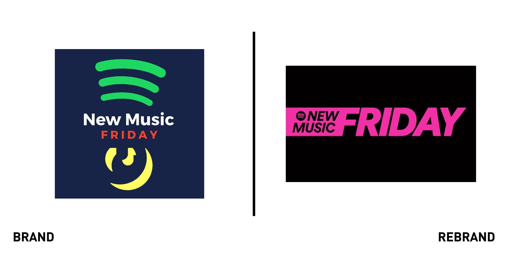
Spotify’s ‘New Music Friday’
Spotify has launched a global rebrand for its ‘New Music Friday’ playlist, a weekly curated section of new tracks, which includes a new logo, colour scheme, social marketing campaign and campaign posters. By using bright colours like apple green and hot pink and chunky capital letters, the new playlist design projects a boldness and sense of importance which reflects its popularity on a global scale, with its 43 versions and 8m followers worldwide. The posters, which take up space and immediately grab the viewers’ attention, feature headshots with different leading artists like the Weekend and Rei Ami and captions, ‘A Friday for fans of the Weekend’ and ‘A Friday for running away with Rei.’ Jeremy Erlich, Spotify’s co-head of music says, “Our playlist has long been considered a destination for discovery and an important springboard for artists and their new music, and we are thrilled to be providing a newly revamped version so fans worldwide can continue to come and discover great new music every week, bolstered by our expert editorial voice.” The rebrand also includes a social share card experience where all artists included in the U.S. version of ‘New Music Friday’ will be to able to share a branded and personalised social asset.