Zara logo redesign sparks debate among brand experts and consumers
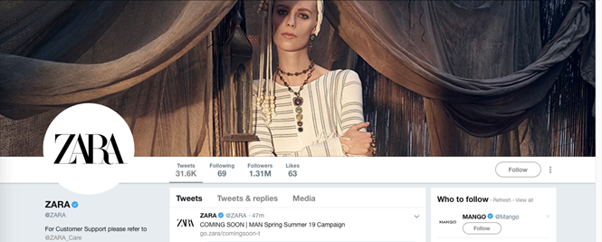
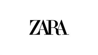
A new season, a new collection and a new logo for Zara. Last week many noticed the removal of the sans serif font, that Zara has toted since 2010, and in its place a new overlapping font was revealed.
New York-based advertising agency Baron & Baron redesigned the band’s insignia with more curvaceous lettering and reduced kerning. The new design has been met with polarised reactions. Matthew Morek, designer and UI engineer at the digital team for Co-op, tweeted that the Zara logo is the “Lousiest redesign I’ve seen this year, and it’s just January.” While others claim it be a means of identification and a celebrated rejection of the sans serif block that many brands such as Burberry and Balmain have adopted. But something other than the technicalities of typography has sparked all of this controversy.
Many companies try to launch aspirational rebrands, where they present idealised versions of themselves with the belief that if they tell customers of their new identities, they’ll live up to their own high standards. But brand identity is more than a redesigned logo; it is a promise to the market and consumers that shouldn’t be made lightly.
Baron & Baron designed the new logo with the intention of “lifting the retailer to the level of luxury contemporaries,” but that aspiration is, realistically, unattainable by Zara. Steve Blue, president and CEO at Miller Ingenuity, wrote in Entrepreneur Europe, “When there’s a disconnect between how the market perceives a company and how the company perceives itself, the revised image rarely lands as intended.”
Looking at the case of Zara, this may be what has occurred. Zara seems to have rebranded without fully understanding who their clientele are and, as a result, it has left consumers and critiques alike dangling in between the notion of its aspirational self and reality. We have yet to see how this rebrand will affect their overall sales this year, but if the critiques of designers and industry professionals are any indication, they may have missed the mark.
Alex Gordon, CEO, Sign Salad
Zara is the very embodiment of the ‘want it now’ mentality of modern consumers – selling semi-premium products at a colossal rate, and offering them to people at lower prices.
Many fast fashion brands like Zara use a bold minimalist sans serif font in their logos to express this throwaway functionality – Topshop is one example. But the new logo actually shares a likeness with the more complex designs of the heritage design houses like Cartier, Gucci, and Bulgari.
Certainly the design, with its use of elongated letters (that ‘tower over’ all else), and widely-spread block capitals (that recall the voice of authority) can be interpreted as a signal of Zara’s ambition to carve out a place among these uber-confident, luxury brands.
It might seem like a bold move for Zara to attempt to reenvision itself as a premium brand. But given rising public awareness about the questionable ethics of fast fashion, the company might be over-hauling its image at just the right time.
Younger generations are more purpose-driven and environmentally conscious than ever before, so it’s possible that fast fashion brands might experience something of a cultural backlash from consumers if they continue to push the boundaries of speed and quality in their bid to satisfy product demand, without offering something to the conscience and ideals of a new generation.


