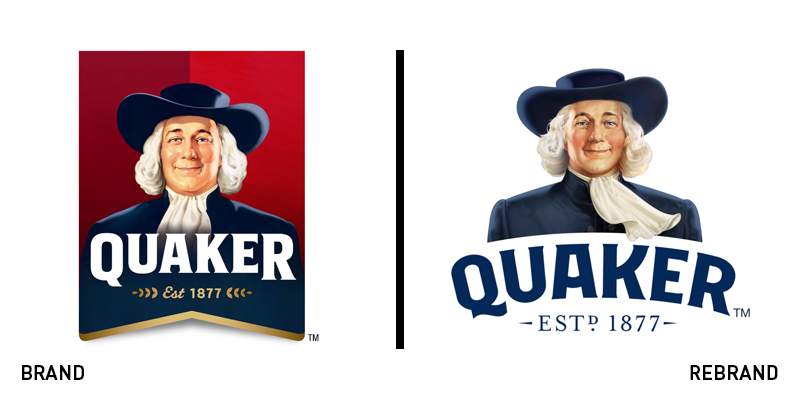
Vintage and freshness come together in Quaker Oats’ new icon
After losing a few pounds in 2012, the Quaker Oats man gets another rebrand positioning Quaker as a business for healthy products.
A new logo has recently been released for American food company Quaker Oats, to bring the brand closer to its healthy products. The rebrand follows another attempt to refresh Quaker in 2012, when the iconic man in the foreground had been redrawn and slimmed down, then placed against a red pennant.
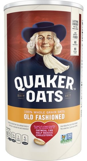
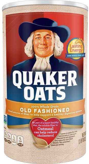
Last autumn’s rebrand leaves stillness behind and opts for a windy oat field behind the Quaker man’s back, with fluffier hair and mild breeze moving his handkerchief. The oat field is an attempt to convey the company’s care for healthy products, and it is presented in warm shades of red blending freshness and old-school together.
The new sense of dynamism is reflected in the typography itself, now arched and rejecting the old logo’s straight line.
The new packaging still hosts the writing ‘old fashioned’ in capital letters, once again putting old-school values at the heart of the brand.