#TransformTuesday: 25 June
Every week, Transform examines recent rebrands and updated visual identities. This week's picks are below. For more from #TransformTuesday, follow @Transformsays
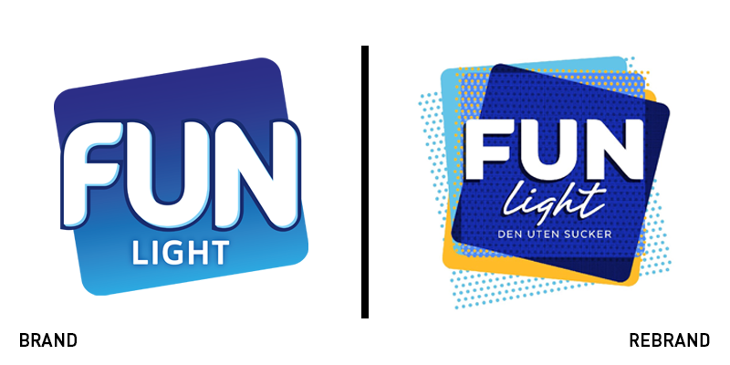
Fun Light
Crafting a brand that would maintain a brand personality dubbed ‘a ball of playful energy’ may not be the simplest of tasks. Even more challenging is the fact that the rebrand, by JDO, was for one of the bestselling Scandinavian cordial brands, Fun Light. The fun, right there in the name, was built into the new branding from logo to bottle. JDO’s strategy united the Fun Light range through brand architecture and modernised it to contend against challenger brands. JDO redeveloped the bottle, integrating the bright visual identity into an angular, polka-dotted pack that speaks of movement and character. Paul Drake, founder and creative director at JDO says, “It’s sleek, fun and ergonomic – the unique shape we created allows FUN Light’s personality to shine.” The logo itself was also updated, building in colour coding and eliminating the gradients of the past for better representation across digital and physical touchpoints.
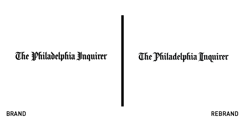
The Philadelphia Inquirer
The third-oldest daily newspaper in the United States, the Philadelphia Inquirer has a history rooted in the events that shaped the nation – with its initial rise to prominence during the US Civil War. Throughout all that time, its logo has shifted only slightly, with the most recent edition tracing its inspiration back to the 1880s. But, as any newspaper knows, times change. “Every incremental tweak or major redesign has been an attempt to modernise the Inquirer brand to keep pace with our changing region and the greater media landscape,” says Andrew Albert, the paper’s branded content designer. After six months of research, the in-house design team unveiled a new masthead that retains the visual cues characteristic to the brand, while improving some elements for better recognition across all the paper’s current channels. The new brand will make its biggest impact online, where a cleaner typeface will improve legibility. Updating the letter ‘I’ was a big challenge for the team, as they needed to ensure it could stand alone as an icon in its own right.
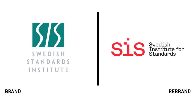
Swedish Institute for Standards
Setting the literal standard for work across many sectors, the Swedish Institute for Standards (SIS) needed a recognisable mark that would ensure its standards were viewed with authority and credibility. Much like BSI’s rebrand in 2013, that involved crafting a more ownable logo. Working with Stockholm-based agency Essen International, SIS adopted the brand strapline, ‘it fits,’ to communicate the concept of working together within standards. Eliminating an italic wordmark and awkward box shape, Essen International freed the wordmark, focusing more on the SIS monogram than on the lengthy full brand name. It uses a coral red colour and bespoke ‘I’ design in its logo. Essen International also released a series of icons, including a globe mark that acts as a standard-bearer. The sharp red is a welcome change for a brand that previously used a dull teal shade as its primary colour.
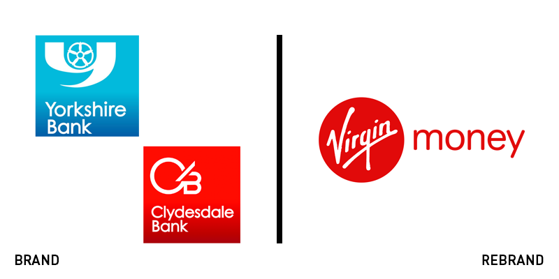
Virgin Money UK
In a newly minted rebrand, the longstanding financial services organisation CYBG – composed of the Clydesdale and Yorkshire Banks – will be rebranded as Virgin Money UK by the end of 2021. CYBG’s chief executive David Duffy said that the rebrand was not an easy decision to make. The authority and trust built into the banks over nearly two centuries of operation is keenly felt by customers. But the rebrand will see that ethos wedded to Virgin Money’s modern character and customer-first mentality. “Clydesdale and Yorkshire Bank have been serving customers in Scotland and the North of England for over 175 years. Both brands are a by-word for reliability and trust and we understand the emotional attachment customers and local communities have towards them," he says. "The decision to retire brand names with such long and proud histories is not an easy one. Marrying the values and expertise of these heritage brands with the Virgin Money brand will allow us to realise efficiencies and grow our business throughout the UK.” While most CYBG platforms – digital and physical – will be rebranded as Virgin Money UK, the company will continue printing Clydesdale bank notes in Scotland.


