My Roti Place gets bold and spicy brand

To mark its debut in the heart of Toronto, Indian restaurant chain My Roti Place has unveiled its visual identity, including interior design, signage, logo and web presence. The branding process was conceived by C&D Group.
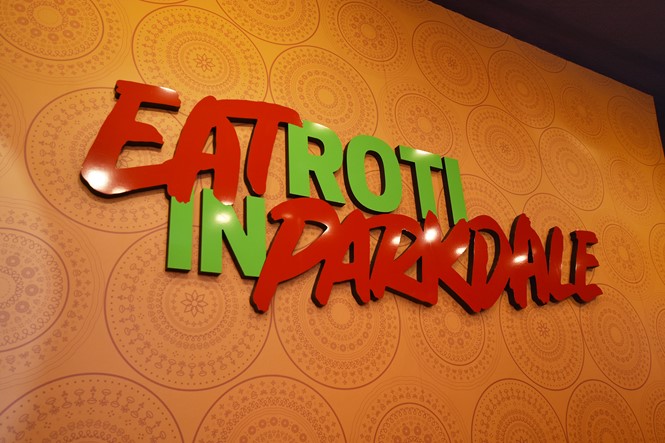
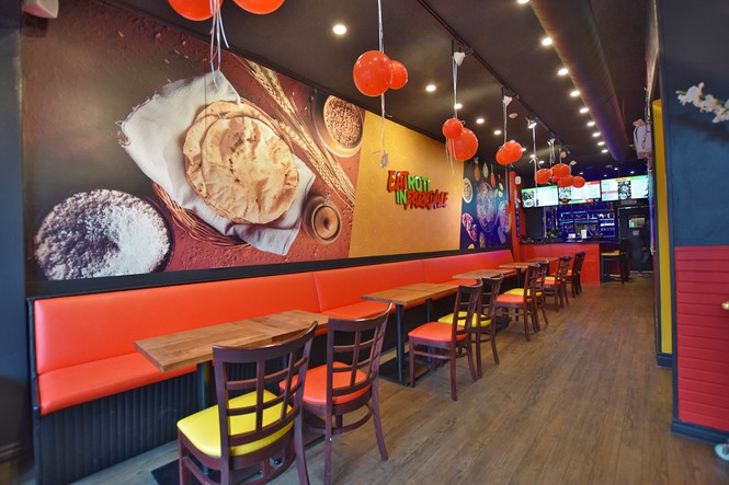
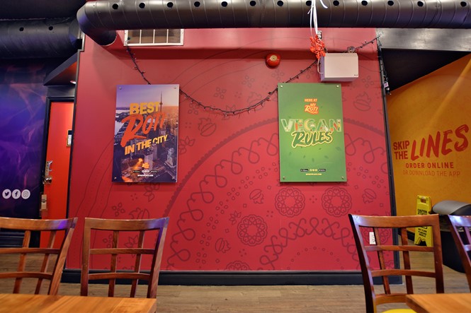
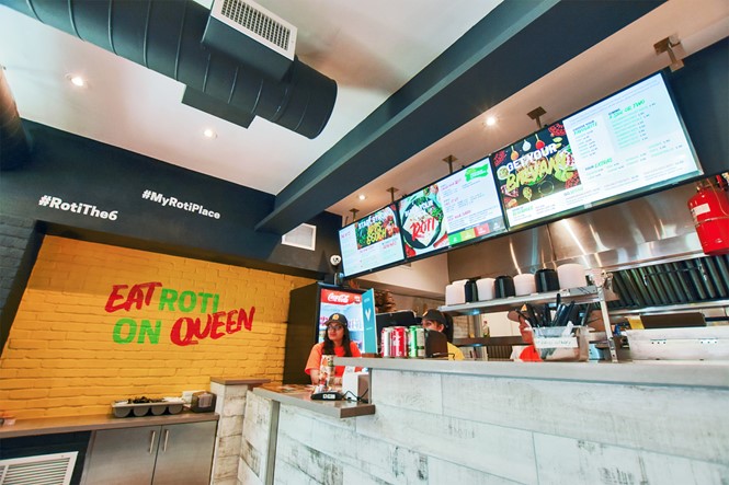
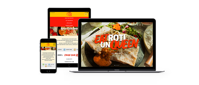
Warm colours and shades of orange dominate the newborn Indian restaurant chain, sending a bold and colourful message with unique simplicity. To promote My Roti Place, creative agency C&D Group has worked to capture the multifaceted personality of the brand, delivering consistency across all areas of the company.
My Roti Place’s identity blends boldness and simplicity, playing with contrast to convey an urban feeling for the whole brand. The expanding chain has applied the visuals throughout all of its restaurants, featuring bright brush marks and exotic colours across all of the company’s assets.
C&D Group’s work sets My Roti Place apart from most of its competitors, with a colourful identity seldom seen in other Indian restaurant chains. The Toronto-based company is already expanding its reach across Ontario’s capital, and it is safe to assume its surging success might come from its streamlined, bold look and brand identity.
For more from Transform magazine, sign up for the Transform newsletter here and follow us on Twitter @Transformsays.


