#TransformTuesday: 15 January

Every week, Transform examines recent rebrands and updated visual identities. This week's picks are below. For more from #TransformTuesday, follow @Transformsays
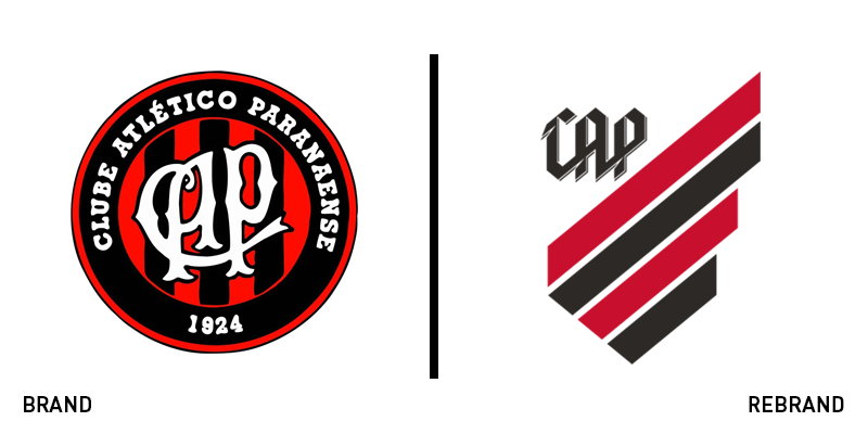
Athletico Paranaense
Rebranding a sports club is usually an occasion fraught with the desires of passionate fans, difficult stakeholders and complicated processes. Those that get it right cane reap the rewards of a renewed brand awareness and inspired fan base. For Club Athletico Paranaense, a Brazilian Serie A club, turned to its history in the process of a rebrand. Brazilian brand agency Oz worked with the club to capitalise on its iconic red and black striped shirts. By consulting with the club and its players, the new brand was developed focusing on passion, enthusiasm, ambition and rebellion. The new brand mark liberates the iconic stripes from their circular prison, allowing for a more freeform brand expression and a simpler incorporation of sub-brands. The typeface equally draws inspiration from the stripes, but features a sense of momentum and rebellion.
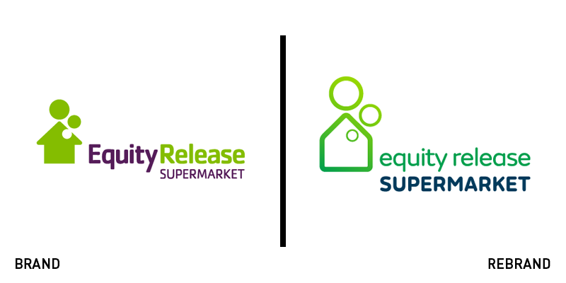
Equity Release Supermarket
British business consultancy Fogg has unveiled new work carried out for the Equity Release Supermarket featuring a new brand and positioning. With a niche market but an interesting point of differentiation, the supermarket required fresh thinking to help it capitalise on this positioning. A new wordmark was developed, simplifying the existing logo and making it more friendly, while highlighting the word ‘supermarket.’ An image library was developed to focus on people living their lives to help avoid visual clichés. The new strategy focuses on ‘empowering, educating and inspiring’ customers through the equity release process.
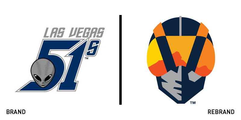
Las Vegas Aviators
Minor League Baseball teams are often renamed, shifted, moved from city to city and franchise to franchise. For the Las Vegas 51s, change had been eluded for 17 years. But, with developments spearheaded by owner the Howard Hughes Corporation, the 51s – so named for Area 51 – are now the Las Vegas Aviators. The new brand corresponds with a new stadium to help the team grow. The name was chosen from a public competition and happily suits the corporation’s heritage and Howard Hughes’ own legacy in southern Nevada. The new brand features a steely-faced aviator with a flying helmet rendered in the colours of a desert sunset. An alternative LV logo features a bold slab serif and a similar colour palette.
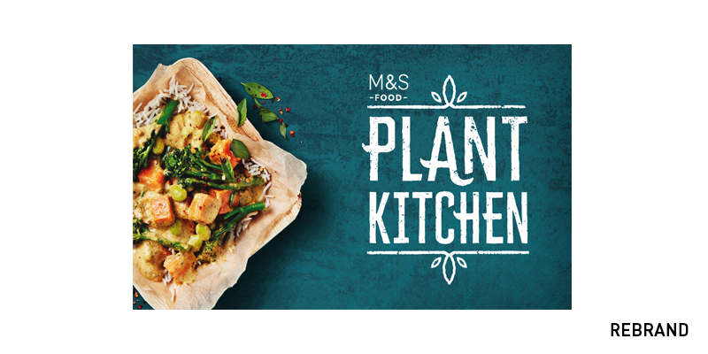
M&S Plant Kitchen
Almost every British supermarket is turning its focus to free from own-brand labels. Sainsburys and Waitrose are just two of the retailers that have recently reexamined their vegan and free from ranges. Now high-end supermarket M&S Food is turning its sights to the vegetarian and plant-based market. It worked with brand consultancy Coley Porter Bell on a UK-wide launch of the M&S Plant Kitchen. The new range is positioned as a means of encouraging people to turn toward a more vegetarian lifestyle by providing excellent taste and a positive attitude. Claire Richardson, senior product developer at M&S, says, “Some people think meat-free food is dull but this couldn’t be further from the truth, it’s experimental and it’s delicious. We’ve created a collection that will appeal to everyone – whether you’re a longstanding vegan, want to lead a more flexitarian lifestyle or you love meat but think cauliflower popcorn sounds amazing! It’s all about delicious tasting food first.”
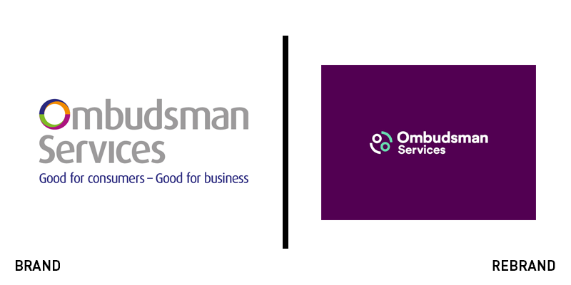
Ombudsman Services
Managing consumer complaints can be a tough job. Mediating the disputes between unhappy consumers and unhappy retailers, the UK’s Ombudsman Services required a more straightforward approach to its digital platform. Redeveloping its website – alongside Code Computerlove – has allowed for a streamlined complaints management process, but the organisation has also examined its brand. Working with brand agency Halo, the site has a fresh visual identity that uses a cheerful purple and turquoise colour palette, replacing a government-corporate grey and blue look. Jodi Hamilton, head of marketing and communications at Ombudsman Services says, “Overall our aim is to appeal to a wider audience, increase users and make our services accessible and easy to use. We want to deliver a best in breed service to consumers as well as service providers signed up to us.”
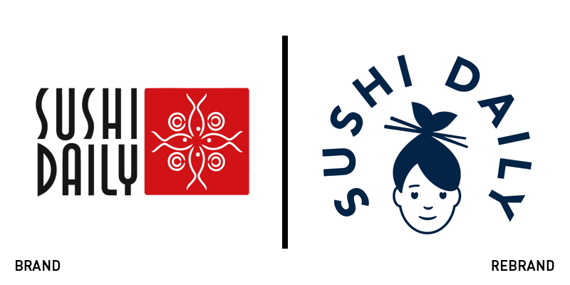
Sushi Daily
Following the successful launch of the Wahaca rebrand, London-based design studio Without has turned its sights to sushi. Sushi Daily, a sushi concession operating in Waitrose stores across the UK has also begun launching its own, standalone restaurants and needed a brand to support it. Its previous visual identity was black, white, red and fairly typical for a sushi concession. Without chose to alter the brand’s positioning to emphasis the artisan, hand-crafted nature of its product. The simplified visual identity also features Japanese-inspired patterns and a simple, distinctive set of illustrations. The brand’s primary icon – a sushi chef drawn in indigo – features a hairstyle shaped like a fishtail, emphasising Sushi Daily’s purpose.


